 Miscellaneous
Miscellaneous
Miscellaneous  Our World
 10 Green Practices That Actually Make a Difference
 Humans
 Ten Historic Men Who Deserve Way More Credit Than They Got
 Movies and TV
 The 10 Most Heartwarming Moments in Pixar Films
 Travel
 Top 10 Religious Architectural Marvels
 Creepy
 10 Haunted Places in Alabama
 History
 Top 10 Tragic Facts about England’s 9 Days Queen
 Food
Food 10 Weird Foods Inspired by Your Favorite Movies
 Religion
 10 Mind-Blowing Claims and Messages Hidden in the Bible Code
 Facts
Facts 10 Things You Never Knew about the History of Gambling
Miscellaneous Ten Groundbreaking Tattoos with Fascinating Backstories
Our World 10 Green Practices That Actually Make a Difference
Humans Ten Historic Men Who Deserve Way More Credit Than They Got
Who's Behind Listverse?

Jamie Frater
Head Editor
Jamie founded Listverse due to an insatiable desire to share fascinating, obscure, and bizarre facts. He has been a guest speaker on numerous national radio and television stations and is a five time published author.
More About Us
Movies and TV The 10 Most Heartwarming Moments in Pixar Films
Travel Top 10 Religious Architectural Marvels
Creepy 10 Haunted Places in Alabama
History Top 10 Tragic Facts about England’s 9 Days Queen
Food 10 Weird Foods Inspired by Your Favorite Movies
Religion 10 Mind-Blowing Claims and Messages Hidden in the Bible Code
Facts 10 Things You Never Knew about the History of Gambling
Top 12 Logo Competition Submissions
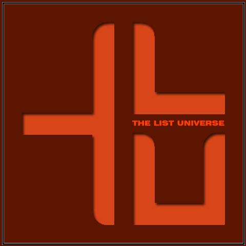
First of all, I would like to thank everyone that submitted logos for the competition. I received over 40 entries and they were all brilliant. I am incredibly impressed with the artistic and creative talent that we have on the site! I have now spent the day going through the entries and breaking it down to the 12 most suitable. In making my initial decision, I have tried to consider all of the media that the logo may appear on – web, print, merchandise, and advertising.
What happens now? I would like you all to look at all of the logos (click for a larger view) and tell me in the comments which one you think should become our official logo and winner of this competition. I have not put them in any specific order – the numbering is simply to make it easier to refer to your favorites in the comments.
1. Mekanikal_Demon

2. Anderi

3. esmaeil
4. fogelks
5. esmaeil 2
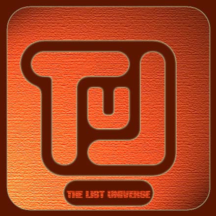
6. Cullinan
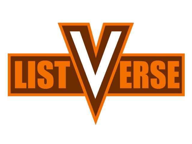
7. Bishopwhitet
8. Chica
9. Chica 2
10. Davidr4889
11. NathanCipher

12. DFrost
More Great Lists
 Top 10 Top-Level Domains That Caused Controversies
 Top 10 Best Movies From The Top Genres
 Top 10 Worst Movies From The Top Genres
 Top 10 Ridiculously Over The Top Horror Movie Deaths
 Top 10 More Bizarre Beliefs Held By Top Celebrities
 Top 10 Amazing Feats And Facts About Glass
 Top 10 Interesting Things About The People Of Pompeii
 Top 10 Bizarre Costumed Street Characters And Performers
 Top 10 MIA Fighter Pilots Whose Planes Were Found
fact checked by
Alex Hanton
More Great Lists