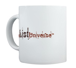
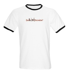
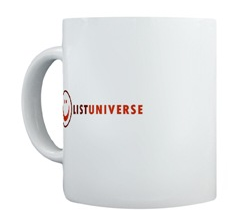
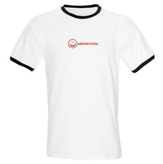
Having tallied the count from the top 12 list, we are now down to the final five. I would like to remind you that I will be making the final decision but I will take in to account the votes here. For this list I have included the original logo, as well as a sample of the logo on a tee-shirt and a mug – so you get a better idea of how they will look on merchandise (the main reason for this competition).
Another thing to keep in mind is that I am considering changing the overall color scheme of this site from orange/brown to shades of blue – the logo will be modified when that happens.
Again, the logos are in no specific order, but having seen them on potential merchandise, I have made a few comments on each one.
Logo Entry 1


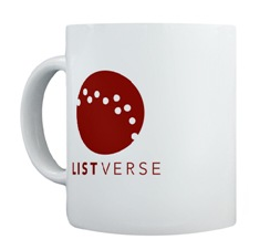
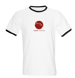
I like this one because the circular part of the design can be used separately or with the words. It stands out on the clothing and could be modified to put the text on the right for the top of the website.
Logo Entry 2


I like the modern funky style of this one but I am a little concerned that it does not show too well on merchandise. It would be good for the top of the site – but I would need some convincing for apparel.
Logo Entry 3


Like number 1, the circular section could be used separately. I am just not sure if the smiley face would be recognized as our own – whereas the image in entry 1 is distinct.
Logo Entry 4


This was one of my favorites in the top 12, but seeing it on merchandise does tend to remind me of a corporate logo – the sort of thing you would see a dozen men on a company golf team wearing.
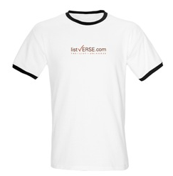
Logo Entry 5


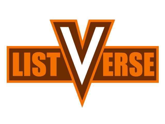
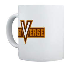
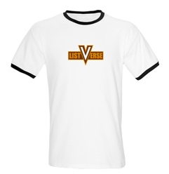
This one has great impact and the V could be extracted if needed. It is distinct and I think it has a very modern/retro appeal to it.


I would like to have 5 on my mug but the shirt looks good with 2 i think this is gonna be a hard choice
They’re all pretty good, but I’d go with two.
#2
Yeps…I still likes #2.
1.
Number 1.
i see your point about being able to extract the logo from the text for regognition purposes. that is important, methinks. i’d say 1 or 5.
me: thanks for not saying “1st post”
number 1. i liked it the first time i saw it. now i REALLY like it! and if you change the site to a blue colored theme, well, it would look even better… kinda like a blue-ish earth-like planet… or what the milky way looks like if a child was to draw it…
1 imo
ringtailroxy is right, pick #1 and I throw away all my clothes and dishes
yess.
definitely number 1 or 5.
#5 for me
absolutely #1, and it would be actually the first merchandise I would buy to support something, as it still looks cool.
#2, simply because it reminds me of my own work (which was never submitted, sadly).
#4 is still my favorite and no one else likes it :[ If it isn’t #4, then I’d go for #2.
Wow tough call but i would say #2 with #4 a very close second.
I like 1 or 5.
Number 1 is simple, attractive, would work in any colour and would be instantly recognizable in even a very small display.
My problem with 5 is that, while it looks good on a page or a mug, on a shirt it looks a bit like a cheesy super hero costume.
Can you combine these? Could you take the ball from 1 and put it with the text from 4? Or can you change the text on 1 to say Listverse.com? You have a short URL so that works. It would be a better for advertising. It makes it so that it is immediately known that you are a web page.
Please don’t pick 3. It’s cute, but that’s it. It’s too juvenile.
Entry # 5!! It remins me of a college t-shirt, which is very easy to wear
i cant wait to see who wins!!
the problem is that only one of these final five has both the common name (listverse) and the actual name (the list universe) combined in the logo.
i like 5, but it doesn’t have the actual name of the site.
Are you going to narrow it down to a Top Two?
its either 4 or 5
4
Spence425: that’s why I was wondering if the logos could be combined. 4 and 1
# 5 looks like a college jersy to me. GO V! #1 and #4 are cool too. You have you’re work cut out for you. Good luck on pleasing the masses (the good thing is, as long as you’re happy it’s all good)
jocsboss: no – I will be selecting the winner from this list of five
For me, it’ still 1 & 2. They convey the playful, informative tone we’ve all grown accustomed too.
#1 all the way- hip and cool without being too “dot-comey”
#2 too busy and would be difficult to scale down to smaller sizes and still be readable
#3 too amateur looking- no credibility
#4 would blend in with hundreds of other logos- totally not memorable or unique
#5 would be fine for the Junior Varsity team
Number 4 for me. Definitely.
1: Doesn’t really tie into anything on the site, it’s just a cirdle with some holes in.
2: It’s good but a bit too detailed to work well on small things. Would probably smudge pretty badly on a mug.
3: Looks retarded, to be honest. Like the kind of thing a little kid would come up with.
5: Looks like a superhero logo. A bit too ‘in your face’ I think.
Agree with Parker Harrington no.3 would look too general. 5 looks cool,sort of a comic book thing
Why would you want a logo that looks like a college jersey? Or am I misreading these comments?
2 still is probably my fav
I still like # 4 though # 1 is growing on me….
I like #2, it seems the most creative, but #1 seems the most functional.
Go with #1.
1…it’s very clear
i’ll stick with my 1st choice #4
although 1 and 5 really do ‘pop’ on the merchandise
2, but i would enlarge the writing on the tee.
I vote for #1
Hi,
I like No 1 and 2. No 1 is clear and modern and includes universe and the list part of the site. Anyway I prefer No 2 because it really represents the character of this site. It’s colorful and covers a variety of topics. This logo represents through it’s plentiful shapes the spirit of this site were people from around the world discuss myriads of themes in a peaceful manner. On Top you can look on it for some time without getting bored.
My Vote: Number 2
Cheers!
Number 1 is the only one here that is going to work for your purposes. All the other submissions are good but number 1 is the most versatile.
I couldn’t decide between 4 and 2 but you’re right…it does seem to be a corporate type logo.
So anyway 2 seems like the best to me! You’re right the logo in 1 could be used with or without the name of the site but I just don’t really like the look of it. 2 is the obvious choice in my opinion
It is very original and reflects this site alot in that it looks very profesional yet is still cool and interesting and odd (in the best way possible).
so NUMBER TWO!!!!
I would SO buy that shirt!!
No offence to the person who made it but I personally think #1 is very boring to look at…
number 2 is definitely the best
4
no, #1 is boring and ugly. #2 is original and will be distinctive for this site. and if u think it will be dificult to read if it is smaller then dont size it down on the t-shirts. as for the mugs, idk try to make it big as possible anyway. #3 is just stupid. #4 is alright but its kinda boring too. i wouldnt mind a whole lot if #4 wins. #5 reminds me of the Virginia Tech logo. kinda. so its #2 for me.
and as for that circular thing being used seperatley for #1, who would remember that boring circle with some dots?
i am begging you to go with number 2.
1 or 4
number one or three for sure.. they will be one of the winnners
1 and 5 have my vote!
4, deff.
My favorite look is #1 but I’d have to put my vote for #4 simply because it has the dot com in it and I would be MUCH MORE apt to wear merchandise with it.
Number 1 for the proverbial win.
JF: Whichever you choose, do make sure it has “ListVerse” instead of “List Universe”. Anyone who doesn’t know about this site and sees it on a mug or T-Shirt would tend to go to http://www.listuniverse.com otherwise. Not many would have the patience to do a google search for the right site after that (as someone pointed out in the other logo list)
None of the above… keep trying. Once in place, it will be hard to change. You need a design that screams “This is the one” as soon as you see it.
No contest #1. It is clean, unique and will become easily recognizable.
Retyping my long and boring thoughts. Somehow I clicked on an ad or something and they disappeared.
What is your goal with merchandising? Is it for walking billboards to advertise this site? Is the merchandise supposed to be something fun for people who love the site to show how much they love the site?
1. This one would be great even as a pin. You could even pass them out at corporate events. Oh wait you are not a large corporation. The logo would look even better as a “pocket” style logo on the left side below the shoulder. It is a little bit too corporatey for me.
2. I like the creativity of this one. It is fun and whimsical yet gives off an air of being educated. I have this nagging feeling I have seen it somewhere before though. I will try to keep thinking where I saw it. Or maybe it is the one you ended up going with and I saw it in my psycho, oops I mean psychic dreams.
3. Cute and fun, but a bit too kiddy. Although I am always for smilies.
4. This is your walking billboard. It advertises the site with the website address and the website name. It is plain and simple. Doesn’t really stand out and not very memorable. It is very simplistic and I am not sure it conveys they way you are trying to head with this site.
5. This one reminded me of a high school or College Varsity shirt the first time I saw it. I think it is fun and gives me a “We’ve got spirit! Yes we do!” type attitude.
So I haven’t really committed to one. I think you have a tough decision.
I have to admit, I’m still in love with number 2. Even more now that I saw the logo on a mug and shirt.
Taking in consideration that the color scheme will change to blue, though… I would hate #2 in blue.
So I really hope jfrater picks number 4. I still insist on the idea that the logo should have the name together with the URL.
Number 4 is by far the more sophisticated and worthy of this site. Simple, yet effective and long lasting. The best! The checkmark is brilliant!
Number four is by far the best design. It’s simple, but conveys the idea of a list, and has both the URL and the name of the website. I would also say that number two is good, but it isn’t my favorite. While it shows the variation of lists on the website, it’s very complicated and someone who’s never visited the site would not understand that it was a website of lists. Numbers one, three, and five do not deserve to win the competition. Number one is cool, but doesn’t have anything to do with lists. It’s ridiculous that number three made it to the finals. Not only does it have nothing to do with lists or the listverse, which would not attract customers, the smiley face is poorly designed, and looks a little scary. Number five is okay, but I don’t like that it doesn’t have the URL, and it doesn’t really convey the idea of lists to the viewer. Also, on a shirt, it would make you look like a superhero.
My vote is number 4.