 Weird Stuff
Weird Stuff
Weird Stuff  Humans
 The Ten Most Lethal Gunslingers of the Old West
 Misconceptions
 10 Phony Myths and Urban Legends That Just Won’t Die
 History
 10 Amazing Roman Epitaphs
 Weird Stuff
 10 Niche Subcultures That Are More Popular Than You Might Think
 Mysteries
 10 Tragic Disappearances and Deaths in Joshua Tree National Park
 History
 10 Ways Childhood Really Sucked in the Old West
 Music
Music 10 Name Origins of Famous Bands from the 1990s
 Religion
 10 Biggest Turnarounds by the Catholic Church
 Weird Stuff
 10 Unbelievable Times Laws Had Unintended Consequences
Weird Stuff 10 Cool and Creepy Facts about Collecting Tears
Humans The Ten Most Lethal Gunslingers of the Old West
Misconceptions 10 Phony Myths and Urban Legends That Just Won’t Die
Who's Behind Listverse?

Jamie Frater
Head Editor
Jamie founded Listverse due to an insatiable desire to share fascinating, obscure, and bizarre facts. He has been a guest speaker on numerous national radio and television stations and is a five time published author.
More About Us
History 10 Amazing Roman Epitaphs
Weird Stuff 10 Niche Subcultures That Are More Popular Than You Might Think
Mysteries 10 Tragic Disappearances and Deaths in Joshua Tree National Park
History 10 Ways Childhood Really Sucked in the Old West
Music 10 Name Origins of Famous Bands from the 1990s
Religion 10 Biggest Turnarounds by the Catholic Church
Weird Stuff 10 Unbelievable Times Laws Had Unintended Consequences
10 Simple Charts That Will Change The Way You See The World
Our world is built on assumptions. At any given time, we each have a number of basic ideas ticking in our subconscious: where we stand in the world, what our social class is, how much longer we have left to live, and so on. But every now and then, someone comes along with a simple, easy-to-understand chart which blows those assumptions wide open. Think you know the world around you? Think again.
10Half Your Life Is Over By The Age Of Seven
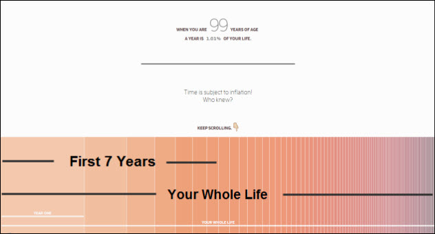
Photo credit: Maximilian Kiener
Remember going on summer break when you were a kid? Remember how long those few weeks seemed to last? For most of us, that time away from school probably felt like an eternity. In a certain way, it really was.
Way back in 1897, Paul Janet theorized that we measure the passage of time as a proportion of our total life span. So a year feels like a long time when you’re eight, because it’s 12.5 percent of your entire life. By contrast, when you’re 35, it’s a mere 2.86 percent, which is why time seems to speed up as you get older. Mathematically, this raises some interesting points. For example, your summer vacation at age 18 should feel as long as your entire 76th year. Even crazier, half your life should feel like it’s over by the time you reach age seven.
According to this chart by Austrian designer Maximilian Kiener, our perception of time is focused heavily on our earlier years. So much so that just reaching our eighth birthday should feel like slogging it all the way to middle age. If you account for the fact that most of us don’t remember our first three years, then the perceived midpoint of our lives should still be around age 18—a full 61 years before most of us will actually cop it.
Not everyone agrees this is a fair way to measure our experience of time. Still, there’s no denying that things appear to speed up as you get older, which is why everyone acts so surprised when they hit 40. In their heads, they’re still just out of college.
9America Is Less One Nation Than Eleven Different Ones
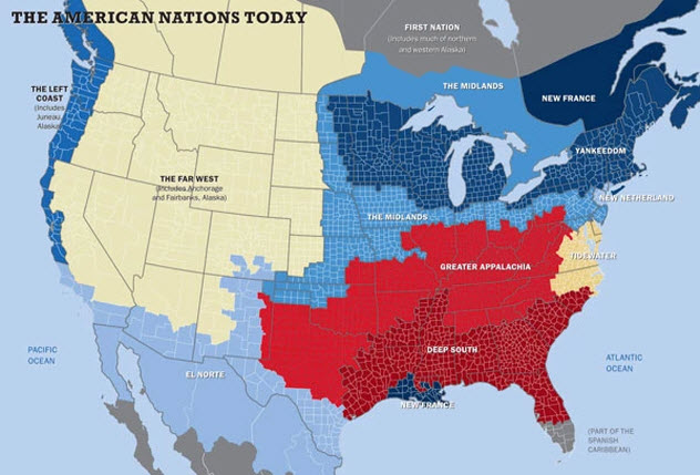
Photo credit: Tufts Magazine
As anyone who’s ever driven coast to coast knows, America is big. Within all that vast land, it’s perhaps no surprise that wildly different communities will rise up. Most of us already split these communities up by definitions like Midwest, Deep South, New England, and so on. But journalist Colin Woodard thinks these are too ambiguous. According to his map, you can split the United States (and parts of Canada) into 11 separate nations.
Far from being random, his 11 nations are defined by a shared history and cultural identity, much like the actual countries of the EU. Many are also pretty hard to argue with. Louisiana and Quebec have former French colonial regions that are both part of “New France,” with a shared French heritage and similar socially liberal values. New England and the industrial Midwest is “Yankeedom,” the area originally founded by Puritans and supportive of big government. The region running along the Great Smoky Mountains is “Greater Appalachia,” founded by Irish, Scottish, and English settlers with an abiding love of individual liberty. Southern Florida, controversially, is named as part of the Spanish Caribbean.
What’s interesting is that many of these nations have characteristics we would recognize as being similar, but we wouldn’t usually lump together. The “Midlands,” for instance, encompasses Iowa, Quaker Territory, the densely-populated Midwest, and a band stretching around the Great Lakes all the way into Canada, all of which is vaguely antigovernment and very pro–middle class.
8Globally, US Broadband Is Pathetic
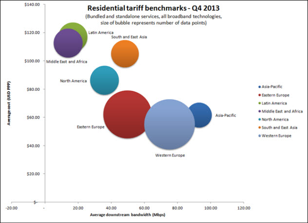
Photo credit: Gigaom
As home to Google, Amazon, Facebook, and just about every other Internet giant, you’d be forgiven for thinking America was a pretty technologically switched-on place. Maybe not quite up to Japanese or South Korean standards, but better than average, right? Not even close. As these charts from gigaom.com show, US broadband is both expensive and utterly pathetic.
The first chart compares the cost of monthly subscriptions from across the world, translated into US dollars and adjusted for purchasing power parity. Russia and Finland dominate the low-cost end, with locals paying the equivalent of $37 and $40 per month respectively. The UK ranks 17th with charges of $49, while the Netherlands is far down at 28th with charges of $58 per month. The US, on the other hand, ranks 58th.
That’s below Bosnia, Malaysia, and Albania. It’s also below Hong Kong, where everything is expensive. That extra cost doesn’t translate into better service, either. The second chart compares monthly price against average bandwidth in multiple regions. While North American broadband is still faster and cheaper than its Latin American, African, or Middle Eastern equivalent, it trails laughably behind that available to Europe or Asia Pacific. At its very best, Western European broadband offers twice the bandwidth at half the price, while that available in Asia Pacific is nearly 20 bucks cheaper and goes so fast it’s like magic.
7The British Class System Is Even More Complicated Than You Realize

Photo credit: BBC News
It’s an open secret that the British are obsessed with class. British music, British art, and British sitcoms are all inextricably linked to the social scale, and recent research has shown background and job prospects in the UK are closely tied. But while most Brits would happily identify themselves as working, middle, or upper class, this way of thinking may be outmoded. In 2013, a BBC-backed survey revealed the country was divided into seven distinct social classes.
In an interactive posted to the corporation’s website, the Beeb asked visitors to answer a handful of questions then assigned them a new class. The categories were complicated, to say the least. While the upper class (renamed the “elite”) stayed more or less the same, all the lower classes were heavily subdivided. At the lower end of the scale, the traditional working class was joined by two new groups: emergent service workers and the “Precariat.” The first are what we’d call hipsters: people obsessed with music and new technology working high-skilled, low-pay jobs like production assistant or Internet list writer. The second are the people on the bottom rung of society: people who do low-pay, low-skilled jobs and don’t have any savings whatsoever.
The middle class was cut in three: new affluent workers (whose parents were working class but who have well-paid, secure jobs), technical middle class (who work highly-skilled manual jobs and love cultural activities), and established middle class (who had a good education and now work in well-paid professional jobs). As the researchers told BBC News, these new divisions allow a “more complete picture of class in modern Britain.” If you want to figure out where you fit in, you can always take the test and find out.
6The Effect Of Race On Justice And Death Is Insane
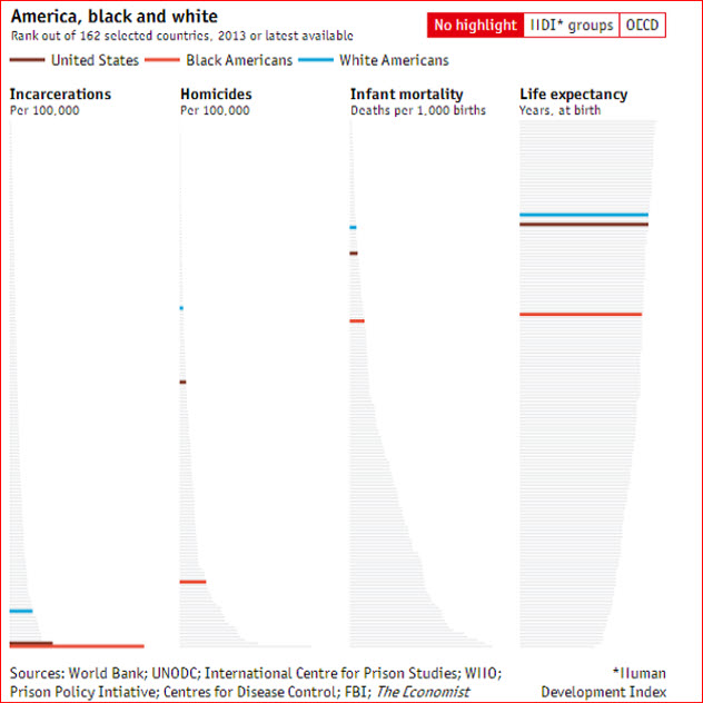
Photo credit: The Economist
As the old adage has it, if Brits are obsessed with class, then America is obsessed with race. Most of us are probably aware of studies showing stuff like how you’re more likely to be arrested for marijuana possession if you’re black. The effects of race go much deeper. In a recent interactive, The Economist showed African Americans suffer everything from higher incarceration rates to higher homicides and lower life expectancy.
The Economist‘s chart collects data from all the world’s countries on the above criteria plus infant mortality rates. It then splits America into “White America” and “Black America” and allows users to compare them to other countries. The results are eye-opening. In terms of homicides, White America sits just below Norway. The country as a whole is roughly level with Ukraine. By contrast, Black America ranks far below Russia, Sudan, and Zimbabwe and just below Guyana—a country listed as “Critical” for crime by the US Embassy.
This disparity continues in other categories. In life expectancy, White America ranks just behind Denmark and Chile at 79 years, with the general population only slightly behind that. At 75 years, Black America ranks below Mexico. In terms of infant mortality, White Americans rank above New Zealand. African Americans are on par with Romania and China.
But the worst is incarceration rates. While White America ranks only 13 places from the bottom with 380 incarcerated for every 100,000 in population, Black America is literally last. With 2,207 African Americans imprisoned for every 100,000 in population, its rate is higher than Russia, Cuba, Turkmenistan, and Iran combined.
5You’re Far Wealthier Than You Realize
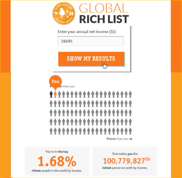
Photo credit: CARE International
How many of you reading this would call yourselves rich? Probably not many. Research shows that the vast majority of us self-identify as “middle class,” although even those with decent jobs have seen their incomes stagnate over the last few years. If we had to guess how our income compares with the rest of the human race, very few of us would put ourselves anywhere near the fabled “one percent.”
According to an interactive by CARE International, that’s exactly where we are. By taking your annual net worth, their website can figure out how rich you are compared to the rest of humanity and plot it on a handy chart. It turns out you don’t need much to qualify for the global elite. A modest annual income of $22,500 puts you in the top 2.7 percent of all earners as of this writing. The median US wage of $26,695 gets you into the top 1.7 percent as of this writing.
By the time you’re earning the $42,339 your average McDonald’s manager might expect to make, your global standing is easily within the top 1 percent. Anything above that and you’re stepping into the global mega-elite. It may not always feel like it, but you have more money than nearly everyone else on Earth.
4Over Half The World’s Population Lives In One Tiny Region
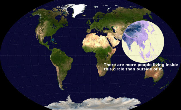
Photo credit: valeriepieris
The United States has the fourth-largest population of any country on Earth. If you count it as a single entity, the European Union has the third biggest. With numbers like that, it’s easy to assume the global population is evenly distributed between the West and heavy hitters like China. As this map shows, that assumption couldn’t be more wrong. Globally, there are more people living inside a tiny little bubble in Asia than there are outside it.
The above map first appeared on Reddit courtesy of user valeriepieris, and it’s based on some pretty reasonable projections. Pakistan, Bangladesh, Indonesia, Japan, and the Philippines each have official populations way over 100 million, and in the case of India and China, over a billion. Along with some slightly smaller but still populous nations like Vietnam, South Korea, and Burma, they contain a seething mass of humanity almost dazzling in its scope. Combined, the handful of nations contained within that circle is home to more people than the whole of Africa, Europe, the Middle East, Australia, and the Americas combined.
This only gets more impressive when you realize that the circle is mostly comprised of water. For whatever reason, humanity is concentrated on a few relatively small patches of earth in one corner of the globe, a corner most of us have never even visited.
3Gay Rights In Europe Aren’t What You’d Expect
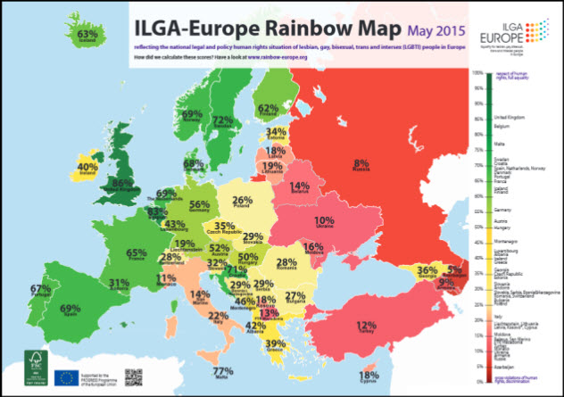
Photo credit: ILGA-Europe
In the last decade or so, LGBT rights have become a cause celebre. Gay marriage has been legalized in many countries, and acceptance is at an all-time high. One of the most accepting regions is Europe. But tolerance in the cradle of Western civilization isn’t as straightforward as it first appears. Look closely and the issue reveals plenty of surprises.
In May 2015, ILGA-Europe, an LGBT charity that gets funding from the EU, produced a map scoring each country in the region on a scale of 0 to 100 percent for tolerance (where 100 percent meant complete equality and 0 percent meant run for your lives). Some rankings, such as Russia’s 8 percent or Sweden’s 72 percent, were pretty much as you’d expect. Others were surprising, to say the least. Catholic Croatia scored just behind Sweden with 71, making it the fifth-best country in which to be LGBT in Europe. Highly religious Malta scored even higher with 77. On the other hand, famously tolerant Germany scored a mere 56, while tiny Monaco was ranked only 3 percentage points ahead of notoriously homophobic Russia.
The country that came out best of all was the UK, which ILGA-Europe ranked as the most LGBT-friendly place in all of Europe, beating even famously liberal Holland. While this is clearly just one organization’s view of gay rights on the continent, it still shows the overall image is more nuanced and surprising than you might imagine.
2Wikipedia’s Edit Wars Are Geographically Insane
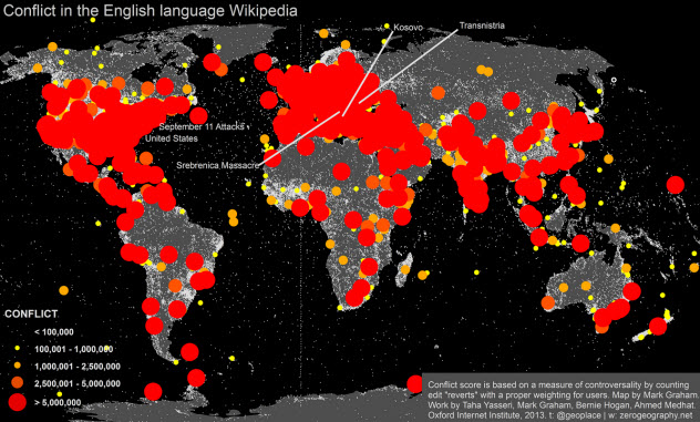
Photo credit: zerogeography.net
Wikipedia’s ridiculous edit wars are the stuff of legend. The site itself keeps a handy reference page of its own lamest battles, including wars over stuff like the exact diameter of the Death Star. In 2013, the Oxford Internet Institute decided to map these battles by language, subject, and frequency. They discovered that our Wikipedia wars say more about our culture than you might have thought.
For instance, the map of the English Wikipedia’s wars shows subjects spanning the entire globe, all gathering over five million “reverts” (when an editor undoes all of a previous editor’s work). Among these, the most controversial topics were George W. Bush, anarchism, and unsurprisingly, the Prophet Muhammad. Not far behind were the topics of 9/11, the status of Kosovo, and the genocidal Srebrenica Massacre of 1995.
On the other hand, the French-language Wikipedia was obsessed with Segolene Royal (Francois Hollande’s ex-partner), UFOs, and Jehovah’s Witnesses. The Spanish version was at its angriest where the Falkland Islands were concerned, while four of the five biggest edit wars on the Portuguese site had to do with soccer.
Taken together, the maps were strangely revealing. The Japanese only have significant Wikipedia fights over their own universities, while the Czechs hardly ever disagree. On the other hand, nearly every single version of Wikipedia had users duking it out over Israel/Palestine.
1How Well You Do In Life Depends Largely On Who Your Dad Is
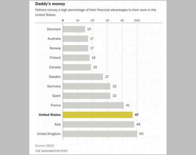
Photo credit: The Washington Post
As bold ideas for a country go, it’s hard to beat the “American Dream.” The idea that even the son of a street sweeper can become the next Warren Buffett if only he applies himself is intoxicating. According to The Washington Post’s Wonk Blog, though, it may be time to rename the concept. Far from being American, a more appropriate title might be the “Danish Dream.”
In the chart shown above, the paper used data from the OECD to calculate what percentage of his financial advantages and disadvantages a father might pass on to his son in a wealthy nation. In Canada, they estimated the average dad might pass on 19 percent of his financial advantages. In Denmark, the most egalitarian of the lot, it was a mere 15 percent. By contrast, US fathers passed on a whopping 47 percent.
That’s one of the highest in the OECD, just behind the nepotism of Italy (48 percent) and the rigid class structure of Britain (50 percent). To give some meaning to these numbers, the paper offered the following example: Imagine two students, one who is highly intelligent and hard-working but poor and one who is born rich but is a lazy high school dropout. In 21st-century America, the gifted poor kid has the same chance of staying poor as the worthless rich idiot has of staying rich.
In other words, if you’re reading this on a PC running Windows 95 by candlelight in a tiny hovel, you’d better pray to God that hovel is in Denmark.
More Great Lists
 8 Maps That Will Change How You See The World
 Top 10 Bizarre Facts That Will Change How You See Dinosaurs
 10 Simple Things That Aren't As Old As You Think
 10 Ways Life Will Change If China Becomes The…
 Top 10 Tech Crazes That Failed To Change The World
 10 Historical Facts That Will Change How You Think…
 Top 10 People Who Didn't Die The Way You Think They Did
 10 Bizarre Helper Animals You Don't See Every Day
 20 Incredible Time-lapse Videos You Have To See
fact checked by
Jamie Frater
More Great Lists