 Miscellaneous
Miscellaneous
Miscellaneous  Our World
 10 Green Practices That Actually Make a Difference
 Humans
 Ten Historic Men Who Deserve Way More Credit Than They Got
 Movies and TV
 The 10 Most Heartwarming Moments in Pixar Films
 Travel
 Top 10 Religious Architectural Marvels
 Creepy
 10 Haunted Places in Alabama
 History
 Top 10 Tragic Facts about England’s 9 Days Queen
 Food
Food 10 Weird Foods Inspired by Your Favorite Movies
 Religion
 10 Mind-Blowing Claims and Messages Hidden in the Bible Code
 Facts
Facts 10 Things You Never Knew about the History of Gambling
Miscellaneous Ten Groundbreaking Tattoos with Fascinating Backstories
Our World 10 Green Practices That Actually Make a Difference
Humans Ten Historic Men Who Deserve Way More Credit Than They Got
Who's Behind Listverse?

Jamie Frater
Head Editor
Jamie founded Listverse due to an insatiable desire to share fascinating, obscure, and bizarre facts. He has been a guest speaker on numerous national radio and television stations and is a five time published author.
More About Us
Movies and TV The 10 Most Heartwarming Moments in Pixar Films
Travel Top 10 Religious Architectural Marvels
Creepy 10 Haunted Places in Alabama
History Top 10 Tragic Facts about England’s 9 Days Queen
Food 10 Weird Foods Inspired by Your Favorite Movies
Religion 10 Mind-Blowing Claims and Messages Hidden in the Bible Code
Facts 10 Things You Never Knew about the History of Gambling
Top 10 Origins Of Famous Fonts
Although they’re literally at our fingertips, we seldom think of them. However, our word processors’ fonts sometimes have intriguing, even surprising origins, and they’re not always free of controversy and criticism.
Businesses have commissioned some of them. Others have been inspired by cartoon lettering, music, road signs, and puzzles. Still others are based on marketplace needs, requirements imposed by technological devices, or innovations in art, design, and manufacturing. Whatever led to the development of these fonts, the inspirations behind them are, at times, inspirational in themselves.
10 Wingdings
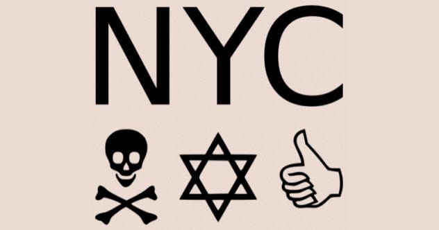
Photo credit: Haza-w
Originally, the weird font that became known as Wingdings was hand-drawn before being digitized, printed, and exhibited at the 1984 Association Typographique Internationale conference in London, England. Microsoft bought the font in 1990, renaming it “Wingdings” and remapping the keyboard layout.
But who would want a collection of these weird symbols and why? At the time the font was invented, incorporating images into text documents was difficult and time-consuming. Graphics libraries were limited, and graphics files were large and depended on hard drives with severe space limitations.
Lucida designers Charles Bigelow and Kris Holmes offered their strange font characters as a solution. Lucida Icons, Lucida Arrows, and Lucida Stars supplied ready-made, easy-to-use images that users could easily insert into their documents to add a bit of early 1990s pizzazz.
The weirdest thing about Wingdings, though, wasn’t typing a “Q” and producing the image of an airplane or getting a flag in exchange for a “P.” It was a bizarre controversy generated by its use.[1]
Conspiracy theorists were convinced that using Wingdings was a way of typing secret messages. One such message was allegedly anti-Semitic. Typing “NYC” resulted in a skull and crossbones, followed by a Star of David, followed by a thumbs-up gesture. Conspiracy theorists suggested that this indicated it was acceptable to kill Jews who lived or worked in New York City.
Microsoft insisted that there was no conspiracy. Rather, the substitution of these particular icons for those letters was the result of mere coincidence. In fact, the characters of the original Lucida font, on which Wingdings is based, were selected from a variety of sources, including ancient gestures, medieval manuscripts, modern inventions. Also, Bigelow and Holmes liked fleurons, which are floral designs based on flowers from their yard.
9 Comic Sans
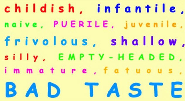
Photo credit: BBC
An Internet campaign against the use of Comic Sans argues that the font is too unsophisticated. It is childish, critics contend, bordering on infantile. Worse yet, its users seem determined to print its characters in bright, primary colors, adding to its childish appearance.
What such critics seem to have forgotten, if they’ve ever known it, is that Comic Sans is supposed to look unsophisticated. It was designed to look childlike, if not childish.
In 1994, its designer, Vincent Connare, thought that the font chosen for Microsoft Bob, a new user-friendly software suite for children, was too sedate for the product. He wanted something more dynamic. Connare was inspired by the lettering of the text he saw in cartoon speech bubbles. Using a program for making fonts, he rounded off the letters, making a simple, fun, new font.[2]
His font wasn’t selected for the Microsoft Bob package, though, because it didn’t fit the company’s existing grids. Instead, when Microsoft later launched its Movie Maker program, Connare’s font was chosen for the new software.
Subsequently, Comic Sans was included with the Windows 95 operating system, making the font available to the company’s millions of customers. Although reviled by those who don’t appreciate its appearance, Comic Sans remains popular with many and is a favorite among people who work with dyslexic children.
8 Centaur
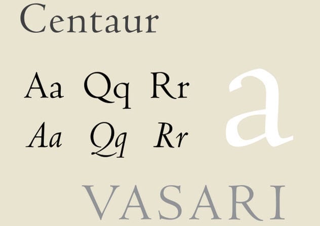
Photo credit: Jim Hood
Over the centuries, font weights were added to existing typefaces. For example, italic and bold weights, which we take for granted today, didn’t exist until the late 19th and early 20th centuries. (The weight of a font is determined by a character’s thickness relative to the character’s height. In general, the heavier the weight, the darker the impression created by the typeface.)
English poet and novelist William Morris was so impressed with French engraver Nicolas Jenson’s printing from the late 15th century that Morris sought to revive the font created from that typeface. As a result, he had another font produced for his 19th-century work that imitated Jenson’s earlier typeface.
Morris faced a conundrum, though. Neither bold nor italic font weights existed in Jenson’s time.
Consequently, another 30 years passed before the italic font weight could be added to Centaur. Papal scribe Ludovico Vicentino degli Arrighi was also a type designer, and he printed several of his works, which included italics based on his own calligraphy. Others also contributed to the creation of italic weights, but he is credited with one of the most elegant and popular versions.
Bold weights appear to have been introduced in 1913 when an international committee met in Paris. During their convention, the committee established “a table of bold sans serif and hairline alphabets in 19th-century style” of various sizes and weights. It became generally accepted and is still used today by mapmakers.[3]
7 Copperplate Gothic
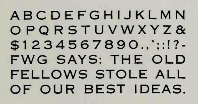
Photo credit: luc.devroye.org
Despite its name, Copperplate Gothic is not a true Gothic font. Gothic styles lack serifs (small lines protruding from the tops and bottoms of many letters and from the ends of the top bar of the capital “T,” for example).
What’s more unusual about this font, though, is that Frederic Goudy, its designer, created only capital letters for it.[4] He did that because the font was initially intended only for headings and key words of text.
6 Times New Roman
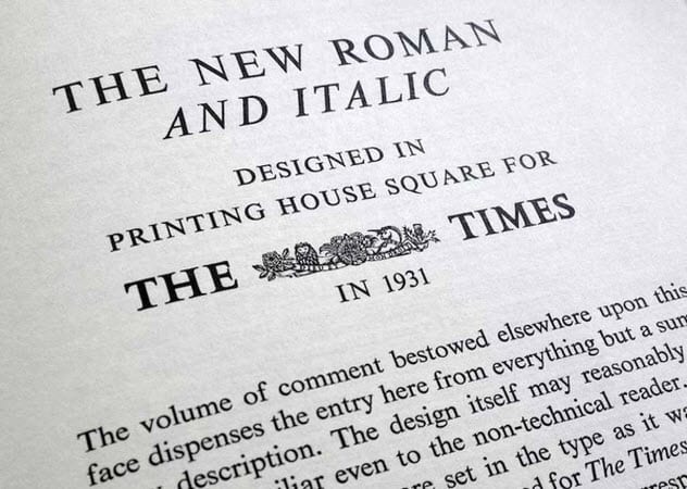
Photo credit: typographyforlawyers.com
In 1929, The Times, a British newspaper, commissioned typographer Stanley Morison to design a new font. Created with the assistance of the newspaper’s artist, Victor Lardent, Morrison’s narrow font became popular with printers.
Although it is widely used in a variety of fields, including the legal profession, the staid Times New Roman font is not without its critics. They suggest that the letters are uninspired and stodgy, perhaps reflecting the users’ own lack of imagination.[5]
Font pundits agree that font selection says something about those who make the choice to use it rather than an alternative.
5 Gabriola
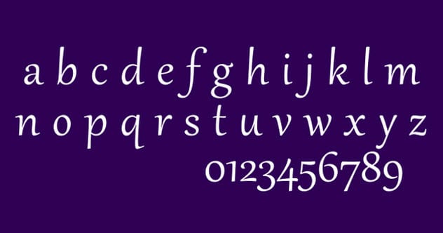
Photo credit: Moyogo
Music inspired the elegant Gabriola font, which is named for a Canadian island. Its designer, John Hudson, was inspired by the idea in music that a melody can be played in a variety of styles without losing its unique character.
This font has eight sets, each in its own style, allowing users to employ it in as many variations.[6] In addition, the font allows substitutions of characters in various styles to avoid unwanted repetitions of the same kinds of letters.
4 Dyslexie
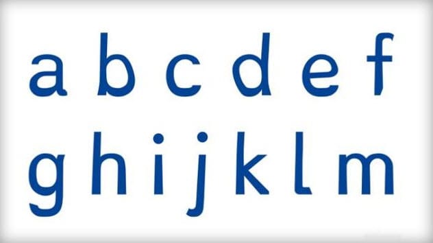
Photo credit: cbsnews.com
A dyslexic himself, Dutch designer Christian Boer developed the font Dyslexie to help himself read more easily and more accurately. Dyslexia can make reading and writing difficult because dyslexics tend to transpose or rotate letters in their minds and have difficulty recognizing them.
Boer’s solution was to make the differences in every letter clearer so that the differences stand out better. This makes it easier to distinguish one letter from another.
Boer made letters thicker at the bottom. That way, he didn’t invert them in his mind. By italicizing parts of letters (such as “j”) or enlarging the openings of other letters (such as “a”), he stresses the differences in their appearance.
Boer accomplishes the same result by making some letters (such as “v”) larger than similar-looking letters (such as “w”). These strategies and similar ones have proven to work well for Boer and for dyslexics in general who use Dyslexie.[7]
3 Trebuchet MS
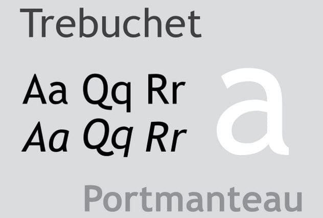
Photo via Wikimedia
After he finished his work on Matthew Carter’s Verdana font, Vincent Connare set to work creating the font that came to be known as Trebuchet MS. He was inspired by the style exhibited by US highway signs as well as a number of typefaces. (Although the two terms are often used interchangeably, “typeface” refers to a particular design of type, the metal casts of letters that make ink imprints on paper, whereas “font” refers to the impressions thus imprinted.)
Once he completed his design, Connare needed a name for his new font. The answer to a puzzle question supplied it. The question asked, “Can you make a trebuchet that could launch a person from main campus to the new consumer campus about a mile away?”[8]
A trebuchet is a medieval weapon capable of launching missiles. Connare, who proposed to “launch words across the Internet” with his new font, considered the image of this engine of war to be appropriate. So he seized its name for his new font.
2 Westminster
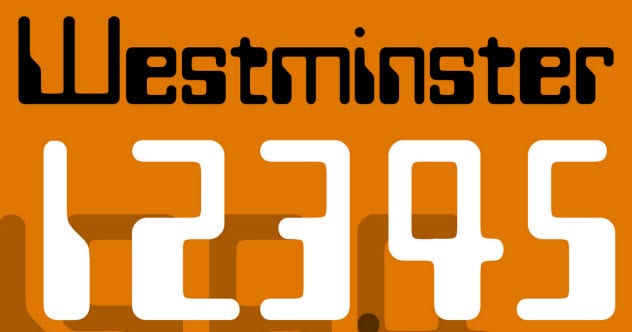
Photo credit: mercerdesign.com
Whether by design or accident, some fonts meet technological demands. Leo Maggs created his typeface as a special project for the magazine About the House, which was targeted toward patrons of Covent Garden Opera House.
In 1964 or 1965, he was asked to devise a “futuristic style” for one of the magazine’s articles. To accomplish the task, he needed to create only a few letters. But he finished the rest of the alphabet on his own time, basing his work on the proportions established by Gill Sans, a classic typeface.
Maggs’s font was rejected by Letraset, a typeface manufacturer, as “commercially unviable.”[9] However, a photo-typesetting company, Photoscript Ltd, accepted Maggs’s design. It proved to be a great success, earning its inventor a series of royalties. In 1993, Maggs licensed Westminster font to Microsoft for a new software package the company was developing.
One reason that Westminster font was so popular is because it was modeled on the account numbers that can be read by machines on bank checks. Therefore, the check-processing machines could read it, which may explain why it was named after the Westminster Bank.
1 Bulmer
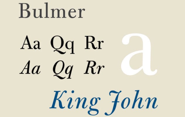
Photo credit: GearedBull
Bulmer, one of the fonts marking the transition between the medieval and the modern worlds of typeface,[10] was designed by William Martin expressly for the purpose of printing the Boydell Shakespeare folio edition.
Bulmer was named for the printing company where Martin worked when he cut the typeface in 1790. It is an update and refinement of the earlier Baskerville typeface which is still in use today.
Gary Pullman lives south of Area 51, which, according to his family and friends, explains “a lot.” His 2016 urban fantasy novel, A Whole World Full of Hurt, available on Amazon.com, was published by The Wild Rose Press. An instructor at the University of Nevada, Las Vegas, he writes several blogs, one of which is Chillers and Thrillers: A Blog on the Theory and Practice of Writing Horror Fiction.
More Great Lists
 10 Ridiculous Problems Caused By Fonts
 Top 10 Sayings With Misunderstood Origins
 Top 10 Silliest English Words And Their Origins
 Top 10 Origins Of Controversial Stereotypes
 Top 10 Origins of Memorable Movie Lines 2020
 10 Common Articles Of Clothing And Their Origins
 10 Origins Of Common Foods
 10 Influential Movies With Dark And Surprising Origins
 10 Crazy Origins Of Popular Websites
fact checked by
Jamie Frater
More Great Lists