 Music
Music  Music
Music  Movies and TV
 10 Famous War Films That Flubbed the Facts
 Movies and TV
 10 Must-See Mockumentary TV Shows To Binge Right Now
 Crime
Crime 10 Severely Twisted American Psychopath Parents Who Poisoned Children
 Health
 10 Amazing New Things We’ve Learned About the Human Psyche
 Creepy
 10 Creepy Discoveries Made During Home Renovations
 Religion
 10 Innovations and Discoveries Made by Monks
 Weird Stuff
 10 Horrifying Final Destination-Like Accidents
 Movies and TV
 10 Music Biopics That Actually Got It Right
 History
 10 Momentous Events That Also Occurred on July 4th
 Music
Music 10 ‘Patriotic’ Songs That Actually Criticize America
 Movies and TV
 10 Famous War Films That Flubbed the Facts
 Movies and TV
 10 Must-See Mockumentary TV Shows To Binge Right Now
Who's Behind Listverse?

Jamie Frater
Head Editor
Jamie founded Listverse due to an insatiable desire to share fascinating, obscure, and bizarre facts. He has been a guest speaker on numerous national radio and television stations and is a five time published author.
More About Us Crime
Crime 10 Severely Twisted American Psychopath Parents Who Poisoned Children
 Health
 10 Amazing New Things We’ve Learned About the Human Psyche
 Creepy
 10 Creepy Discoveries Made During Home Renovations
 Religion
 10 Innovations and Discoveries Made by Monks
 Weird Stuff
 10 Horrifying Final Destination-Like Accidents
 Movies and TV
 10 Music Biopics That Actually Got It Right
 History
 10 Momentous Events That Also Occurred on July 4th
Logo Competition Winner
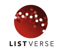
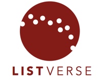
I am very pleased to announce that the winner of the logo competition is David Rygiol (Davidr4889). His logo was voted top out of the final five by our readers and was also my preference. Below are the two representations of the logo that he submitted:
David is about to complete the BFA program at San Jose State University in California. The text of his brief follows:
A good logo clearly communicates the mission and ideals of the organization it represents with a simple and engaging visual statement. A great logo not only does this successfully, but it also inspires. I believe that this logo is a clear and profound representation of your vision, and that it will inspire an interest in learning and discovery among visitors of The List Universe.
Concept
After spending some time exploring your website and getting a general feel for what you stand for, I took the two words ”list” and “universe” and through a process of word association and idea gathering came up with some visual guidelines for the logo. For list, I thought it was important to include a clear representation of the number 10, since your site is founded on top 10 lists and similar lists. Thus I included the 10 white dots within the deep orange circle. Universe is an extremely broad and somewhat abstract term, but I chose to represent feelings and ideas of an infinite space of information, to communicate the extensive nature of your website’s content.
Design
Although this logo at first appears complicated, it is actually very simple and easily reproducible. I have also designed a one color option for simpler applications, which I display on the following page. The entire mark uses only 2 colors: Black and Orange, but makes use of combining these colors to achieve depth and richness. The typeface is Avenir, a very simple and modern face that brings a somewhat distinguished feeling to the logo, while not coming across as pretentious.
Congratulations David! You definitely deserve the prize!

