 Mysteries
  Mysteries
  Our World
 10 Countries Where Water Scarcity Gets Seriously Weird
 Weird Stuff
 10 of the Most Bizarre Buildings Around the World
 Creepy
 10 American Urban Legends Far Stranger Than Bigfoot
 Movies and TV
 10 Radical Reimaginings of Frankenstein
 Facts
Facts 10 Explosive Facts You Probably Don’t Know About Volcanoes
 Pop Culture
 0 Things That Became Massive Hits the Second Time Around
 Humans
 History’s 10 Little-Remembered Acts of Charity
 The Arts
 10 Iconic Masterpieces Attacked by Pure Pettiness
 History
 History’s Ten Most Lopsided Battles Ever
 Mysteries
 10 People Who Infamously Appeared out of Nowhere
 Our World
 10 Countries Where Water Scarcity Gets Seriously Weird
 Weird Stuff
 10 of the Most Bizarre Buildings Around the World
Who's Behind Listverse?

Jamie Frater
Head Editor
Jamie founded Listverse due to an insatiable desire to share fascinating, obscure, and bizarre facts. He has been a guest speaker on numerous national radio and television stations and is a five time published author.
More About Us Creepy
 10 American Urban Legends Far Stranger Than Bigfoot
 Movies and TV
 10 Radical Reimaginings of Frankenstein
 Facts
Facts 10 Explosive Facts You Probably Don’t Know About Volcanoes
 Pop Culture
 0 Things That Became Massive Hits the Second Time Around
 Humans
 History’s 10 Little-Remembered Acts of Charity
 The Arts
 10 Iconic Masterpieces Attacked by Pure Pettiness
 History
 History’s Ten Most Lopsided Battles Ever
10 Notable Buildings People Hated
All buildings were once new. And all building designs were once new. But some designs, and the buildings that resulted from them, were so shocking to the public that it took grit to get them built, and time for them to be accepted. Here are ten such buildings, in no order…

The Washington Monument was initially planned shortly after George Washington died, in 1799. But plans were interrupted by the War of 1812 and a lack of funding. In 1833, the Washington National Monument Society was formed to raise money to build the memorial. The winning design was submitted by Robert Mills, an architect from Charleston, South Carolina. For cost reasons, only the obelisk from his proposed Greco-Roman temple-like edifice was approved. It drew immediate criticism. “A stalk of asparagus” some called it. “The big furnace chimney on the Potomac Flats”, said the New York Tribune. Construction began, but was halted by the Civil War. The half-finished monument stood like a stump for years afterwards. Mark Twain derided the “memorial chimney”, with livestock “dozing in the holy calm of its protecting shadow.” Work resumed in 1877, and the monument was finally dedicated by President Chester A. Arthur on February 21, 1885, to broad public acclaim. But some still dissented. A reviewer in the American Architect and Building News said, “It is to be regretted that ages are likely to elapse before the monument will fall down.”
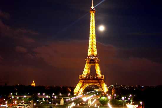
The French government planned to celebrate the centennial of the French Revolution with a symbol of France’s industrial prowess. The plan was to build the highest tower in the world. Of all the plans submitted, the judges unanimously chose Gustav Eiffel’s graceful lattice of girders, anchored by four piers. When the plan, along with its proposed site in the residential neighborhood of Champ de Mars was made public, the protest was immediate. Eminent artists, including Guy de Maupassant and Alexandre Dumas, signed an angry letter to the minister of public works. “We protest with all our strength the useless and monstrous Eiffel Tower. The Eiffel Tower is without doubt the dishonour of Paris. Everyone feels it, everyone says it, everyone is profoundly saddened by it.” As the tower progress, nervous neighbors feared that it would attract lightning, or topple onto their homes, and sued to stop construction. The city would take no responsibility, so Eiffel himself insured the neighbors, and work resumed. Parisians watched in awe & horror as it went up, calling it an “elephant”, a “giraffe”, a “hulking metal beast crouched on all fours”. After it finally opened, it became a huge hit, even with the protesting artists. All except de Maupassant. He hated it so much that he often ate lunch in the tower’s second floor restaurant, which was the only point in the city where he couldn’t see “this tall skinny pyramid of iron ladders, this giant and disgraceful skeleton.”
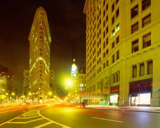
The Fuller Building, immediately nicknamed the Flatiron Building because of its narrow, triangular shape, was, at 23 stories, the highest building in New York, north of City Hall when it was built, in 1902. Designed by architect Daniel Hudson Burnham, and constructed by contractor George B. Fuller, it incorporated many then-new elements of skyscrapers, such as a load supporting steel skeleton, and a masonry veneer. The Madison Square neighborhood in which it was erected was quite stylish at the time, and the imposing building drew ire from the public. An architectural journalist said that the building “is at present quite the most notorious thing in New York, and attracts more attention than all the other buildings now going up put together”. Although fears that strong winds would push the building over proved unfounded, the shape of the building created strong downdrafts. The New York Herald reported how “women were inconveniently blown about and paper money lost from their pockets.” The gusts also, scandalously, revealed the womens ankles. Police chased away male rubberneckers by shouting “Twenty-three skiddoo!”, meaning “leave Twenty-third street.” One blast of wind blew a messenger boy into Fifth Avenue, where he was killed by a passing automobile. Windstorms around the building broke windows. Yet despite all this, the building became a popular tourist attraction, and is now revered as New York’s oldest skyscraper.
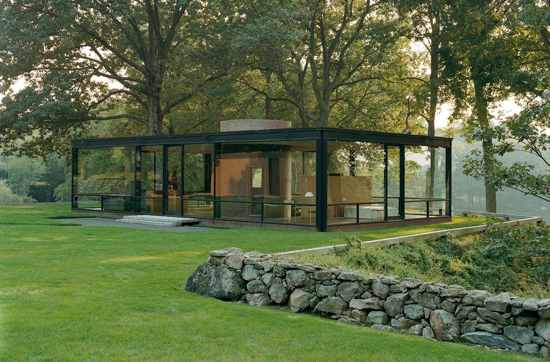
In 1946, architect Philip Johnson bought land in New Canaan, Connecticut, and, over the next three years, built a minimalist, flat-roofed house made of huge sheets of glass. The neighbors were angry because the modernist design sharply clashed with the clapboard colonial houses the area was known for. Some newspapers published mocking verse: “It takes a heap of livin’ in a place to make it home. / And I wish those guys like Johnson would take their plans and roam.” Actually, the house was not visible from the road. In one of the first American usages of feng shui, he situated the house on a rocky shelf, halfway down a hill. “The good spirits will be caught by the hill that’s behind the house; the evil spirits will be unable to climb the hill below the house,” Johnson explained. “My house has beautiful wallpaper,” he said, referring to the New England countryside rolling away from every viewpoint. But the house attracted unwanted attention. Birds crashed into it. Locals threw rocks at it, prompting Johnson to retaliate in kind, landing him in some trouble. As the house was being built, crowds of people came to sightsee, causing traffic problems in the small town, and requiring a police presence. Some residents called it “the desecration of the New Canaan countryside.” Johnson finally made peace with New Canaan by opening his home for a tour once a year. The proceeds went to benefit the community nursery school.

In 1978, architect Frank O. Gehry pondered the house that his wife had found for them to live in. It was a simple two-story pink bungalow in a quiet neighborhood in Santa Monica, California. “It was just a dumb little house with charm, and I became interested in trying to make it more important. I became fascinated with creating a shell around it.” Create a shell he did. He boxed in the house with corrugated sheets of metal, lengths of chain-link fencing, and unfinished plywood, all cut into odd angular shapes. The neighbors predictably complained. One said that it was a dirty thing to do in one’s front yard. “If he were a poet, he’d be writing smutty jingles.” But Gehry has said that he merely used the familiar materials of his own middle-class childhood in an original way, to create a house that is also a work of art. Gehry continued to add to it, but the neighbors hated its unfinished appearance. One neighbor even fired a shot at it. But the house won national architectural awards, and as the years rolled on its fame won it a measure of local acceptance.
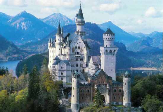
This familiar castle, which looks like it came out of a fairy tale, caused considerable uproar when it was first built. “What, is the king mad?” was one typical reaction. In the Middle Ages, castles were for nobility and their family and retainers. But King Ludwig II of Bavaria built Neuschwasntein, in 1869, only for himself. He picked a remote site 6,000 feet up in the Alps, atop the ruins of an older castle, so that he wouldn’t be troubled by his government’s ministers visiting to discuss matters of state. The storybook design was inspired by his admiration for–and friendship with–Richard Wagner, and his grand operas. In fact, the Singer’s Hall was modeled directly after a scene in Parsifal. Many other idiosyncratic–and expensive–quirks of Ludwig’s personality were expressed in the interior design. He was so busy with the construction of the castle that he barely paid attention to the Franco-Prussian War of 1870, not even attending the victory celebrations. After he moved in, he demanded more and more public money for additions and more castles, even hatching a plan to rob the Rothschild Bank of Frankfurt at one point. As creditors dunned him for his bills, and the commoners protested his spendthrift ways, he withdrew to Neuschwanstein, never appearing in public again. Before he could be declared legally insane, and the throne be given to a regent, Ludwig was found dead in a small lake, in 1886. Contrary to his wishes, Neuschwanstein was not demolished upon his death, and is today Germany’s most popular castle.
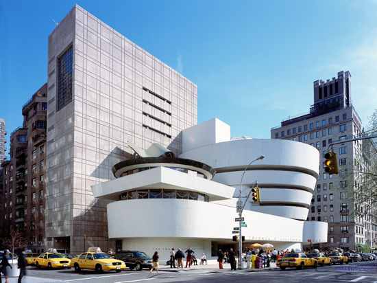
“A toilet bowl?” “A hangar for flying saucers?” These were some of the reactions to Frank Lloyd Wright’s design for the museum housing the art collection of Solomon Guggenheim. It was Wright’s first museum, and his first major building in New York City, which he disliked as “a forest of skyscrapers”. Wright was influenced by Guggenheim’s collection of abstract, modernist Wasilly Kandinsky paintings. The design featured a spiral topped with a dome. This prompted some critics to call it “an inverted potty” to “a gigantic snail shell”. And, indeed, Wright was inspired by the spirals of the chambered nautilus. Construction was due to begin in 1946, but was delayed by squabbles with locals and artists, until 1956. Guggenheim had died in 1949, but Wright was on hand to oversee the construction. The New York press continued to deride the building: a marshmallow, a corkscrew, an upside down washing machine. One of the construction workers called it “screwy. The whole joint goes round and round.” “It is a freak that astonishes passersby. It bears no relationship to its neighbors”, wrote journalist Brendan Gill. Another writer called it “Wright’s joke on New York.” Yet, when the Guggenheim museum opened to the public, in October, 1959, several months after Wright’s death, the giftshop sold far more cards picturing the museum than any of the artworks, therein. It has since become one of the most popular museums in New York.
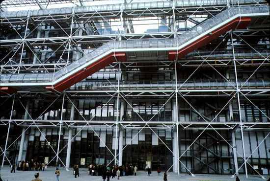
Years ago, when I was in Paris on a student trip, I visited the Pompidou Cultural Center. I looked at its facade, all multicolored piping, and thought, “this thing is a giant hemorrhoid.” I was not alone. “An architectural King Kong.” “The back of a refrigerator, enormously enlarged.” were some other reactions. An obscure architectural duo, Englishman Richard Rogers and Italian Renzo Piano, won a competition, in 1971, to design the cultural center. This, by itself, was enough to incense the French, having two unknown foreigners be charged with building the next major Parisian landmark. At a public hearing one woman was so outraged she had to be removed by police. Things got more exciting when the plan was made public. It would be made of glass and steel, but all of its piping, ductwork, elevators and even wiring would be exposed on the exterior. The seven-story high-tech edifice was to be situated in a medieval neighborhood, full of crooked, gabled, low-rise buildings, a mere block away from the oldest surviving house in Paris, built in 1407. Rogers and Piano worked under a deadline of 1975 for completion. They were hampered by the fact that they hadn’t worked out the details of the concrete substructure, and had to do so as they went along. Then, in 1974, Georges Pompidou died, and his conservative successor Valery Giscard d’Estaing had to be strongly persuaded to let work continue on the project of his former political rival. As the structure took shape, complaints poured in. Residents filed “nuisance allegations” against the design jury. Artists filed lawsuits. The old petition against the Eiffel Tower was recycled by contemporary artists, in opposition to “this useless monster.” At its opening, in 1977, novelist Anthony Burgess called it “a $200 million erector set”. But it drew huge crowds to its public spaces, and won critical praise in the art press. It drew one more criticism during renovation in the late 90s: from original designer Richard Rogers. He disliked the fact that the interior was becoming more enclosed, and that the public now had to buy tickets to ride the exterior escalators.
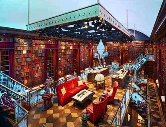
Early in the 20th century, industrial tycoon Andrew Carnegie bequeathed more than a thousand public library buildings, to communities all across America. In a small southern town I once lived in, the little Greek marble building still survived as a flower shop. The much larger Carnegie library, in Minneapolis, served until the late 1970s, when it was obvious that it was too small for the population, and needed expensive physical and electronic upgrades. Plus, in the energy-conscious Seventies, it was hard to keep heated in winter. So, when architect David Bennett won the job of designing a new public library, he decided to make most of it underground. The building would extend several stories below the surface, with a low, cubist plaza occupying the surface of the lot. Although he designed in extra-high ceilings and even a sunken courtyard garden, people complained that the interior was claustrophobic. The librarians complained about how stuffy and bunker-like it was, and joked about giving flashlights to the patrons. One critic called it “more like a mine shaft than a civic building.” It didn’t help matters that it leaked, the heating was inadequate, the above-ground plaza became a hangout for vagrants and sk8tr punks, and passersby often didn’t even know the library was there. Another architect, Francis Bulbulian, was hired, in 1995, to fix it. He modified the windows and the courtyard so that more sunlight would get in, installed a multi-story bookdrop made from two children’s spiral slides, and erected seven-foot-high steel letters on the plaza: L-I-B-R-A-R-Y. After the newly renovated facility was re-opened, the complaints abated, and the community finally seemed to embrace it.

“Will somebody please tell me what’s the matter with McDonald’s?” asked humorist P. J. O’Rourke, back in the 80s. “It’s not like the Europeans don’t line up by the millions to eat there. Maybe McDonald’s food isn’t the best thing for you, but roasted goose liver smooshed up with truffles isn’t either. And has anyone ever smoked a joint and had a “pate’ de foie gras” attack?” The familiar golden arches are a target for snobs and anti-Americans worldwide. “We don’t want one of these restaurants on every street corner in France,” asserted one French vandal. Whenever the G-20 economic summit comes to town, anti-globalist rioters are right there, with McDonalds at the top of their list of businesses to trash. Yet, McDonalds began as a family restaurant founded by two brothers, Richard and Maurice McDonald, in San Bernardino, California. Their innovative restaurant model called for a kitchen open to view, exceptional cleanliness, quick service and cheap meals. The brothers soon felt the urge to create a chain of the restaurants, and hired architect Stanley Meston to create a distinctive design for the buildings. The first McDonalds with the signature Golden Arches arcing over the whole building opened in Phoenix, Arizona, in 1953. The rest of the corporate story, of how salesman Ray Kroc took the franchise to international ubiquity, is familiar or readily available elsewhere. But as the restaurants spread, protests against the tackiness of the buildings did, too. Kroc hired architect Donald Miller to tone down the design. He lowered the arches, eventually reducing them to a logo on the sign. As time went on, and the company heeded protests, restaurants were designed to blend in with the local architecture–adobe blocks in the West, for instance. So, although progressives howl against McDonalds as loudly as ever, the buildings themselves are no longer an issue, save for the arches on the sign.
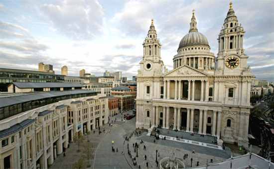
One from the Too Good To Check File. When King William III (some say King Charles II, or Queen Anne) was brought to view the newly completed St. Paul’s Cathedral, he is supposed to have exclaimed to architect Christopher Wren that it was “awful, pompous and artificial”. The words have shifted meaning over the centuries, and in modern English we would say something like “awe-inspiring, magnificent and technically accomplished.” Yet, this linguistic gem is probably apocryphal, possibly originating as a funny in a 1960s lecture by Harvard philosopher John Rawls. Too bad!


