 Movies and TV
Movies and TV
Movies and TV  History
 10 Wild Stories About America’s Most Fascinating Founding Father
 Our World
 10 Astonishingly Valuable Things Their Owners Simply Walked Away From
 Humans
 10 Disturbing Communities from the Dark Corners of the Internet
 Movies and TV
 10 Hollywood Style Choices That Backfired
 Weird Stuff
 10 Ancient Chores That Would Horrify Modern Health Inspectors
 Politics
 10 Strange High-Tech Tools Shaping Modern Politics
 Humans
 10 Extraordinary Places Humans Have Adapted to Live
 Weird Stuff
 Ten of the Strangest Things You Can Buy Online
 Movies and TV
 10 Crime Shows with Gorgeous Settings
Movies and TV 10 Amazing Lost Films That Were Found Again
History 10 Wild Stories About America’s Most Fascinating Founding Father
Our World 10 Astonishingly Valuable Things Their Owners Simply Walked Away From
Who's Behind Listverse?

Jamie Frater
Head Editor
Jamie founded Listverse due to an insatiable desire to share fascinating, obscure, and bizarre facts. He has been a guest speaker on numerous national radio and television stations and is a five time published author.
More About Us
Humans 10 Disturbing Communities from the Dark Corners of the Internet
Movies and TV 10 Hollywood Style Choices That Backfired
Weird Stuff 10 Ancient Chores That Would Horrify Modern Health Inspectors
Politics 10 Strange High-Tech Tools Shaping Modern Politics
Humans 10 Extraordinary Places Humans Have Adapted to Live
Weird Stuff Ten of the Strangest Things You Can Buy Online
Movies and TV 10 Crime Shows with Gorgeous Settings
10 Iconic 60s and 70s Wall Posters
For those of us who grew up in the 1960s-1970s, certain things jump out at us and just shout ‘groovy!’ Avocado-colored refrigerators. VW Beetles. Richard Nixon. OK, not Nixon, but you get the point. Like all generations, we are nostalgic for what we had as children and teenagers/young adults. And one of the things we almost all had to grace the walls of our suburban bedrooms (other than wood paneling) were wall posters. Groovy wall posters! Here is a list of ten of the most iconic wall posters from that era. I deliberately left off this list wall posters that depicted the following – sports figures (Joe Namath, Ali, etc.), movie stars (Farrah Fawcett and her red one piece swimsuit pose), musicians/music/bands (Woodstock, Hendrix, etc.), movies (Star Wars, Jaws, etc.), and celebrities (John Travolta, Raquel Welch, etc.). These could be topics for future lists.
This list will focus on ten of the top iconic posters from that era. Artwork, genres, images, symbols and ideas that are still around today, or which have long since slipped into obscurity. Though wall posters peaked in popularity with the end of the 1970s, you can still find these vintage posters on Ebay and other locations – many of them commanding top prices in good condition. So turn on the AM radio station, turn off the lights, fire up your black light bulbs, light a joint, sit back and enjoy ten top iconic 1960s-1970s wall posters.
10
Marijuana
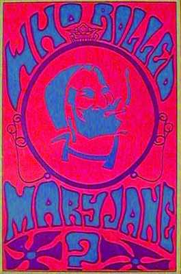
Most wall posters from this era were either meant to be funny, psychedelic, sexual, a depiction of a piece of the culture of the time (a movie or sports star, a popular type of muscle car, a TV show, etc.) or a protest movement. Probably the most popular drug-related wall poster of the 1960s-1970s were those depicting the most popular drug of that era – marijuana (pot, dope, etc.). Some were black light posters with black velvet backgrounds and bright green marijuana leaves in the foreground. Others pictured bongs and water pipes and various drug paraphernalia. Still other posters depicted groovy people of the era smoking a joint. Probably the most popular of this variety and perhaps the most iconic pot wall poster of the era was entitled ‘Who Rolled Mary Jane?’ This poster depicted the ‘Zig Zag’ man, the iconic three quarters image profile of a hippie smoking a doobie that graced the Zig Zag rolling paper line. The words ‘Who Rolled Mary Jane?’ were printed above and below him.
9
Ecology
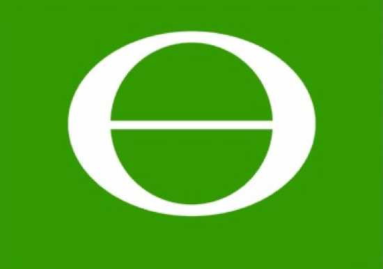
An iconic 1970s symbol designed by a cartoonist Ron Cobb in 1969 was the Ecology symbol. The ecology symbol was first published in the Los Angeles Free Press, and Mr. Cobb placed the symbol in the public domain. It soon took off, gracing buttons, T Shirts, and of course, wall posters. The ecology symbol was very popular and widely seen for the next 10-20 years before almost disappearing. Today we more commonly associate the recycle symbol, or just a green leaf, with ecology. But in the 1970s, it was this symbol. Mr. Cobb used the words ‘ecology’ and ‘organism’ as the root of his symbol using the letter ‘e’ and ‘o’ and placing them on top of one another. This formed a letter similar to the Greek letter ‘Theta’. The symbol is either green with a white background or a white symbol on green.
The symbol was, like the raised fist, a symbol of solidarity of the new ecology movement, and a call to action to save the environment from the rampant pollution of the day. As a young boy, I recall very well the first recycling centers in my town. If you brought cans, glass, paper, and other materials to the county park for recycling, you were given a small sapling tree to plant. Thousands of people did so and I often wonder how many of those sapling trees were planted and survived? Today they would be a forest of forty year-old, mature trees.
This was the first era of environmental awareness in the United States that resulted in the birth of the ecology movement, Earth Day, recycling, and what we now call being ‘Green.’ In the same year the ecology symbol took off on wall posters, the United States adopted strict environmental protection regulations for the first time and created the Environmental Protection Agency. In a 1970 issue of Look magazine, the symbol was placed where the stars are on the American flag and the thirteen stripes were alternated green and white – thus creating the ‘ecology flag of the United States.’ This flag, and the symbol itself, were widely seen on wall posters for many years.
8
The Fist
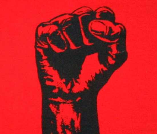
Called ‘The Raised Fist’ or ‘The Clenched Fist,’ this is a symbol mostly known for representing the image of ‘Black Power’ in the 1960s and 1970s. Many posters from that era had the Black Power raised black fist, but you could also find posters with the fist colored in rainbow (peace, love) colors, the colors of the American flag (red white and blue), colored white (White Power), etc. The clenched or raised human fist symbol was all over the place during this era. It symbolized unity and solidarity of groups against all manner of societal evils and issues of the time, be it racism and segregation or the Vietnam war.
7
Smiley Face
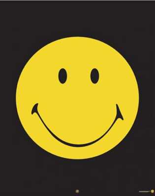
A simple yellow circle with two eyes and a smile, the smiley face was everywhere, including wall posters. Today we see the smiley face most often as an ’emoticon’ placed next to things we type or see on the internet that we ‘like.’ But back in the days before computers, the smiley face meant something else. The image we all came to know and love (or despise) was originally created in 1963 as a motivational image for employees of the State Mutual Life Assurance Company by one Harvey Bell. By the early 1970s, the image was jumped on by savvy business people to sell all manner of items such as T Shirts, bumper stickers, coffee mugs – all with the smiling face and also the words ‘Have a Nice Day!’ The overuse of the smiley face and this statement soon became a cynical joke, meaning just the opposite of what it was intended. It was annoying, not motivating. Still, the smiley face kept right on smiling. It is still with us today, not so much on wall posters anymore, but everywhere on the internet.
6
Peace
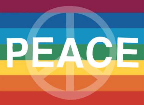
The peace sign (symbol) that graced countless wall posters in the 1960s-1970s was originally created in England as a protest to nuclear armament and nuclear war. Symbols for peace have been with mankind for ages (the palm branch for example). The specific peace sign we recognize from the 1960s-1970s was designed with the semaphore code for the letters ‘N’ and ‘D’. In semaphore code, the letter ‘N’ is created by the user crossing both flags at their waist into an inverted ‘V’ shape. The ‘N’ stood for ‘Nuclear.’ To create the letter ‘D’ in semaphore code, the flagger raises one flag straight over their head, and one flag straight to the ground creating a vertical straight line looking like the letter ‘I’. The ‘D’ stands for ‘Disarmament.’ Place the two semaphore symbols on top of each other (an inverted ‘V’ and an ‘I’) inside a circle and you have the modern peace symbol. The peace symbol created to protest British nuclear arms quickly became the universal symbol for peace, especially as it related to the Vietnam War.
5
The Thing/Middle Finger
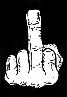
Perhaps this poster was a reaction to the peace symbol posters popping up everywhere in the 1960s-1970s? Whatever its origin, it caught on and there were several variations of this popular poster, but all of them with a ‘thing’ (a round-bodied, furry, evil faced guy with a smug grin) flipping the bird to the viewer of the poster. Typically the thing is seen leaning with one arm against an invisible wall, with his (its?) legs casually crossed.
4
Keep on Truckin’
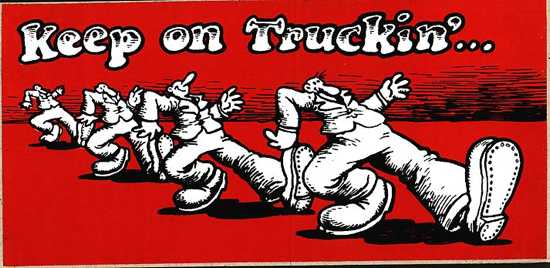
A real icon of this era, this image was drawn from the first issue of counter culture ‘Zap’ magazine. The image was a cartoon created by noted counter-culture artist Robert Crumb. It depicts several men, side by side, one leg forward, strutting down a highway, or through a field, or over all manner of landscapes with the words ‘Keep on Truckin.’ The cartoon was Crumb’s take on the lyrics of the Blind Boy Fuller song “Truckin’ My Blues Away”. Crumb intended the cartoon to be anything other than what it quickly became, a commercialized (and often plagiarized) representation for the entire ‘hippie’ era. Crumb said the cartoon was the worst thing that ever happened to his career. The last thing he wanted to become was ‘the greeting card artist for the counter culture.’ I myself had a T-Shirt with a clear rip off of the image of the men strutting down a street but with the words ‘Just Passin’ Through!’ As I recall, with everyone else wearing ‘Keep on Truckin!’ T Shirts, the girls found mine to be pleasingly different.
3
War is Not Healthy
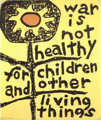
Full Title: War is Not Healthy for Children and Other Living Things
Other than the peace sign, this may be the most instantly recognizable poster from the 1960s-1970s era. It has an interesting history too. The original art work for the poster came from a grass roots anti-Vietnam war movement called ‘Another Mother for Peace’ (AMP). Started in 1967 by writer Barbara Avedon (who among others, created the hit TV show Cagney and Lacey) it came out of Avedon’s fear that her new born son would grow up to fight in more wars like Vietnam (which she opposed). She invited other neighborhood women to join her in starting the movement which was ‘dedicated to eliminating the use of war as a means of solving disputes among nations, people and ideologies… and advocate peace’. A local artist, Art Schneider, donated his image of a sunflower set against a bright yellow background with the words ‘War is Not Healthy for Children and Other Living Things.’ The plan by the AMP was to send the cards with this image to President Johnson and all members of congress, on Mother’s Day, asking for peace and an end to the Vietnam war. The initial order of 1,000 cards was soon exhausted and thousands more were made and sent to members of congress, the President, and leaders of giant corporations. The image of their movement quickly became popular and soon turned into posters that graced the walls of untold thousands of rooms throughout the world. It remains, along with the peace symbol, a universal statement against war and for peace.
2
Black Light
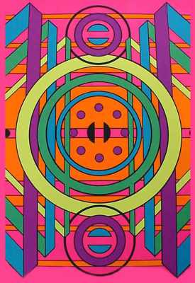
Certainly the type of wall poster most associated with the groovy 1960s and 1970s has to be the black light poster. There were many popular themes for black light posters, sex, drugs, rock n roll, but probably the most popular were the psychedelic pattern posters that, when viewed under black light conditions (especially when stoned, or so I was told) created all manner of groovy, spinning, and morphing patterns, swirls, and other hypnotic hallucinatory effects. As Yoda might have said – ‘far out, they were.’ But all black light posters shared one thing in common, phosphorous ink that would fluoresce under ultraviolet (black) light. To be viewed properly the black light wall poster needed to be seen in dark conditions with just the black light illuminating it. This meant that all bedrooms containing black light posters were always dark with shades and blinds drawn and all other lights turned off or severely dimmed. Entering such a realm, from the outside, was always an interesting experience until your eyes adjusted to the darkness and the ultraviolet light. Then the full glory of the black light poster would slowly come into view. That was of course, assuming you could see it through the haze of smoke. Again, so I was told.
1
Flaming Love
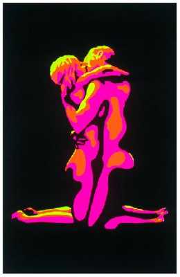
The 1960s and 1970s were the era of sex, drugs and rock n roll and all three were aptly represented in wall posters from the era. One of the most popular posters from the ‘sex’ genre was titled ‘Flaming Love.’ Typically it was a black light poster. The image was a side-on depiction of two young figures, one male, one female, on their knees facing each other in a tight loving or sexual embrace, kissing. There were no words or writing on the poster, just the image of the two people embracing.
There were many other variations on this theme. Another popular wall poster from that time was the Zodiac Sex Position wall poster. This depicted the twelve signs and names of the Zodiac and a different sexual position for each month. The two figures from the ‘Flaming Love’ poster were back, only this time instead of a tender and loving embrace they were placed in all manner of sexual positions – some of them extremely challenging. For example, if your birth date fell under the sign of Pisces, the two young figures were depicted having regular old missionary position sex. However, the two lovers were very busy and ‘getting it on!’ for the signs of Cancer, Leo, or Virgo. Not only did they need to be very flexible, athletic, and adventurous to achieve these positions, they also needed a small stool to sit on! But it was those born under the sign of Taurus who had the most Olympian of sex position on this calendar. Good luck.
More Great Lists
 10 Iconic Mascots And Their Surprising Backstories
 10 Tragic Events That Created Iconic Pieces Of Pop Culture
 Top 10 Iconic Events Of The Last Decade
 Top 10 Secrets Of Iconic Hollywood Sounds
 Top 10 Iconic Places Pictured From Behind
 Top 10 Iconic Behind-The-Scenes Photos From Hit Movies
 Top 10 Iconic Fever Dreams Set In Los Angeles
 Top 10 Iconic Moments From The History Of Music
 Top 10 Iconic Things With Criminal Beginnings
fact checked by
Alex Hanton
More Great Lists