 Our World
  Our World
  Weird Stuff
 10 of the Most Bizarre Buildings Around the World
 Creepy
 10 American Urban Legends Far Stranger Than Bigfoot
 Movies and TV
 10 Radical Reimaginings of Frankenstein
 Facts
Facts 10 Explosive Facts You Probably Don’t Know About Volcanoes
 Pop Culture
 0 Things That Became Massive Hits the Second Time Around
 Humans
 History’s 10 Little-Remembered Acts of Charity
 The Arts
 10 Iconic Masterpieces Attacked by Pure Pettiness
 History
 History’s Ten Most Lopsided Battles Ever
 Movies and TV
 10 Great Meta Horrors to Watch Before Scream 7
 Our World
 10 Countries Where Water Scarcity Gets Seriously Weird
 Weird Stuff
 10 of the Most Bizarre Buildings Around the World
 Creepy
 10 American Urban Legends Far Stranger Than Bigfoot
Who's Behind Listverse?

Jamie Frater
Head Editor
Jamie founded Listverse due to an insatiable desire to share fascinating, obscure, and bizarre facts. He has been a guest speaker on numerous national radio and television stations and is a five time published author.
More About Us Movies and TV
 10 Radical Reimaginings of Frankenstein
 Facts
Facts 10 Explosive Facts You Probably Don’t Know About Volcanoes
 Pop Culture
 0 Things That Became Massive Hits the Second Time Around
 Humans
 History’s 10 Little-Remembered Acts of Charity
 The Arts
 10 Iconic Masterpieces Attacked by Pure Pettiness
 History
 History’s Ten Most Lopsided Battles Ever
 Movies and TV
 10 Great Meta Horrors to Watch Before Scream 7
10 Architectural Wonders Too Impractical To Ever Build
Human history is littered with incredible monuments we stupidly tore down. But plenty didn’t even make it that far. Go digging through dusty old ledgers and architects’ scrapbooks, and you’ll uncover a wealth of awe-inspiring structures ripped straight out a retro sci-fi film—structures that really never could have worked.
10The Tokyo Tower Of Babel

Imagine the entire height of Mount Everest, all 8,848 meters (29,029 ft). Now imagine some lunatic had built Dubai’s record-breaking Burj Khalifa on top of it. Congratulations: That tower plus the mountain (10 times taller) below it combined still fall a couple of hundred meters short of the Tokyo Tower of Babel.
The craziest building Japan never built was dreamed up in the dying days of the bubble economy in 1991. Clocking in at a cool 10,000 meters (around 6.2 miles), it would have taken up to 150 years to build, cost $306 trillion and housed 30 million people. It would also been bigger than many countries. When a comparatively tiny 4,000-meter (13,000 ft) tower was proposed around the same time, somebody crunched the numbers for one the same size as Everest. They concluded that a tower that large would need a base of 4,100 square kilometers (1,500 mi2)—an area of ground nearly twice the size of Luxembourg. The base for Tokyo’s Babel would have been even larger.
Although it was proposed during a Japanese craze for structures bigger than mountains, it’s not clear Babel was ever intended to be built. And by the time the architects made the proposal, the economy was well and truly crashed.
9The Fun Palace
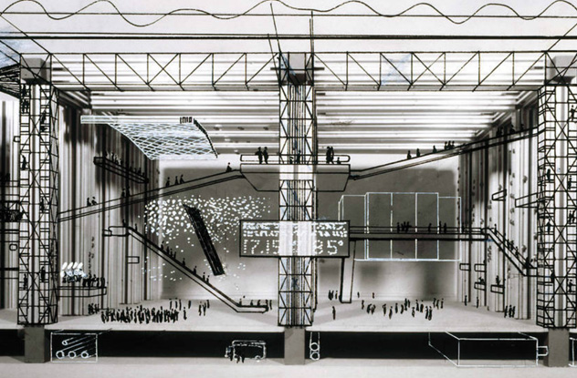
By the late 1950s, Joan Littlewood had already ensured her place in the history books. A British theater director, she was known for smashing down boundaries to make plays more accessible. But rewriting the theater rulebook wasn’t enough. Littlewood wanted to change the way we saw theaters themselves.
In 1960, Littlewood hired architect Cedric Price to design the most radical theater in history. His Fun Palace, as it became known, redefined what architecture could do. Taking inspiration from cybernetics theories, avant garde playwrights, and Monty Python, he drew up plans for a building where nothing stayed in one place. Everything from the seats inside, to the stages, to the lobby, to the cafe and cinema screens could be shunted around and reconfigured at will. Where the stage was one day, you might have the box office the next. Where the changing rooms had been on Monday, you could have the auditorium by Tuesday. No two visits would ever be the same.
If that sounds potentially confusing, you’re not alone. People hated it. Church groups, local citizens, and London’s councils all conspired to stop the Fun Palace going ahead. When permission finally came through in the 1970s, funding mysteriously dried up. Work never even started.
8The Cenotaph For Newton
Etienne-Louis Boullee was fascinated with Isaac Newton. A neo-classical architect working in 18th-century France, he thought the groundbreaking mathematician deserved an equally groundbreaking monument. So he sat down and drew up designs for the biggest, craziest sphere on Earth.
A 1,500-meter (500 ft) orb encased in a sheer cylindrical base, the cenotaph would have dwarfed the Great Pyramid at Giza. It would also have invoked a sensation of vertigo in anyone foolish enough to visit. After climbing up a gigantic staircase, visitors would crawl through a tiny tunnel into the inside of the orb. There, they would encounter a vast, sightless void stretching on seemingly forever. At the very center of this disconcerting blank would sit a single sarcophagus containing the body of Newton, a speck against the emptiness of the universe.
Tiny holes in the skin of the sphere would have let pinpricks of light through in the shape of the constellations. There were even plans to somehow create a fog effect inside the sphere, giving everything a weird, haunted air. For reasons of practicality, the thing sadly never got built.
7Ivan Leonidov’s Lenin Institute
In 1927, Ivan Leonidov was an architecture student with everything to prove. A radical Russian of the constructivist school, Leonidov wanted to make the biggest splash possible with his graduate designs. He wound up aiming far too high. His proposal for the Lenin Institute in Moscow was both breathtakingly ornate and completely unbuildable.
Designed to function as a combined library and lecture hall, everything about Leonidov’s plans screamed “big.” The library alone would have held 15 million books, along with five reading rooms each capable of housing 500–1,000 visitors. Such a huge library needed a similarly huge delivery system, so Leonidov stuffed it full of clanking conveyor belts that whisked books skyward dozens of stories at a time. He also included a gigantic sphere for lectures. Capable of seating 4,000, the enormous glass orb could fold open in half and housed its own private tram system running direct to Moscow. To top it all off, Leonidov then included a radio station.
Although the design won Leonidov plenty of admirers, architect Moisei Ginzburg perhaps summed it up best when he remarked Leonidov “was not really able to prove that his constructive conundrum was actually necessary” and called it “impossible.”
6London’s Safety-Defying Airports
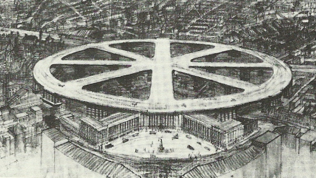
If you’ve ever been to London, you’ll know inserting an airport into the city center is a madman’s dream. Meet that madman: Charles W. Glover. In 1931, Glover produced designs for bringing air travel to central London. He did it by throwing every safety regulation out the nearest window.
Glover proposed a £5 million wheel-shaped runway that would sit on top of thousands of homes. Stretching from Kings Cross to Trafalgar Square, it had private garages for personal airplanes, lifts to bring people up from ground level, and absolutely nothing to stop an incompetent pilot from careening off the end and right into the heart of London’s shopping districts. Although the potential for catastrophe was clearly enormous, people still took Glover seriously. A watered-down version of the project was still being considered as late as the 1960s.
Glover wasn’t the only one to take a cavalier approach to Londoners’ safety. A 1930s proposal suggested placing an airport next to Westminster, where a bad crash could easily wipe out the government. Another from the 1950s aimed to place a landing platform for personal helicopters directly above Charing Cross Station. As Popular Science blithely noted, this new landing pad would helpfully include “radar aids for landings in London’s pea-soup fogs.”
5The Dynamic Tower
In 2008, Italian architect David Fisher unveiled plans for the most ambitious construction project on Earth. Known as the Dynamic Tower, this 80-story behemoth would cost $700 million and generate its own power using 79 wind turbines. Every single floor would rotate independently of the others, so the tower never stayed in a single shape.
The idea was to use prefab constructions hugging tight to a central concrete core, sort of like having 80 separate bungalows stacked on top of one another. The 79 turbines would then send juice flowing through each floor, allowing them to rotate slowly at slightly different speeds. To someone who had never heard of the concept before, it would seem like the Dynamic Tower was constantly shape-shifting.
With such an inspired design, you might be wondering what happened. Officially, nothing. Fisher insists his tower is still going ahead. However, it was originally meant to be finished in 2010, and so far—in mid-2015—not a single brick has been laid or a meter of land purchased. Perhaps it doesn’t help that Fisher’s proposed site was Dubai: a city whose construction industry hasn’t fully recovered from the 2008 banking crash.
4Konstantin Melnikov’s Monument To Columbus
Eight decades before David Fisher came up with his rotating tower, Konstantin Melnikov was working on a dynamic, moving monument. Unlike Fisher, Melnikov wasn’t content with simply creating some building that shifted meaninglessly. He wanted to create one capable of playing its own musical compositions.
One of the Soviet Union’s 23 official entries to the Pan-American competition to design a monument to Christopher Columbus, Melnikov’s lighthouse was the definition of ambitious. Its gigantic upper cone was hollowed out to collect rainwater that would power a small turbine, generating electricity. More impressively, the huge wings on the side of the building were designed to sway in the wind. As they swung back and forth, they would strike one of seven rings, producing a distinct musical note that could be heard for miles. On blustery days, the lighthouse would be capable of playing intricate musical scores.
The Columbus statue itself was equally impressive. As the lighthouse’s two cones turned, they would briefly intersect, causing the statue to temporarily rise up into view. Too bad the committee ultimately ditched Melnikov’s vision in favor of a big, boring block.
3Gerard K. O’Neill’s Space Cylinders
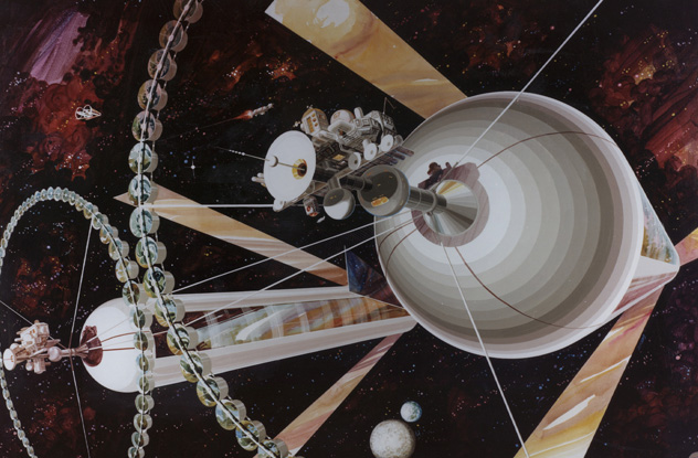
In 1974, Princeton physicist Gerard K. O’Neill wrote a paper that would inspire plans for years to come. Interested in bringing humanity off Earth to inhabit the universe, O’Neill set out his designs for a vast outer space colony living in gigantic cylinders. Known as O’Neill Cylinders, his designs were the pinnacle of futuristic thinking.
Giant glass tubes 30 kilometers (20 mi) long, each O’Neill Cylinder would hang at the L5 point in the Moon’s orbit—a place the Guardian described as “like a gravitational eddy where things stay put by themselves.” Each would provide gravity by rotating, and strips of land would alternate with long sheets of glass to let sunlight in. In effect, this meant that people on one strip of land would always have another directly above their heads. It would be possible to look up in the mornings and see the roof of your neighbor’s house, many thousands of feet above.
Even more impressively, each Cylinder would come complete with its own weather system that could be manipulated to create the sensation of passing seasons. O’Neill’s ultimate plan was to have hundreds of these cylinders connected by a web of cables, connecting four billion human colonists in the empty wastes of space.
Sadly for sci-fi lovers, his plans were hundreds of years ahead of their time. Even now, 40 years later, building an O’Neill cylinder would require technology we simply don’t have. Once again, you failed us, future.
2Giovanni Battista’s Imaginary Prisons
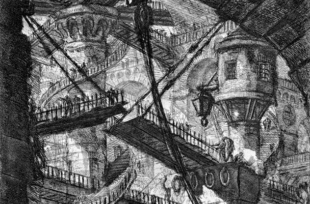
Unlike most of the people on our list, Giovanni Battista Piranesi never intended for his designs to be built. And that’s a good thing because living in Piranesi’s drawings would’ve been hell on Earth. An Italian etcher and architect (among other things) from the 18th century, Piranesi spent his time drawing impossible prisons so horrifying that they seem ripped straight from H.P. Lovecraft’s nightmares.
Featuring bizarre angles, staircases that lead nowhere, and rumbling machines that resemble torture devices, Piranesi’s etchings come from the Venetian tradition of imaginary subjects. In this case, there’s a good argument to be made that his subject was hell. The endless corridors, slumped figures, and chains all seem to point toward people trapped in eternal torment. That didn’t stop his admirers from seeing more earthly possibilities in them. According to art critic Jonathan Jones, Piranesi’s prisons directly inspired the movie architecture for Metropolis and Blade Runner and even influenced London’s real-life Tate Modern and Jubilee Line.
1The Utter Insanity Of Hermann Finsterlin
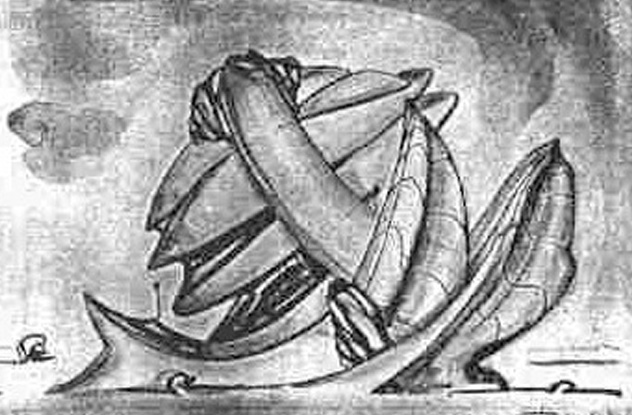
Hermann Finsterlin has an unusual claim to fame. Despite being a visionary architect whose work inspired many, he never saw a single building he designed actually built. There’s a good reason for this. Finsterlin’s designs were bonkers.
We don’t mean they were unusual or overambitious or simply too expensive to make. We mean they were the work of a man who’d clearly parted company with rationality many moons ago. Finsterlin’s whole approach was to make inhabitants of his buildings feel like they were inside a living creature. He took inspiration from mammals’ limbs, the human thorax, the alimentary canal, and dinosaurs. In one book, he claimed he wanted his rooms to feel like separate organs, with inhabitants enjoying “the giving and receiving symbiosis of a giant fossil womb.” At least one of his designs featured what looks uncannily like a gigantic, erect penis.
His 3-D models were no less absurd. One currently housed in New York’s MOMA collection resembles nothing so much as a five-year-old’s overexcited experiments with modeling clay. The more abstract ones don’t even seem to fit together. Yet had Finsterlin been allowed to build his designs, there’s no doubt our world would be a much more interesting place to live in—and one a good deal more nightmarish, too.

