 Crime
Crime
Crime
Crime  Our World
 10 Rare Hybrids with Wild Backstories
 Space
Space 10 Amazing Explanations for Cosmic Conundrums
 Movies and TV
 10 Film Productions That Went Too Far
 Weird Stuff
 10 Historical Facts That Ruin Your Timeline
 History
 10 Maritime Folktales with a Real-Life Twist
 Crime
Crime 10 Notorious Prison Gangs That Became Criminal Empires
 Music
Music Top 10 Hit Song Lyrics That Became Cultural Catchphrases
 Weird Stuff
 10 Bizarre Viral Trends That Took Things Too Far
 Weird Stuff
 10 Plants That Eat Animals
Crime 10 Infamous Crime Scenes That Became Tourist Hotspots
Our World 10 Rare Hybrids with Wild Backstories
Space 10 Amazing Explanations for Cosmic Conundrums
Who's Behind Listverse?

Jamie Frater
Head Editor
Jamie founded Listverse due to an insatiable desire to share fascinating, obscure, and bizarre facts. He has been a guest speaker on numerous national radio and television stations and is a five time published author.
More About Us
Movies and TV 10 Film Productions That Went Too Far
Weird Stuff 10 Historical Facts That Ruin Your Timeline
History 10 Maritime Folktales with a Real-Life Twist
Crime 10 Notorious Prison Gangs That Became Criminal Empires
Music Top 10 Hit Song Lyrics That Became Cultural Catchphrases
Weird Stuff 10 Bizarre Viral Trends That Took Things Too Far
Weird Stuff 10 Plants That Eat Animals
Top 10 Worst Logos
[WARNING: dirty words herein] We are in the middle of our own logo competition, so I thought it apt to demonstrate a few that went seriously wrong. Whatever was in the mind of the designers at the time is anyone’s guess. Top 10 worst logos – and I really mean worst.
10. Bottom Logo
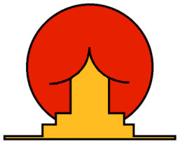
In case you can’t tell – it is a Japanese house in front of the rising sun. What else could it be?
9. *Special* Surgery

Guess where I am not going for surgery?
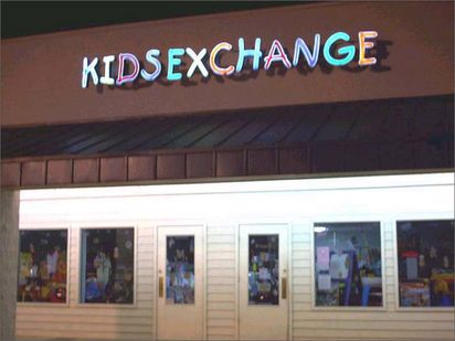
8. High Fashion

Guess where I am going for clothes.
7. Fine Food
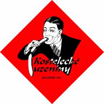
Sausage anyone?
6. Olympics
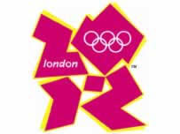
Even though people have pointed out the obvious problem here, they still insist on using this.
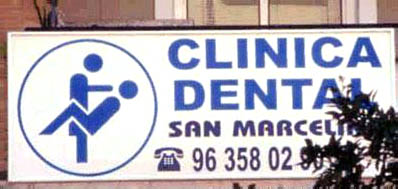
5. Pediatrics

A picture paints a thousand words.
4. Children’s Clinic
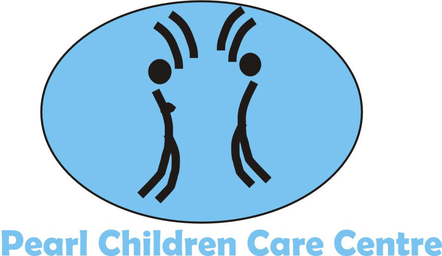
Don’t worry – be happy. Or not.
3. Pharmacy
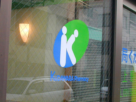
Enemas ‘r’ us.
2. Speechless
1. Open Wide
Bonus: We fix your computers

And your leaky penis.
More Great Lists
 Top 10 Worst Movies From The Top Genres
 Top 10 Worst Instances Of Inflation
 Top 10 Worst Landlords
 Top 10 Worst Times To Be Alive In History
 Top 10 Worst Celebrity Adverts
 Top 10 Horrific Facts About Robert Black, Britain's…
 Top 10 Worst Comic Supervillains
 Top 10 Worst Prisoners At The Colorado Supermax Prison
 Top 10 Actors Who Relived Their Worst Moments On Camera
fact checked by
Alex Hanton
More Great Lists