 History
  History
  Music
Music 10 Misconceptions in Music History
 Animals
 10 Wild Animals Ancient Cultures Successfully Tamed
 Movies and TV
 10 Action Flicks That End on a Quiet Note
 Mysteries
 10 People Who Infamously Appeared out of Nowhere
 Our World
 10 Countries Where Water Scarcity Gets Seriously Weird
 Weird Stuff
 10 of the Most Bizarre Buildings Around the World
 Creepy
 10 American Urban Legends Far Stranger Than Bigfoot
 Movies and TV
 10 Radical Reimaginings of Frankenstein
 Facts
Facts 10 Explosive Facts You Probably Don’t Know About Volcanoes
 History
 10 Surprising Facts You Never Knew About Paul Revere
 Music
Music 10 Misconceptions in Music History
 Animals
 10 Wild Animals Ancient Cultures Successfully Tamed
Who's Behind Listverse?

Jamie Frater
Head Editor
Jamie founded Listverse due to an insatiable desire to share fascinating, obscure, and bizarre facts. He has been a guest speaker on numerous national radio and television stations and is a five time published author.
More About Us Movies and TV
 10 Action Flicks That End on a Quiet Note
 Mysteries
 10 People Who Infamously Appeared out of Nowhere
 Our World
 10 Countries Where Water Scarcity Gets Seriously Weird
 Weird Stuff
 10 of the Most Bizarre Buildings Around the World
 Creepy
 10 American Urban Legends Far Stranger Than Bigfoot
 Movies and TV
 10 Radical Reimaginings of Frankenstein
 Facts
Facts 10 Explosive Facts You Probably Don’t Know About Volcanoes
Top 10 Typography Crimes
Graphic design is a burgeoning industry. With the rise and ubiquity of the Internet in the last decade, web design especially has become prevalent. Other forms of graphic design include print, mobile, illustration, and typography. Typography refers to any design involving the arrangement of letters or alphabetical symbols in a space. Every design geek has taken a course in typography and knows the vast importance of it, yet basic type-crimes (errors or faux-pas in typography design) can still be seen virtually everywhere. While many are quick to dismiss the rules of graphic design, Ron L. Peters in his book Do Good Design emphasizes just how important good design is in our society: “Design creates culture. Culture shapes values. Values determine the future. Design is therefore responsible for the world our children will live in.” Practicing good design is of utmost importance, and good typography is crucial to good design as a whole. This list takes a look at 10 commonly occurring type-crimes:
(Note: to clear up further confusion, a “font” is a specific weight or style such as Arial 16 Bold, whereas “typeface” refers to the broader, all-encompassing Arial).
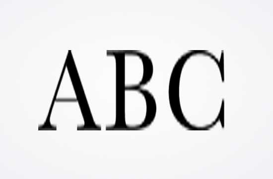
In essence, a good font should be left alone. It can be made bigger or smaller to accommodate the space it occupies, but it should always retain its original ratio. It should not be stretched, compressed, skewed, or any other applicable distortion. As a rule of thumb, if the font looks pixelated, something is wrong. The program Adobe Illustrator is better than Photoshop in this way, because it uses Vectors as opposed to pixels — so your type should never look pixelated in Illustrator. Overall, type is supposed to look crisp and harmonious, not tweaked into oblivion.
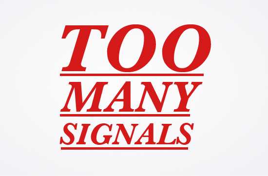
Signals such as: bold, underline, all caps, oblique, and italics are all uniquely different ways to add emphasis to type. Italic type for example is reminiscent of the strokes in calligraphy, and it has a cursive form as well as a Roman influence (named italic in part because it was developed in Italy). Originally, it was often used to help people save money, as it required less space. When the typewriter came out, underline largely replaced italics. Oblique is by some accounts a type-crime in and of itself; it is simply slanted type and not the actual cursive, true italic form. Signals should only be used when appropriate, and should not be overdone.
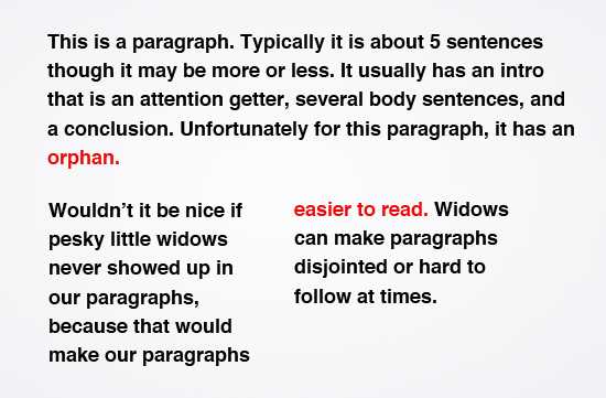
One of the most common type-crimes; designers will cringe upon hearing these words. The terms are often used interchangeably, although they are not the same: an orphan is a lone word at the end of a paragraph, and a widow is a word or part of a sentence that ends at the bottom of a paragraph and carries over onto the top of the next paragraph. They are considered type-crimes because they create unaesthetic gaps in text and make it more difficult for the reader.
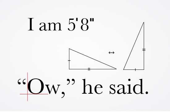
There is a difference between hatch marks and quotation marks. Hatch marks are used to denote feet and inches, and often surface in math (indicative of equal length for triangles in geometry). Hatch marks should not be used in lieu of Quotation marks. Quotation marks should also hang outside of the text. In a clean design, the Quotation marks remain outside.
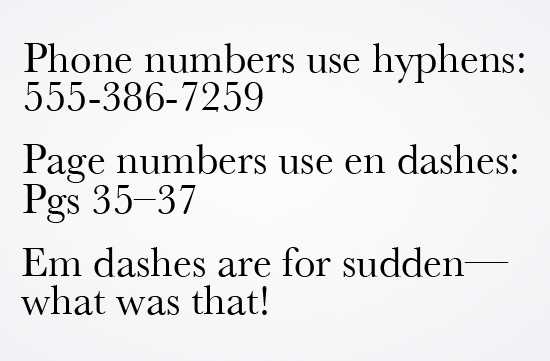
Technically more of a grammatical error, yet just as applicable to design as it is to grammar. Hyphens are used to hyphenate compound words, to break words, and between non-continuing numbers such as phone numbers. En dashes are used to connect continuing or inclusive numbers, example: time and dates, page numbers, and so forth. Em dashes are used to denote a sudden break in thought that causes the end of a word. They enclose words or phrases and create strong breaks in the structure of sentences. Interesting note: the “en dash” received its name for being the length of a standard sized letter “n,” and likewise the em dash with the letter “m.”
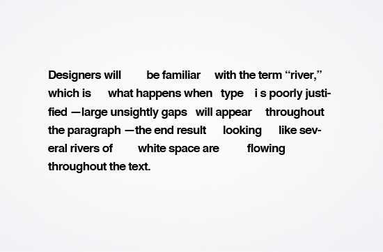
Designers will be familiar with the term “river,” which is what happens when type is poorly justified — large unsightly gaps will appear throughout the paragraph — the end result looking like several rivers of white space are flowing throughout the text. These often appear in newspapers.
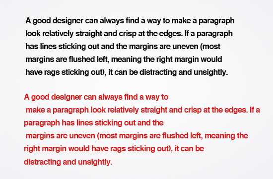
A good designer can always find a way to make a paragraph look relatively straight and crisp at the edges. If a paragraph has lines sticking out and the margins are uneven (most margins are flushed left, meaning the rags would be sticking out to the right), it can be distracting and unsightly.
![]()
Kerning refers to the amount of space between letters in a word. A word may look untidy due to too much space between some letters, or not enough. Tracking is essentially kerning but applied to the entire sentence, paragraph, or body of text, and not just certain letters within the word. “Leading,” (from the literal lead bars that used to be in the press) refers to adjusting the space vertically between lines of text. Any design program worth its money will have simple commands to increase or decrease the kerning, tracking, and leading of words and sentences. (In most Adobe programs you simply highlight a word and press alt + the arrow keys).
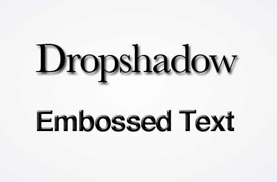
There is great debate about the drop shadow. It is said that when a certain New York Times magazine printed their headline with drop shadow, hundreds of designers called in the following day to the extent that the NY Times had to disconnect their phone temporarily. While it is a way to draw emphasis to type, many are unsatisfied with its unnatural, gimmicky feel. Similar to #10 on the list, embossing and drop shadows are text effects that are best left omitted.
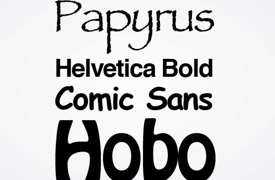
Potentially a controversial item on the list, there are several typefaces that are widely believed by designers to be rubbish and never to be used. Examples include Comic Sans, Papyrus, Jokerman, and Hobo. Even the ubiquitous Times New Roman is frowned upon by many designers who believe it is best kept to its original purpose: newspapers. Many of these typefaces such as Papyrus (famously used in James Cameron’s Avatar) have drawn a lot of scrutiny for being misused and overused. One font in particular known for its overuse is Helvetica. So prevalent in fact is the overuse of Helvetica, that in 2007 a documentary film came out about it. It is a great film and the author of this list highly recommends you see it!


