 Movies and TV
  Movies and TV
  History
 10 Brave Women Who Fooled Entire Armies
 Crime
Crime 10 Criminal Masterminds Brought Down by Ridiculous Mistakes
 Movies and TV
 10 Movie Franchises That Started Dark but Turned Surprisingly Soft
 History
 10 Wars That Sound Made Up (but Absolutely Happened)
 Movies and TV
 10 Movie Adaptations That Ruined Everything for Some Fans
 History
 10 Dirty Government Secrets Revealed by Declassified Files
 Weird Stuff
 10 Wacky Conspiracy Theories You Will Need to Sit Down For
 Movies and TV
 10 Weird Ways That TV Shows Were Censored
 Our World
 10 Places with Geological Features That Shouldn’t Exist
 Movies and TV
 10 Great Meta Horrors to Watch Before Scream 7
 History
 10 Brave Women Who Fooled Entire Armies
 Crime
Crime 10 Criminal Masterminds Brought Down by Ridiculous Mistakes
Who's Behind Listverse?

Jamie Frater
Head Editor
Jamie founded Listverse due to an insatiable desire to share fascinating, obscure, and bizarre facts. He has been a guest speaker on numerous national radio and television stations and is a five time published author.
More About Us Movies and TV
 10 Movie Franchises That Started Dark but Turned Surprisingly Soft
 History
 10 Wars That Sound Made Up (but Absolutely Happened)
 Movies and TV
 10 Movie Adaptations That Ruined Everything for Some Fans
 History
 10 Dirty Government Secrets Revealed by Declassified Files
 Weird Stuff
 10 Wacky Conspiracy Theories You Will Need to Sit Down For
 Movies and TV
 10 Weird Ways That TV Shows Were Censored
 Our World
 10 Places with Geological Features That Shouldn’t Exist
10 Fascinating Typographical Origins
A typographical character is simply a printed symbol—this includes letters, numbers, and punctuation marks. The ? is called a question mark; ( and ) are called parentheses; and ; is known as the semicolon. But you know that already, and I suspect you’re beginning to wonder how one could possibly wring drops of “fascinating” from the dry towel of typography. And that’s fair. But did you know the division sign has a name? What about the mysterious origins of the paragraph sign? Where did the % sign come from? ¿Why on Earth do Spanish-speakers put those upside-down question marks at the beginning of their sentences? Read on!
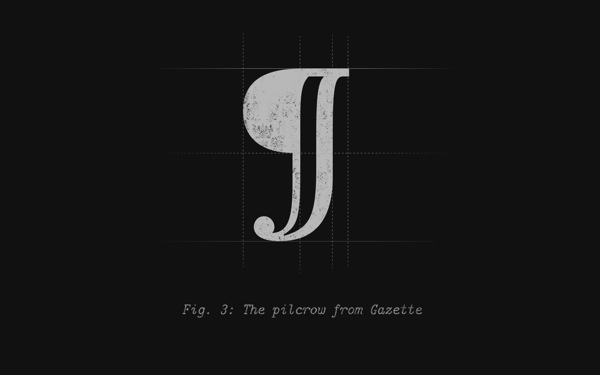
The pilcrow, also less elegantly called the “paragraph mark,” serves a number of purposes, most of which involve denoting the presence or location of a paragraph in one way or another. Most commonly, it’s used in word processing programs to indicate a “carriage return” “control character;” that is to say, a non-permanent mark showing where a paragraph ends. There is disagreement over the origin of the name; The Oxford English Dictionary, for one, likes to think it comes from a string of corruptions of the word “paragraph.” I prefer to side with the Oxford Universal Dictionary, which suggests that the sign itself looks a lot like a featherless crow—a “pulled crow.” The symbol itself derives from the letter C—you can still see it in there—which stood for the Latin “capitulum,” or “chapter.” The two lines that ended up vertically crossing the C were a sort of editorial note from the writer.
The pilcrow was used in the Middle Ages, in an earlier form, as a way of marking a new train of thought before the paragraph became the standard way of accomplishing this. Now, among its myriad uses are in academic writing (when citing from an HTML page), legal texts (when citing a specific paragraph), and in proofreading (an indication that a paragraph should be split in two).

The ampersand is a logogram used to mean “and.” The symbol itself is based on a shorthand version of the Latin word for “and”—et—and in certain fonts, you can still clearly see an ‘e’ and a ‘t’ linked together (Adobe Caslon, for instance). The word ampersand has a somewhat unusual origin—it’s a corruption of the hard-to-parse, multilingual (English and Latin) phrase “& per se and,” which means “& by itself is ‘and.’” Confused? Don’t worry—that’s only natural. All it means is: “The symbol &, all by its little self, simply means and.” And where did this phrase come from? Well, in the early 1800s, & was considered the 27th letter of the English alphabet, and since saying “X, Y, Z, and” would be confusing, “and per se and” was said instead. It doesn’t take a major stretch of the imagination to fathom how this could quickly turn into ampersand, which it did by around 1837.
Because people like to make up urban legends based on everything, including stodgy ol’ typographical marks, there’s a vicious rumor floating around that French physicist and mathematician André-Marie Ampère used the mark so much that it eventually got called “Ampere’s and.” Don’t believe it for a second. In the end we’re left with a pretty little symbol that has more than a few variants.
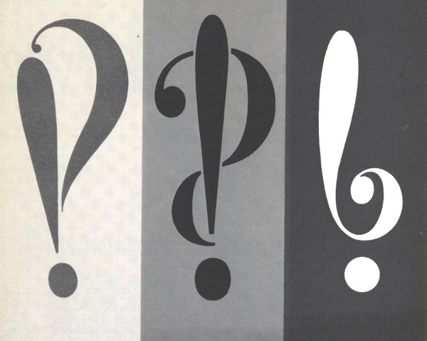
What?! You’ve never heard of the interrobang!? Really? Well, now you have, so all is forgiven. An interrobang is described as a “nonstandard punctuation mark” (it’s part of the punctuation counterculture), used to end sentences where you really want both the exclamation point and the question mark. While the use of both marks side by side had been prevalent for some time, it wasn’t until 1962 when an advertising executive named Martin K. Speckter decided that enough was enough—no longer would he withstand the tyranny of two separate punctuation marks when one would suffice. He asked readers to suggest names—rejecting such fine ideas as rhet, exclarotive, and exclamaquest—and ultimately settled upon interrobang, a combination of the Latin root “interro” (think “interrogate”), and “bang,” which is printer’s slang for the exclamation mark. The word is used to describe both the two side by side (!? or ?!), or the combined symbol ?.
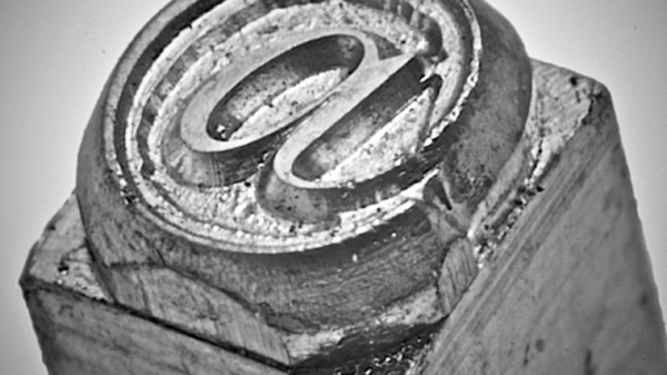
What we know as @ has a lot of different monikers—including “at sign,” “at symbol,” “ampersat,” and “apetail”—but is unusual in that it doesn’t have a widely-accepted name in English. In Spanish, it is known as an arroba, and in French the arobase. @ has two primary usages—its original one, used in commerce to mean “at the rate of,” and more recently, “directed at” (primarily in email and in social media like Twitter). It has been claimed (by Italian professor Giorgio Stabile) that the symbol is actually over 500 years old, to represent an “amphora”—a unit of capacity used in commerce. It first made its way onto a typewriter as early as 1885, and has since found its way into our hearts.
A couple of fun facts:
– The Spanish arroba was a unit of weight equivalent to 25 pounds.
– The names for @ in other languages often derive from the idea that it looks like an animal. To wit: apenstaartje (Dutch for “monkey’s tail); papacy (Greek for “little duck); dalphaengi (Korean for “snail”); sobachka (Russian for “little dog”).

Guillemets are what the French use instead of quotation marks. In addition to the physical differences, the usage differs as well—generally, guillemets open and close entire conversations or exchanges, rather than individual utterances. Amusingly, the guillemet is named after a French printer named Guillaume Le Bé from the 16th century; “Guillemet” is a diminutive of “Guillaume.” One can only assume that French people call our quotation marks “Willies,” “li’l Bills,” or “Mini Williams.”
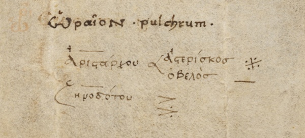
The Obelus, more commonly known as “the division sign” for reasons I can’t fathom, comes from an Ancient Greek word for a sharpened stick or other similar pointy object. It shares its roots with the word “obelisk.” The obelus was once used to denote sections of writing that were considered incorrect or suspicious; in other words, it would have been perfect for Wikipedia editors. It was first used to mean “division” in 1659 by Swiss mathematician Johann Rahn. While still used frequently in the US and in Britain, it is not commonly used to mean division in most of the rest of the world.
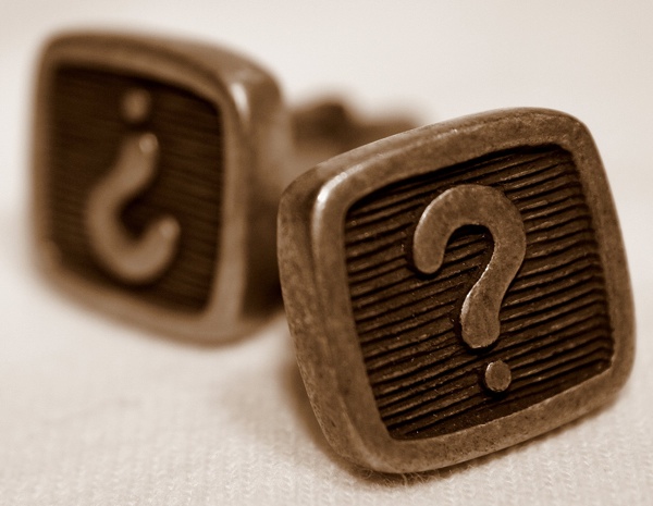
In Spanish, when a sentence ends with a question mark or an exclamation point, it also starts with an inverted one. ¿Porque? Well, I’ll tell you porque. In 1754, the Spanish Royal Academy decided that the Spanish language had a dire problem: when you start reading a sentence, you often have no way of telling if it’s a question or not until you get to the very end.
Consider the sentence vas a ir a la tienda? (Are you going to go to the store?). Up until you get to the question mark, you are totally in the dark—is it a question, or simply a declarative sentence stating “you are going to go to the store”? In English, we have ways of indicating that a question is coming, so that proper inflection can be used, as well as to help with comprehension. In Spanish, you used to need contextual clues to help you out before the Royal Academy had its way. They also decided that the exclamation point would be lonely, so they advocated for its inverted use as well.
Though the language was slow to adopt this new convention, it is now a fully integrated part of the language. A few interesting usage notes:
– Short, unambiguous questions are often written without the inverted mark—Quien eres?
– In digital communication, the inverted mark is frequently left off (emails, instant messaging, texts).
– Some authors refuse to use inverted marks.
– Writers can get playful with the marks, including starting a sentence with a ¡ and ending it with a ?.
– ¿ can be used in the middle of a sentence if the whole sentence is not a question, but rather the final clause.
– Note that ¿ and ¡ are positioned differently than ? and !; they hang below the line.
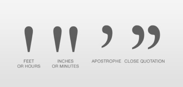
File this under “things we use all the time but don’t know their name.” Ditto marks are those quotation-looking-guys you use to save your tired wrist from a few more seconds of writing, indicating that what’s directly above should be repeated. Though one might suspect (“one” being “me” before I researched it) that the word ditto may have been related to the Latin root “di” (meaning “two”, as in when you say “ditto” you mean “me too!”), it in fact derives from an early (c. 1620) form of the Italian word for “to say.” Originally, it was used to avoid needless repetition when writing a series of dates in the same month.
A “ditto mark” is a type of “iteration mark.” Other languages have their own, notably Chinese, Japanese, and Ancient Egyptian. It’s tough to fathom why Ancient Egyptian scribes might have needed a way to cut down on chiseling elaborate drawings into rock.

Take a look at the percent sign. Look at each of the three individual marks—a circle, a line, a circle. Remind you of anything? Does it, perhaps, remind you of a certain number, with the digits rearranged and realigned? A very important number? Maybe . . . the number 100?
The % sign, of course, means that the preceding number should be understood as being divided by one hundred—”per cent.” The slash mark used to be straight across, with zeroes above and beneath, but it gradually became slanted—leading to what D.E. Smith, in 1925, called the “solidus form” of the percent sign. The solidus, aka slash, virgule, fraction bar, and other names, is this sign: /.
Because there is disagreement about everything, there is disagreement over whether there should be a space between the number and the % sign, over whether it should be per cent or percent, and when you should use the % symbol and when you should instead write out the word.
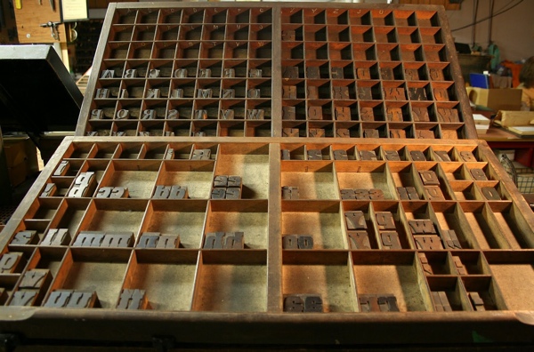
Once I learned the origins of the terms “upper case” and “lower case,” it seemed so obvious. I mused: does everyone know this but me? What else are my friends and family keeping from me? Instead, though, I decided to convince myself that legions of Listversers were in the dark like me, too embarrassed to say anything. Take comfort, fellow readers, for you may remain anonymous in your ignorance.
Now then: in the early days of printing, when each letter was set individually, the letters were kept in cases. The capital letters were kept in—you guessed it—the “upper case,” less convenient to the printer because of how relatively few capital letters are used, while the lower case letters were kept in the more accessible—wait for it—”lower case.” It’s as simple as that, really. This usage of the terms dates back to 1588.
Fun facts about cases:
– The use of two cases in a written language is called “bicameral script.” Languages with only one case are called “unicase.”
– So what were lower-case letters called before they used cases at all? Well, we have other words to describe them—Upper-case letters are called majuscules (and, of course, capitals), and lower-case letters are called minuscule. Note the spelling difference with the word miniscule.


