 Humans
Humans
Humans  Movies and TV
 10 Hollywood Style Choices That Backfired
 Weird Stuff
 10 Ancient Chores That Would Horrify Modern Health Inspectors
 Politics
 10 Strange High-Tech Tools Shaping Modern Politics
 Humans
 10 Extraordinary Places Humans Have Adapted to Live
 Weird Stuff
 Ten of the Strangest Things You Can Buy Online
 Movies and TV
 10 Crime Shows with Gorgeous Settings
 History
 10 Cold War Spies Who Feared Nothing
 Animals
 10 of the Most Gluttonous Animals
 Music
Music 10 Women Who Changed Rock and Metal Forever
Humans 10 Disturbing Communities from the Dark Corners of the Internet
Movies and TV 10 Hollywood Style Choices That Backfired
Weird Stuff 10 Ancient Chores That Would Horrify Modern Health Inspectors
Who's Behind Listverse?

Jamie Frater
Head Editor
Jamie founded Listverse due to an insatiable desire to share fascinating, obscure, and bizarre facts. He has been a guest speaker on numerous national radio and television stations and is a five time published author.
More About Us
Politics 10 Strange High-Tech Tools Shaping Modern Politics
Humans 10 Extraordinary Places Humans Have Adapted to Live
Weird Stuff Ten of the Strangest Things You Can Buy Online
Movies and TV 10 Crime Shows with Gorgeous Settings
History 10 Cold War Spies Who Feared Nothing
Animals 10 of the Most Gluttonous Animals
Music 10 Women Who Changed Rock and Metal Forever
10 Logos That Mean Way More Than You Think
Logos—we see hundreds of them every day. We see them so much that we often don’t even think about them. But years of work and millions of dollars go into even the simplest logos, and sometimes the layers of hidden meanings can be hard to believe.
10Fedex Logo Subliminally Tells Us They Are Fast

The Fedex logo is basically just the company’s name: “Fed” in bold purple writing and “Ex” in bold orange. There’s nothing particularly clever about that. So why has such an unassuming logo won dozens of awards? For its use of negative space. In the FedEx logo, the “E” and the “x” are positioned in such a way that an arrow is formed in the space between them. A lot went into the creation of this logo, including months of work and the creation of an entirely new letterform. But what is represented in the logo is apparently very effective on a subliminal level. Many don’t specifically notice the arrow but still process it on an unconscious level, associating it with the sense of speed and proficiency that the company certainly hopes to be linked to.
9The Golden Arches Are Boobs

One would be forgiven for thinking that the McDonald’s logo is nothing but a large yellow representation of the first letter in the company’s name. And it technically is, but there’s more to it. To some, the rounded “M” subconsciously represents our mother’s breasts. In the 1960s, McDonald’s was retooling its image, which included discussing a possible new logo. Louis Cheskin, a psychologist and design consultant hired by McDonald’s urged them to keep the current logo, claiming that the golden arches had a Freudian effect that made customers imagine a pair of nourishing breasts, which then made them hungry. Some find this hard to believe, but one thing’s for sure—you won’t look at the big “M” the same way again after today.
8Museum of London Logo Shows History
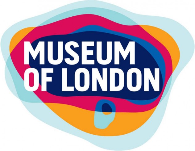
The Museum of London is dedicated to recounting the history of London through all eras, from medieval times to today. In 2010, the museum needed a revamp, hoping to update their image and appeal to a younger audience. The new logo they presented was certainly capable of that due to its vibrant color, but on top of that you can learn about the history of London just by looking at it. The logo features several colored layers, each representing a different geographical shape London has taken in its evolution through time. This reflects the history and change that the museum displays and documents inside, as well as being almost impossible to miss due to its color.
7Adidas Logo Makes You Work Harder
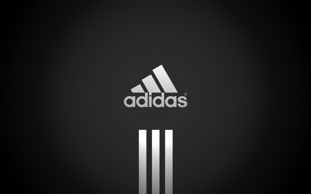
Adidas manufactures sports clothing and accessories, but it’s probably most known for the shoes. The name “Adidas” originated as a combination of the first and last name of the company’s creator, Adolf Dassler. Even at the very beginning, Adidas put heavy interest into marketing, with “the brand with the three stripes” almost becoming their motto. Throughout time, the company’s logo has changed, but has always incorporated the three stripes. The current logo features three slanted stripes in a triangle shape, but referencing the logo of times past isn’t all that’s represented here. This new logo symbolizes a mountain, a metaphor for the challenges and perceivable goals that all athletes must meet and overcome.
6Mitsubishi Logo Shows Company Lineage
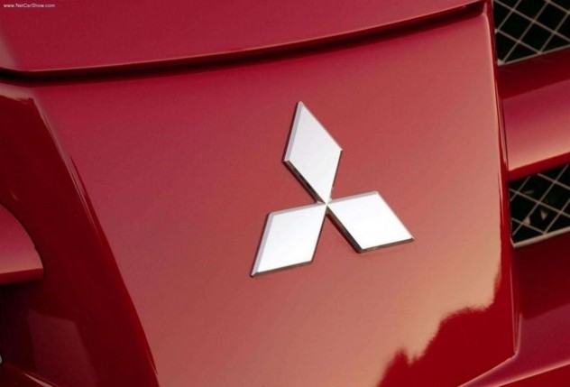
Mitsubishi was first established as a shipping firm in the 1800s and involved the merging of two groups to become one company. The logo represents this by combining two “crests”—the three-leaf crest of the Tosa Clan and the Iwasaki family crest, which showed three diamonds stacked on top of each other. The three diamonds are said to signify reliability, integrity, and success and are colored red because red denotes confidence and attracts customers to the brand.
5Google Logo Is A Rebel
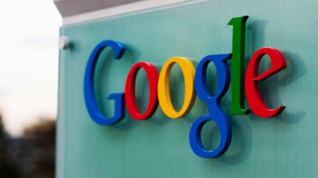
The Google logo appears to be made of fairly humble, simple colors with no flashy font or symbols, but even simple colors can have a deep relation to company image. During the creation of the Google logo, designers wanted a way to display a sense of playfulness without bulky objects or symbols in the logo limiting what they could do. This was initially achieved by skewing some of the letters, but this idea was scrapped and instead focus was directed toward color. The current logo features a pattern of primary colors being broken with a single letter shown in the secondary color of green. The broken pattern represents playfulness and the idea that Google isn’t a company that plays by the rules.
4Animal Planet Logo Is Feral
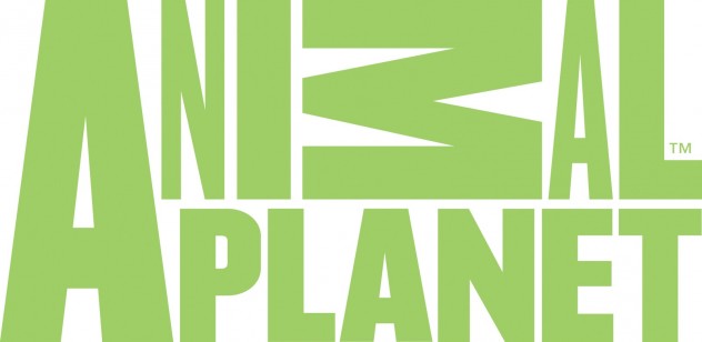
The Animal Planet logo used to be an elephant reaching out to a miniature Earth. An animal and a planet—that’s simple enough. The channel relaunched in 2008 with the intention of appealing to a wider audience and the elephant-globe logo was replaced. With its relaunch, Animal Planet sought to rid itself of the slow and boring pace associated with documentaries for more primal and exciting programming, and they attempted to present a new logo to match. The new logo is said to represent instinct, with the shades of green bringing to mind images of a jungle and feelings of primal urges, emotion, and “animalistic boldness”. That’s a lot of feeling to be had from what is essentially the name of the channel with one letter turned sideways.
3NBC Logo Makes Us Buy Stuff

Most people know that the NBC logo is a peacock; that part isn’t a secret. But many fail to ask why the peacock is there in the first place. It was all a marketing trick to make people buy color televisions. At the time of the logo’s development, NBC was owned by the electronics company Radio Corporation of America (RCA). Color televisions were just beginning to emerge and RCA wanted a way to show the public that the relatively high price of the units was worth the enhanced experience of viewing in color. They needed a logo that required color to be fully appreciated, reminding viewers with black-and-white units that they were missing out. Rainbows were rejected as too obvious, butterflies were too tame and eventually the peacock was selected, bringing with it the connotation that NBC was proud of its new color programming because of the then-common phrase “proud as a peacock”.
2The Amazon Logo Represents Diversity And Smiles
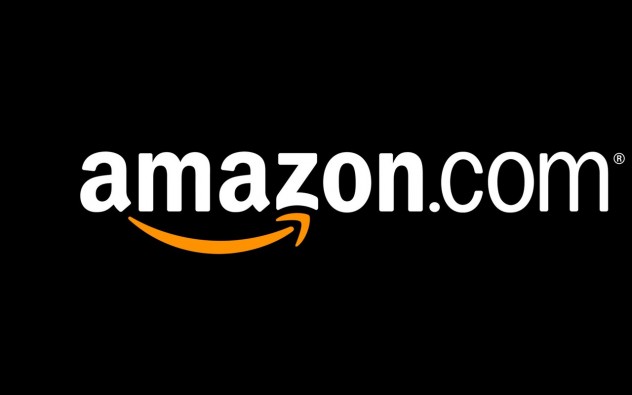
The Amazon logo looks fairly simple at first glance. The company’s name, Amazon.com, in bold black lettering with a simple yellow line curving underneath. But what does that arrow represent? It’s intended to be two things. It represents the smile customers should find on their faces after a great Amazon experience. The position of the yellow line forms a visible smile with each “a” in the word acting as the eyes.
The yellow line is also an arrow, beginning at the first “a” and spanning over to “z”. This signifies the diversity among Amazon’s products—“everything from ‘a’ to ‘z’ “—as well as denoting a link to the diversity in the Amazon forest itself. At one point this logo was animated with the yellow arrow beginning at the “A” and slowly growing out towards the “z”, but it was later changed for being too phallic.
1The Pepsi Logo Represents Everything

The Pepsi logo is a simple circle. The top half is red, the bottom half is blue, and a wavy white line runs through the center. The colors intentionally represent the American flag, but that’s just scratching the surface of this simple globe. Pepsi spent hundreds of millions on their current logo, which is very similar to their previous ones, but tweaked in a way that it (apparently) means a lot more.
When submitting the new logo, the branding agency hired by Pepsi presented a 27-page document explaining the many, many connotations their design represented. According to this document the new logo represents the Earth’s magnetic field, feng shui, Pythagoras, geodynamics, the theory of relativity, and plenty more. Makes you wonder if the logo is working as intended or if the branding company lied their way into a big fat check.
Scott friggin’ tweets @frigginboom.
More Great Lists
 10 Traditions That Are Way Newer Than We Think They Are
 Top 10 People Who Didn't Die The Way You Think They Did
 Top 10 Reasons The Dark Ages Were Darker Than You Think
 Top 10 Things That Prove Deserts Are Stranger Than You Think
 10 Ways A Kitchen Can Hurt You More Than A Torture Chamber
 10 Wild West Lawmen Who Were More Dangerous Than The Outlaws
 10 Societies That Recognize More Than Two Genders
 10 Yeti Reports Involving More Than Footprints
 Top 10 One-Color Paintings Worth More Than Your House
fact checked by
Jamie Frater
More Great Lists