 Movies and TV
Movies and TV
Movies and TV  Technology
 10 of History’s Most Expensive Megaprojects
 Mysteries
 10 Secrets That Vanished with the Last Person Who Knew Them
 Weird Stuff
 10 Historical Status Symbols That Seem Absurd Today
 History
 10 Speeches That Helped Push Nations Into War
 Politics
 10 Wild Campaign Promises That Became Political Legends
 Mysteries
 10 Fresh Clues That Might Crack Old Mysteries
 Weird Stuff
 10 Weirdly Specific Conspiracy Theories from the 1990s
 Movies and TV
 10 Characters Who Never Forgot a Grudge
 Technology
 10 Historical Inventions That Changed War Forever
Movies and TV 10 Film Franchises That Never Fixed Their Biggest Problems
Technology 10 of History’s Most Expensive Megaprojects
Mysteries 10 Secrets That Vanished with the Last Person Who Knew Them
Who's Behind Listverse?

Jamie Frater
Head Editor
Jamie founded Listverse due to an insatiable desire to share fascinating, obscure, and bizarre facts. He has been a guest speaker on numerous national radio and television stations and is a five time published author.
More About Us
Weird Stuff 10 Historical Status Symbols That Seem Absurd Today
History 10 Speeches That Helped Push Nations Into War
Politics 10 Wild Campaign Promises That Became Political Legends
Mysteries 10 Fresh Clues That Might Crack Old Mysteries
Weird Stuff 10 Weirdly Specific Conspiracy Theories from the 1990s
Movies and TV 10 Characters Who Never Forgot a Grudge
Technology 10 Historical Inventions That Changed War Forever
10 Stunning New Ways To Visualize How The Earth Works
Earth’s green-blue visage is awful nice, but we see it so often that we’re sick of it. Luckily, NASA and other space agencies are constantly dreaming up new ways to visualize the countless terrestrial processes we take for granted.
10Earth’s Plasmasphere
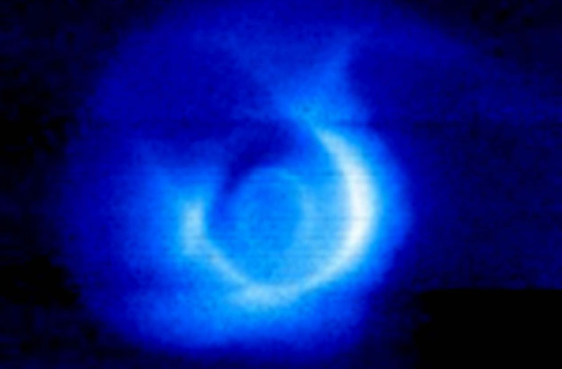
Photo credit: NASA
The plasmasphere is the inner portion of Earth’s magnetic field, and it’s fabulous. Recently, astronomers have found a constant flux of particles between the two electrically charged regions, forming a terrestrial version of the solar wind.
As solar UV radiation strikes the atmosphere, it kicks off a gigantic ionic rave. Tiny electrons are whipped up and ionize other particles, creating a magnetic stew high above Earth’s surface. The flow is somewhat modest in cosmic terms. It releases only about 1 kilogram (2.2 lb) of charged material into the outer magnetosphere per second. Daily, this adds up to 90 tons of plasma discharge, and this flowing electric material forms a large doughnut around our planet.
Voids created as charged wind escapes are constantly refilled by a sort of plasmic diffusion, and so the plasmasphere is continually recycled. In the early ’60s, astronomers found that this region thins out quickly as we approach a distance of three terrestrial radii—or about 20,000 kilometers (12,000 mi) out into space. The USSR spacecraft Luna 2 confirmed this supposition, and the area is now known as the plasmapause.
9Rock Magnetism
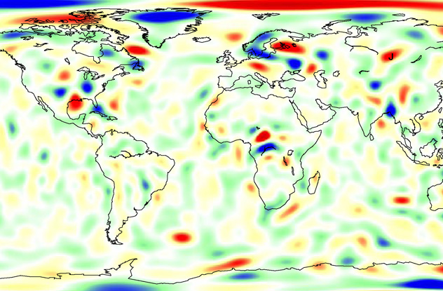
Photo credit: Terence Sabaka, NASA GSFC
Even though NASA mostly concerns itself with the astronomical, in 2004, the space agency turned a magnetic eye toward Earth. And with some help from the United States Geological Survey, they created a map of magnetic trends across the planet. These lithosphere magnetism anomalies can reveal many things, including water reservoirs, earthquake risk, and even Earth’s geological evolution.
It might seem unlikely, but rocks are like tectonic scrapbooks, and their magnetic profiles hold a legacy of the past. Knowing this, researchers can reverse-engineer Earth’s tectonic history by treating the colored areas like a global jigsaw puzzle. By tracking these major shifts through time, researchers can test their simulations against reality.
The spots of magnetism are color-coded according to directional influence. Red and yellow blotches (positive values) exert an outward magnetic push. Blues and greens (negative values) indicate an inward magnetic pull. And while magnetic forces propagate in every direction, the map you see only displays a vertical component. However impressive it may look, the measurements are in nanoTeslas, and the magnetic interactions are laughably weak. The biggest splotch on the map is still 200 times weaker than your average fridge magnet.
8Earth In False Colors
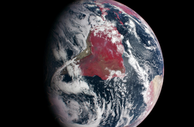
Photo credit: NASA/Johns Hopkins University Applied Physics Laboratory
Don’t worry—the Earth is totally fine. The bloody reds and post-apocalyptic browns actually show a proliferation of vegetation across the planet and not some kind of theoretical doomsday scenario.
The image was snapped by the phonetically awkward Mercury Surface, Space Environment, Geochemistry, and Ranging probe, or MESSENGER. The probe has been orbiting Mercury for the past four years, but it started its journey with a practice lap around Earth and honed its instruments by capturing Earth in all its false glory.
The snapshot was taken by the Mercury Dual Imaging Sytem’s wide-angle, 11 wavelength–spanning super-camera. It’s almost a true-color (blue, red, and green), yet it swaps in infrared for blue because our atmosphere scatters blue light. Infrared makes it through unencumbered and produces a much sharper image. Plant-life reflects near-infrared light, and since that wavelength is assigned to visible red in the image, we see this oddly colored Earth.
The psychedelically false colors allow NASA to observe Earth across the radio magnetic spectrum, and there are numerous false-color combinations. These artificial color bands reveal significant terrestrial processes, including vegetation patterns, various aspects of the water cycle, temperatures, and even small-scale planetary disasters like floods and wildfires.
7Earth Breathing
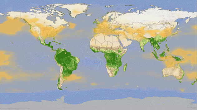
Photo credit: NASA
NASA’s beaver-tailed Aqua satellite tells us almost everything we want to know about Earth’s water cycle. And by combining a glut of readings from 2003–2010, NASA has produced an animation of the breathing planet.
AIRS, or the Atmospheric Infrared Sounder, is the ultimate unsung hero of meteorology and responsible for single-handedly improving forecasting accuracy more than any other tool in the past decade. AIRS’s partner in crime, MODIS (the Moderate Resolution Imaging Spectroradiometer), defies conventional acronym logic and monitors vegetation and carbon dioxide while making its pole-to-pole transit across low-Earth orbit.
The cycle kicks off January 1, when Northern Hemisphere dwellers are still in the midst of a chilly Christmas hangover. As you can see on the map, the bare areas are bathed in used carbon dioxide. Through these recreations, we’re also privy to less obvious phenomena. For example, 10 percent of these gassy carbon dioxides are released from warming soils (and not just dying plants). We can also see a three-month lag between vegetative rebirth and increasing CO2 in the middle troposphere, part of the lowest atmospheric layer.
6Lightning
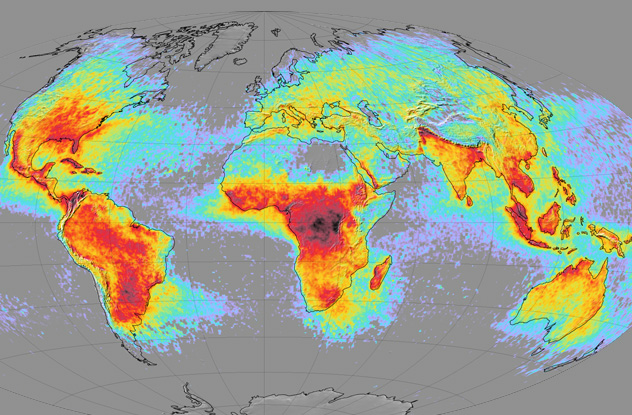
Photo credit: NASA
Lightning costs us billions of dollars per year in repairs to man-made structures. To guide us in avoiding these strikes, NASA created a set of lightning density maps that show strike frequency across the globe. The map uses data collected from 1995–2002 by spaceborne instruments OTD (Optical Transient Detector) and LIS (Lightning Imaging Sensor). You’ll want to avoid the dark red splotches, which represent electric hot spots, but the purple and gray areas are much safer and relatively free of deadly bolts.
Thanks to the aesthetically pleasing map, a couple of trends jump out at you. First, large swaths of ocean remain lightning-free. Large bodies of water remain relatively calm because the seas are more resistant to the Sun’s warming touch. Land heats up readily and warms the air above it. Air currents are whirled upward by convective forces, breeding larger thunderstorms to scorch the Earth. Secondly, it’s clear that areas along the equatorial diameter are far more lighting-prone, for largely the same reasons.
And if you would like something more interactive, you can view a global lightning map that tracks strikes in real time.
5Earth Wind Map
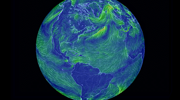
Photo credit: Cameron Beccario
The Global Forecast System (GFS) tracks winds as they race across the planet. This data is now easily digestible in the form of an incredibly hypnotic Earth Wind Map, courtesy of Web developer Cameron Beccario.
The best part? It’s fully interactive, and you can fiddle with features by clicking on “earth” in the lower left corner of the site. Wind speeds are measured across a color scale, with blues and greens representing the gentlest of breezes. As you zoom in or out, a fuller range of colors is revealed, and hovering your cursor on the color scale reveals precise figures. Reds and violets are downright angry, representing the most malevolent winds.
Updated every three hours with fresh GFS data, the Earth Wind Map keeps you current with a variety of parameters, including temperature and humidity. These readings can be overlaid on a variety of projections, though we suggest Stereographic for a trippy, possibly nausea-inducing experience. If you still aren’t satisfied, you can switch to ocean currents and effectively double the amount of content at your fingertips.
4Rainfall
NASA | First Global Rainfall and Snowfall Map from New Mission

That we can watch a year’s worth of global rainfall in a few minutes is a testament to the awesomeness of orbital observation. NASA and JAXA (Japan’s national space agency) have teamed up to create the most comprehensive precipitation map to date, and the Global Precipitation Measurement mission successfully produced its first global map of rain and snowfall.
The constellation of satellites covers almost 90 percent of the Earth’s surface and updates every half hour. Snowfall is generally difficult to track, but the precipitation project represents an astronomical milestone for its ability to monitor these otherwise elusive flurries.
The breadth of observation really is revolutionary, offering unprecedented detail and range. Plus, watching how the storms travel across the globe provides insight into future events, allowing more accurate predictions in the future.
3Ocean Currents
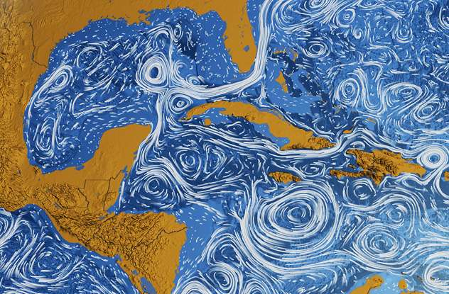
Photo credit: NASA
Post-impressionist Vincent van Gogh was continually awed by the night sky, so it’s fitting that NASA’s compilation of ocean currents looks so similar to van Gogh’s own starry nightscapes. The map makes winds visible and unveils the vastly turbulent action that engulfs the seas.
NASA’s Scientific Visualization Studio condensed countless satellite-hours and over two years of observations into a 20-minute-long animation, the Perpetual Ocean. It covers a period from June 2005 to December 2007, and an even more truncated version of the video is available here. It’s a most excellent combination of science and art, and NASA hopes similar visualizations will make their work more accessible to the masses.
Thankfully, the map omits the Great Pacific Garbage Patch, which is exactly what it sounds like and the size of Texas. Most of the sludge floats slightly beneath the surface and is fortunately invisible from the air. It exists due to the churning gyres working as advertised, which is why pieces of aquatic trash coagulate into large, disgusting clots.
2Radiation
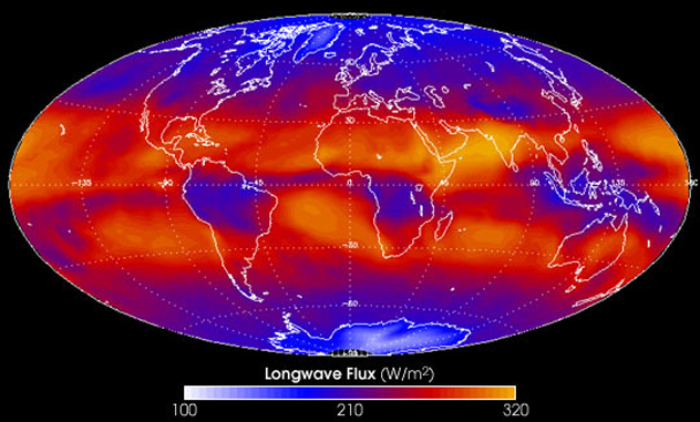
Photo credit: NASA
NASA’s CERES (Clouds and the Earth’s Radiant Energy System) is a platform for measuring Earth’s solar budget, a delicate balance between solar radiation absorbed and bounced back into space. CERES tracks shortwave radiation, or reflected sunlight, as well as longwave radiation, or heat emitted by Earth. The bright image above depicts this flux over a one-month period.
CERES monitors Earth’s ever-changing albedo as well, or reflective power. A fully frost-covered world boasts an albedo of 0.84 (84 percent of light is reflected back), while a world replete with dark, leafy vegetation would only register a 0.13. Extrapolating from over 40 years of data, Earth’s current albedo is 0.30—quite disheartening. And that value is set to plunge, as the polar caps shrink and the remaining ice becomes dirtied and loses its reflective prowess.
The featured map shows albedo trends from March 1, 2000, to December 31, 2011. Orange splotches show areas that have dimmed and absorb more heat. Blue areas denote an increasing albedo, which is good for us. These values vary wildly over the observed period, and NASA is unable to ascertain any significant trend from the spiking data.
1Space Junk Map
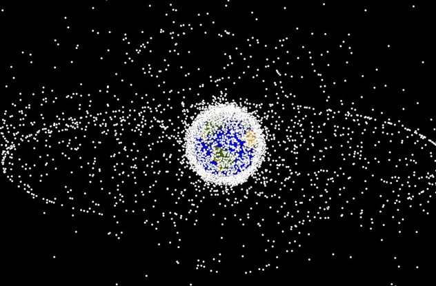
Photo credit: NASA
We humans are pretty bad with pollution, and in the past 50 years, we’ve turned Earth orbit into a cosmic junkyard. More than 500,000 pieces of space detritus are whipping around our planet as we speak, at downright scary speeds of up to 28,000 kilometers (17,500 mi) per hour. And you can see it all play out, live.
Of the 6,000 satellites we’ve sent into space, at least 3,600 are still in orbit, inching ever closer to death-by-atmosphere. Luckily, the thick shell of gasses around our planet ensures that most of these chunks are burned to nothingness as they crash back down to Earth.
NASA doggedly tracks everything 10 centimeters (4 in) or larger (softball-sized), and they’re currently watching more than 20,000 such objects. Remember, this is in addition to the aforementioned 500,000 marble-sized pieces. And we’re not even including the millions of bits that are much too small for surveillance. And at speeds of several miles per second, a fleck of paint is energetically indistinguishable from a 250-kilogram (550 lb) mass traveling at 100 kilometers (60 mi) per hour.
There are several interactive orbital junk maps online, including this one, which tracks pieces in real-time and offers dates of reentry for bulkier objects.
More Great Lists
 10 Bizarre Ways The Moon Affects Life On Earth
 60 Stunning Images of The Middle East That Will Make…
 60 Stunning Images Of South Asia
 Top 10 Stunning Photographs Of Hidden Gem Destinations
 Top 10 Stunning Churches and Cathedrals
 Top 10 Stunning Images Of Beautiful Modern Buildings
 10 Prehistoric Works Of Art And Their Stories
 10 Great Works Of Art Destroyed By Vandals
 10 Writers Who Stole Their Greatest Works From Other Authors
fact checked by
Jamie Frater
More Great Lists