 Our World
  Our World
  Health
 10 Times the Placebo Effect Fooled Modern Science
 History
 10 Surprising Facts You Never Knew About Paul Revere
 Music
Music 10 Misconceptions in Music History
 Animals
 10 Wild Animals Ancient Cultures Successfully Tamed
 Movies and TV
 10 Action Flicks That End on a Quiet Note
 Mysteries
 10 People Who Infamously Appeared out of Nowhere
 Our World
 10 Countries Where Water Scarcity Gets Seriously Weird
 Weird Stuff
 10 of the Most Bizarre Buildings Around the World
 Creepy
 10 American Urban Legends Far Stranger Than Bigfoot
 Our World
 10 Countries That Exist… but Aren’t Officially Recognized
 Health
 10 Times the Placebo Effect Fooled Modern Science
 History
 10 Surprising Facts You Never Knew About Paul Revere
Who's Behind Listverse?

Jamie Frater
Head Editor
Jamie founded Listverse due to an insatiable desire to share fascinating, obscure, and bizarre facts. He has been a guest speaker on numerous national radio and television stations and is a five time published author.
More About Us Music
Music 10 Misconceptions in Music History
 Animals
 10 Wild Animals Ancient Cultures Successfully Tamed
 Movies and TV
 10 Action Flicks That End on a Quiet Note
 Mysteries
 10 People Who Infamously Appeared out of Nowhere
 Our World
 10 Countries Where Water Scarcity Gets Seriously Weird
 Weird Stuff
 10 of the Most Bizarre Buildings Around the World
 Creepy
 10 American Urban Legends Far Stranger Than Bigfoot
Top 10 Sneaky, Secret Tricks Companies Use To Make Us Spend More
Shopping is a battle between company and consumer. You want to spend less, the stores want you to spend more, and they usually get what they want.
That’s not all on you, though. Corporations have a whole bag of tricks up their sleeves to get you to drop more of your hard-earned cash than you planned. From the tiles on their floors to the font size they use to purposefully rude salespeople, here are the top ten sneaky, secret tricks they’re using without us even knowing it.
10 Decoy Pricing
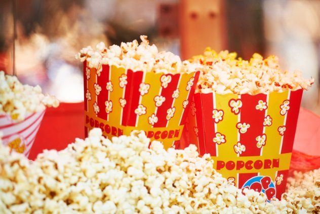
Think of the last time you went to the movies. Maybe you bought some popcorn. We all know it’s overpriced, but did you ever wonder why the price gap between the small (say, $3) and the medium (say, $7) is bigger than the gap between the medium and the large ($8)? Well, it’s because people are more likely to buy the large, thinking they’re getting a bargain since it’s only a dollar more than the medium. This is called the decoy effect. Essentially, companies introduce a slightly cheaper “decoy” option to make it seem like the most expensive option is a bargain.
MIT professor Dan Ariely conducted a study which illustrates the power of the effect. Using his students as test subjects, he split them into two groups. Both groups were offered subscriptions to the magazine The Economist. Group A was offered a web subscription for $59 and a combined web and print subscription for $125. 68 percent of his students chose the cheaper web subscription.
He switched things up for Group B. He offered them a web subscription for $59, a print subscription for $125, and a combined web and print subscription also for $125. This time, 84 percent of his students chose the more expensive web and print subscription, thinking they were getting a great deal. By simply introducing a decoy option, sales increased by a whopping 30 percent![1]
So think about the decoy option next time you hear the cashier say, “Do you want the large for just 50 cents more?”
9 Dropping The Dollar Sign
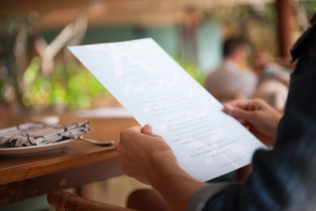
We’ve all seen those chic menus at hip restaurants that drop the dollar sign in front of prices. But that’s not just a stylistic choice. It’s meant to make you spend more.
According to researchers at Cornell University, diners spent roughly eight percent more at a restaurant when the menu did not include the dollar sign. Explaining the findings, Professor Sheryl E. Kimes noted, “References to dollars, in words or symbol, reminds people of the ‘pain of paying.’ ”[2]
8 Using Small Tiles On The Floor
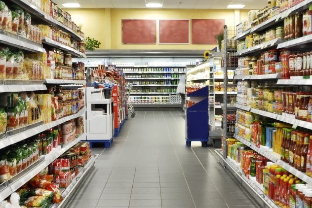
The recent increase in online shopping has sent traditional stores scrambling to maintain their profits. As a result, retailers have gotten . . . creative.
A recent study of over 4,000 shoppers by Professor Nico Heuvinck of the IESEG School of Management in France found that “closely spaced, horizontal lines on the floor slow the pace at which shoppers walk down an aisle, encouraging them to browse and buy more. Widen the gaps between the lines and shoppers move more quickly and spend less.”[3]
He noted that retailers tend to use smaller tiles in aisles that housed more expensive products while using bigger tiles in areas where they try to minimize congestion, like the entrance.
Take a look next time you are in a store to see if there’s a difference in tile spacing.
7 ‘.99’ Pricing
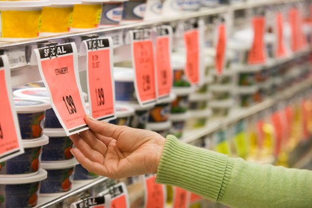
Okay, no one seriously thinks that $4.99 is any different than $5.00, right? Wrong!
In a 2005 study by researchers from New York University, investigators found that ending prices in “.99,” had an incredible impact, which they call the “left-digit effect in price cognition.” “Nine-ending prices will be perceived to be smaller than a price one cent higher,” they wrote. They explain that, because we read from left to right, the first digit in a price resonates with us the most. Unconsciously, our brains perceive $2.99 to be closer to $2 than to $3. Additionally, they added, ending a price in “.99” makes us think that the item is on sale, even if it’s not.[4]
The power of “.99” pricing was demonstrated in a groundbreaking study conducted by professors from the University of Chicago and MIT. Researchers took a piece of women’s clothing and assigned it different prices: $34, $39.99, and $44. Astonishingly, the garment was most popular at $39.99 even though it was six dollars more expensive than the cheapest option!
6 ’10 for $10′
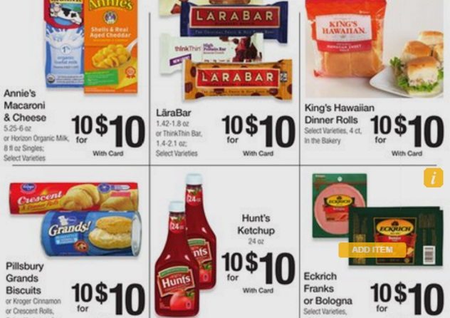
How many of us have seen a “10 for $10” sign at the supermarket and loaded up our cart? It’s safe to say that many of us have. But did you know that oftentimes, you did not have to buy ten items in order to get the deal?
In many cases, “10 for $10” is just another way of saying “1 for $1.” Still, many people end up buying much more product than they really need, according to William Poundstone, author of Priceless: The Myth of Fair Value and How to Take Advantage of It.[5]
5 Rude Salespeople

You might think a friendly salesperson would mean more business for a company. But recent findings from researchers at the University of British Columbia Sauder School of Business say otherwise. According to researchers, the ruder the staff are at luxury stores, the better the profits.
Professor Darren Dahl, author of the study, noted, “It appears that snobbiness might actually be a qualification worth considering for luxury brands like Louis Vuitton or Gucci. Our research indicates they can end up having a similar effect to an ‘in-group’ in high school that others aspire to join.” Essentially, people who shop at luxury stores like to fit in with the high-fashion crowd. These luxury shoppers think that the salesperson is being rude because they do not yet have the expensive item and that by buying it, they will become part of the exclusive club.
Notably, researchers found that this phenomenon was not observed among shoppers in mass-market department stores. “Our study shows you’ve got to be the right kind of snob in the right kind of store for the effect to work,” says Dahl.[6]
4 ‘While Supplies Last’

We’ve all been at the supermarket and seen a great deal. The only downside is that there’s a per-customer limit: a gallon of milk for only $1.99, but only four per customer. But why is there a limit? It’s not because there’s a milk shortage. It’s because this is an effective trick for getting customers to buy more than they need.
This trick makes shoppers think there’s a big demand for the product, which is scarce. So they end up buying four gallons of milk when they would usually buy only one or two in order to avoid missing out.
The illusion of scarcity effect was demonstrated in a 1975 psychology study. In the experiment, researchers showed test subjects two identical cookie jars. One cookie jar had ten cookies; the other only had two. The test subjects rated the cookies in the nearly empty jar as more valuable, reasoning that they must be so because there are fewer of them.[7]
Think about this next time you’re buying airline tickets and see a pop-up on the screen: “Only 11 seats left on this flight. Buy now!”
3 Using Small Fonts
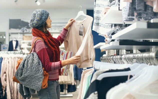
Say you’re a store manager and want to promote a sale. Perhaps you are selling a certain sweater that usually retails at $50 for only $30. While you might be tempted to put the $30 sale price in big, bold letters, research says that the size of your sale price should actually be smaller than the regular price.
How come? The reason is that, unconsciously, our brains associate a smaller font with a lower price. Researchers call this “magnitude representation congruency.” A 2005 study by professors from Clark University and the University of Connecticut found that, compared to shoppers who see a sale price in large font, people who see the same sale price in a smaller font are more likely to buy the item.[8]
2 Using Lots Of Adjectives
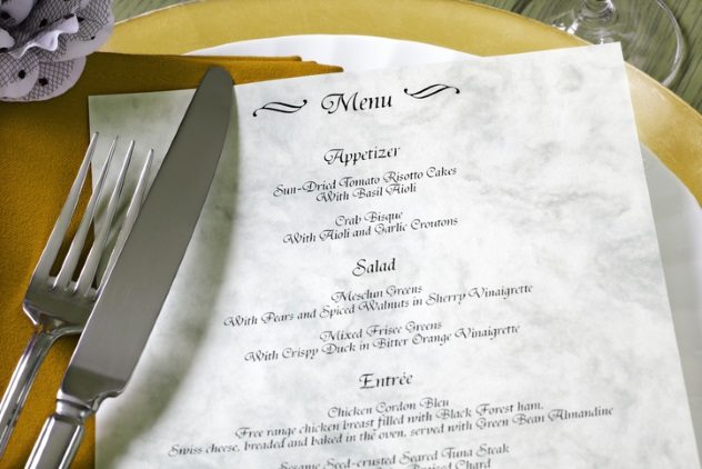
There are two types of menus at restaurants: ones that simply list the food and ones that describe it in detail. Think “steak taco” versus “authentic carne asada taco with fresh cilantro, onion, and lime, wrapped in a handmade corn tortilla, garnished with an avocado salsa.”
Restaurateurs aren’t writing these descriptions just so you know what you’re eating; they help their bottom line. According to research from Cornell University and the University of Illinois at Urbana-Champaign, these types of menus raised sales by 27 percent, compared to those without descriptions.
Interestingly, one of the most effective ways to describe menu items and boost sales was to tell diners the brands of ingredients being used (e.g. Jack Daniels whiskey sauce rather than plain old whiskey sauce).[9]
1 Staring At Your Kids

We all know kids love sugar. But there might be a more surreptitious reason your children are cuckoo for Cocoa Puffs. A 2014 study by researchers at Cornell University and the Harvard T.H. Chan School of Public Health looked at 65 different cereals in ten different grocery stores. They examined their position on the store’s shelves and found that cereal marketed at children is placed on shelves just above children’s eye level.
But why not at eye level? Here comes the real kicker: They found that the “average angle of the gaze of cereal spokes-characters on cereal boxes marketed to kids is downward at 9.6 degrees,” giving kids the impression that their favorite cereal character is staring right at them.[10]
The researchers followed up with a second study and determined that participants were 28 percent more likely to like a cereal if the character on the box made eye contact with them.
Oscar is a Master of Public Policy candidate at the University of Oxford in the UK. He is originally from Los Angeles, California.
Read more about tricks businesses use to get your money on 10 Tricks Casinos Use On You and 10 Ways Car Dealers Make Money Off You.

