 History
History
History  Animals
 10 of the Most Gluttonous Animals
 Music
Music 10 Women Who Changed Rock and Metal Forever
 Misconceptions
 10 Things That Exist (But Not in the Way You Think)
 Movies and TV
 10 Film Franchises That Never Fixed Their Biggest Problems
 Technology
 10 of History’s Most Expensive Megaprojects
 Mysteries
 10 Secrets That Vanished with the Last Person Who Knew Them
 Weird Stuff
 10 Historical Status Symbols That Seem Absurd Today
 History
 10 Speeches That Helped Push Nations Into War
 Politics
 10 Wild Campaign Promises That Became Political Legends
History 10 Cold War Spies Who Feared Nothing
Animals 10 of the Most Gluttonous Animals
Music 10 Women Who Changed Rock and Metal Forever
Who's Behind Listverse?

Jamie Frater
Head Editor
Jamie founded Listverse due to an insatiable desire to share fascinating, obscure, and bizarre facts. He has been a guest speaker on numerous national radio and television stations and is a five time published author.
More About Us
Misconceptions 10 Things That Exist (But Not in the Way You Think)
Movies and TV 10 Film Franchises That Never Fixed Their Biggest Problems
Technology 10 of History’s Most Expensive Megaprojects
Mysteries 10 Secrets That Vanished with the Last Person Who Knew Them
Weird Stuff 10 Historical Status Symbols That Seem Absurd Today
History 10 Speeches That Helped Push Nations Into War
Politics 10 Wild Campaign Promises That Became Political Legends
10 Intriguing Backstories Behind Common Symbols
We’re surrounded by symbols that we seem to instinctively understand but rarely question where they originally came from. Often, the history of common symbols is more convoluted than we might think.
10 Heart Symbol

The heart symbol shape has been found in Cro-Magnon pictograms from the last ice age, but it probably didn’t gain its modern meaning until the Middle Ages. Some contend that it was based on the seedpod of the silphium plant, a North African plant that was a popular form of birth control until it went extinct. The city-state of Cyrene even minted coins with the image of the seedpod, which closely resembled the heart shape. This may have helped associate the image with sex and love.
Others claim a more divine inspiration, holding the modern heart symbol as descended from the medieval symbol of the Sacred Heart, which represented the sacrifice of Jesus Christ and was often shown covered in wounds. The Catholic Church teaches that the symbol was revealed in a vision to Saint Margaret Mary Alocoque in the 17th century, where it appeared surrounded by thorns. Historians point out that the symbol was known and used much earlier than the 1600s.
Still others believe that the symbol was based on ill-conceived notions of the human heart, which they saw as an organ with three chambers, a round top, and a pointy bottom. It was believed to hold human passions. Attempts to draw this notion of the heart may have become widespread in medieval iconography and paintings, only to be later co-opted by the emergence of Valentine’s Day in 17th-century England.
9 Dollar Sign

What is almost universally recognized as the dollar sign was actually a sign for the peso. The domination of ore mining in Central and South America allowed the Spanish peso de ocho to become a truly international currency. It supplanted the older Bohemian thaler coins in popularity, although that coin influenced the development of other Germanic words for heavy silver coins, such as the Slovenian “taler,” Dutch daalder, and the English word “dollar.”
However, the Spanish peso was what ended up adopted into trade in Europe, the Americas, and the Far East. Merchants substituted the word “pesos” with the abbreviation “Ps,” the letters of which were later written superimposed on top of one another. By the 1770s, the shorthand form of the old “PS” abbreviation was written as “$,” which was then adopted by the new United States to symbolize their currency.
There are a number of other proposed theories about the origin of the dollar sign. Ayn Rand claimed that it was a superimposition of the letters “U” and “S” and was also a symbol for the nation, a free economy, and a free mind. Others say it was linked to the monogram used by the rich Potosi silver mines, “PTSI.” Still others claim it was linked to the Portuguese cifrao symbol, the British shilling, or to the Spanish words for “slave” and “nail.”
8 Arrow Symbol
![]()
The use of the arrow symbol to denote direction was preceded by the ancient Greek footprint and the medieval pointing finger. The former can be seen in the ancient Greek city of Ephesus, where a footprint and a woman’s face carved into the pavement signify the direction to a local brothel. The extended finger was used in medieval signage and early printed texts, where they were sometimes referred to as printer’s fists, pointers, or manicules. These are believed by some to trace back to the 12th century, becoming popular in Italy in the 14th and 15th centuries.
The arrow was not adopted as a form of pictorial instruction until the 18th century, and even then, early arrows retained a visible arrowhead and shaft. They first appeared in engineering treatises and cartographic maps showing the flow of rivers. The arrows’ fletching wasn’t lost until the 19th century, when the symbolized arrow began to appear on maps. The stylized arrowhead gave way to more abstract triangles or oblique lines meeting in a point. By the 20th century, the arrow had became an entirely abstract symbol with its incorporation into logic and math sets.
7 Mathematical Signs
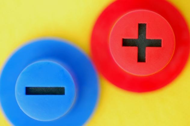
The symbols for addition and subtraction first emerged in the 15th century. The “+” sign seems to have been one of many ways that the Latin word et, meaning “and,” was abbreviated. The ancient Greeks had used the letter “psi” for addition (or sometimes simply juxtaposition), while the Hindus used the word yu, and the ancient Egyptians used a pair of legs walking forward to denote addition or walking away to denote subtraction. Early 15th-century Europeans were using the letters “p” and “m” for “plus” and “minus” (then called “piu” and “memo”), but the first use of “+” to mean et was probably by the astronomer Nicole d’Oresme in the 14th century.
The “–” sign may have originated from merchants’ notation when cargo was unloaded from ships, or it may have simply have been a shorthand way of denoting the letter “m,” which often had a line over it when indicating subtraction. Interestingly, the modern division sign was originally used to denote subtraction by northern European mathematicians and may have originated from notation used on manuscripts to mark passages suspected of being corrupt or incorrect.
It wasn’t until the late 16th century that these symbols were commonly used in mathematics. Johann Widman and Vander Hoecke, two 15th-century mathematicians, used them. They were apparently introduced into English notation by Robert Recorde in 1557, who said, “There be other 2 signes in often use of which the first is made thus + and betokeneth more: the other is thus made — and betokeneth lesse.”
6 Asterisk And Dagger
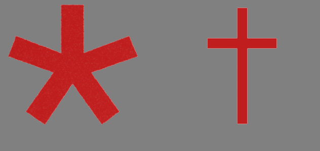
Now exceedingly more popular due to its usage on the Internet, the asterisk was once much more rarely seen and was associated with a subordinate symbol known as the dagger. Both were traditionally used in footnotes, indicated dates of birth and death in European typography, and also indicated long and short pauses in Gregorian chant notation. Some claim that the ultimate origins of the asterisk can be traced back 5,000 years to ancient Sumeria, where the cuneiform symbol dingir or an represented “heaven” or “divinity,” Others, however, consider this connection dubious at best.
More reliable history ties the asterisk and dagger to the Library of Alexandria, which was attached to a larger center of learning called the Mouseion. At the time, an Athenian official named Peisistratus had offered to pay by the line for Homeric verse, much of which had been lost. Much of what was submitted was fraudulent Homer invented by hucksters. A grammarian at the Mouseion named Zenodotus of Ephesus was in charge of reviewing the body of work and removing fake verses, which he annotated with a single line in the margin.
Zenodotus’s line was named “obelus,” Greek for “roasting spit,” which would later evolve into the dagger symbol. The asterisk came later, invented by another Alexandrian scholar, Aristarchus of Samothrace, who was charged with editing Zenodotus’s work. He invented several new symbols, such as the simple angled diple to mark noteworthy passages and the spotted diple, which marked passages over which he disagreed with Zenodotus. He paired the obelus with a star-like glyph he called asterikos, or “little star,” which denoted passages which had been mistakenly duplicated or misplaced.
These symbols would also be adopted by the early Christians, particularly Origen, who used variations on the symbols when trying to reconcile the original Hebrew Old Testament, or Pentateuch, with the first Greek translation. Various permutations of these symbols would be passed down throughout Christian scholarship, though their precise shape and meaning shifted and evolved over time.
5 Exit Signs

There are two major competing standards for exit signs in use around the world. The United States uses the word “EXIT” in bold, red type, which is considered appropriate for its high visibility and bombastic nature, using a color usually associated with danger. However, much of the rest of the world uses a pictogram of a running man leaving through a door in green, which is readily understandable to people of any language and background and uses a color traditionally associated with safety.
The US sign has its origins in the 1911 Triangle Shirtwaist Fire, in which 146 workers were killed in a Manhattan garment factory. This encouraged the National Fire Protection Association (NFPA) to begin to promote the concept of “life safety,” meaning the importance of getting people out of burning buildings. They developed the criteria for emergency exit signage during the 1930s and 1940s, experimenting with different sizes and stroke widths for lettering until establishing a standard. According to Robert Solomon of the NFPA’s Building Fire Protection and Life Safety departments, an English word was chosen over a symbol because, “The U.S. was more parochial then.”
Over the next few decades, however, graphical symbols came into vogue. A Japanese fire safety association ran a competition for a new national emergency exit sign, receiving 3,300 entries. It was won by designer Yukio Ota with his running man image, which was then tweaked and evaluated. The angle of the leg was even changed because it looked like he was sprinting, and they wanted to encourage people to run slowly in an emergency situation.
Meanwhile, the International Organization for Standardization was developing a new set of international standards to be applied to ease world trade, and the Japanese government submitted Ota’s design for evaluation. The Japanese design beat out a very similar Soviet proposal, which differed largely in the presence of a door on the pictographic exit.
Though it has since been widely adopted around the world, its acceptance in the US has been slow. Much of this is due to cultural recognition and inertia, though there also hasn’t been a pressing need for it. NFPA fire investigations have never reported a situation where someone didn’t know what the exit sign was. It was only when signage wasn’t posted at all that people ever had difficulty locating exits.
4 Radiation Symbol
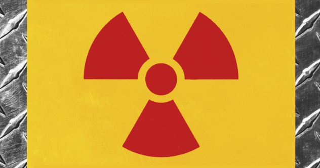
The now universally recognized radiation symbol was first invented in 1946 by a team working at University of California at Berkeley’s radiation laboratory. The team was led by Nels Garden, who was quoted as saying, “A number of people in the group took an interest in suggesting different motifs, and the one arousing the most interest was a design which was supposed to represent activity radiating from an atom.” However, the actual reasons the symbol was chosen are unknown.
The theory went that if it represented an atom, then the central circle represented a radiation source, and the three blades represented alpha, beta, and gamma radiation, respectively. It may also have been inspired by a symbol used at the naval dry dock near Berkeley which warned against spinning propellers, or it may have been adapted from a pre-1947 radiation symbol consisting of a red dot with red lightning bolts radiating outward, similar to electrical hazard symbols. Another fringe possibility is that the symbol may have been influenced by the Japanese battle flag, which would have been familiar on the West Coast.
The first signs had the shape printed in magenta on a blue background. Garden believed that magenta was appropriate because, “It was distinctive and did not conflict with any color code that we were familiar with. Another factor in its favor was its cost. [ . . . ] The high cost will deter others from using this color promiscuously.” As for the blue background, Garden preferred it because the color was rarely used in settings where radiation work was carried out.
While many workers thought blue was inappropriate since it was rarely used on warning signs, Garden believed yellow was too commonly used, as it was so highly visible. In 1948, experiments with color combinations at the Oak Ridge National Lab led to the standardization of magenta on yellow. There were design variations for a few years until the modern incarnation was regulated. The substitution of black for magenta was also permitted, which is more commonly done outside of the United States.
3 Stop Signs

In the early days of automobiles in the US, there was precious little signage on the roads, and there was anarchic competition between cars, horses, and bicycles. The first stop sign appeared in Detroit, Michigan, in 1915, the same year that the first electric traffic signal appeared in Cleveland. The first stop sign was a simple 0.6-meter (2 ft) square sheet of metal with black lettering on a white background.
In 1923, the Mississippi Valley Association of State Highway Departments developed a set of guidelines for signage design based on levels of danger. The logic was that the more sides there were on a sign, the more potentially hazardous the situation was. The circle, with infinite sides, was used for railway crossings, and the octagon was designated for the second-highest level of danger. Diamonds, meanwhile, were for warning signs, with rectangles used for purely information signs. According to Texas A&M University Civil Engineering Professor Gene Hawkins, “You have to realize this was done by engineers, and engineers can be overly analytical.”
The first octagonal stop signs still had a white background, which was later changed to yellow. In 1935, the Manual on Uniform Traffic Control Devices for Streets and Highways defined the stop sign as a 0.6-meter (2 ft) octagon with a yellow background and red or black letters. This was changed in a 1954 revision that was developing a color code system for both railways and roads. Hawkins explains, “Red has always been associated with stop. The problem was they could not produce a reflective material in red that would last. It just was not durable until companies came up with a product in the late ’40s, early ’50s.” Further revisions of the Manual in 1978, 1988, and 2000 retained the iconic shape, which is now commonly recognized worldwide.
2 Male And Female Symbols

The standard explanation for the male and female symbols is that they were derived from Greek mythology, namely the Shield of Mars and the Mirror of Venus, items traditionally associated with the male and female genders, respectively. However, there is little evidence linking those particular objects to the current symbols, and the actual history is far more complex than that.
In ancient astrology and alchemy, various celestial objects were associated with different Earth metals. The Sun, the Moon, Mars, Mercury, Venus, Jupiter, and Saturn respectively corresponded with gold, silver, iron, mercury or quicksilver, copper, tin, and lead. This was the system learned by 18th-century botanist Carl Linnaeus, who was born before the development of the modern system of chemical notation using a letter or letters taken from the Greek or Latin names of the elements, which was developed in 1814. Before this, chemists often used the same symbols that medieval alchemists had used.
Linnaeus decided to borrow the chemical system for his botanical notation as a crude form of shorthand. He first used the symbols formally in a 1756 dissertation on hybrid plants and then later in his work Species Plantarum. He used the old astrological and alchemical symbols for Saturn, Jupiter, Mars, and the Sun to represent woody, herbaceous perennial, biennial, and annual plants and the symbols for Mars, Venus, and Mercury to represent male, female, and hermaphroditic conditions.
Soon, other botanists and zoologists adopted the use of these symbols, as they were convenient and easy to remember. Various attempts to link the symbols to pictographs, runes, and Babylonian astrological symbols have not panned out, and they are largely believed to be truncated forms of works in the early Greek script. The female symbol is derived from the goddess Phosphorus (associated with the planet Venus but not the Roman goddess) and the male symbol from the planet Thouros (the planet Mars but not the Roman god).
1 Question Mark

There are a number of contending explanations for the question mark, which was once called the interrogation point. The most popular explanation is that it derived from the Latin word quaestio, or “inquiry,” which was written in shorthand as “qo” and eventually became the mark we use today. Others believe the question mark could have derived from a neume used in medieval musical notation called the punctus interruptus, which indicated the intonation at the end of a question. Some even believe that it came from Egypt and was derived from the appearance of a cat’s tail.
Others believe that the English scholar Alcuin of York developed the first question mark while he was working at Charlemagne’s court and developing a new system of punctuation. His question mark resembled a point with a tilde above it and became widely accepted by the ninth century.
The most recent theory was proposed in 2011 based on fifth-century Syriac manuscripts of the Bible, which are known for their liberal use of dots with unclear meaning. Cambridge University’s Dr. Chip Coakley believes that one of these, the zagwa elaya, or “vertical double dot,” is placed above certain questions that are not immediately obvious as questions. For example, “What are you doing?” is still obviously a question with a mark, but “You’re leaving?” would become a statement without it. While it is likely that the question marks used in later Greek and Latin script were an independent invention, if Coakley is correct, the zagwa elaya is the earliest known question mark in history.
David Tormsen is symbolized by a slightly imperfect hypercube. Email him at [email protected].
More Great Lists
 Top 10 Bloody Histories Behind Common Surgeries
 10 Heartbreaking Backstories Of Famous Sideshow Freaks
 10 Calm Photographs With Awful Backstories
 10 Rare Artifacts With Fascinating Backstories
 10 Most Haunted Buildings In New York City And Their…
 10 Iconic Mascots And Their Surprising Backstories
 10 Cereals With Strange And Interesting Backstories
 10 Rude-Sounding British Places With Unbelievable…
 10 Haunting Images Of The Chernobyl Disaster And…
fact checked by
Jamie Frater
More Great Lists