 Mysteries
Mysteries
Mysteries  History
 10 Surprising Stories About the Texas Rangers
 Humans
 10 Philosophers Who Were Driven Mad by Their Own Theories
 Miscellaneous
 10 Video-Game-Worthy Weapons and Armors from History
 Weird Stuff
 10 Psychics Who Accurately Predicted Wartime Events
 The Arts
 10 Pieces of Art Inspired by a Broken Heart
 Health
 10 Science Fiction-Sounding New Medical Treatments
 History
 10 Surprising Facts About the Father of Submarine Warfare
 Space
Space Ten Astonishing New Insights into Alien Worlds
 Weird Stuff
 10 Bizarre Summer Solstice Rituals Still Practiced Today
Mysteries Top 10 Haunting Facts About the Ghost Ship MV Alta
History 10 Surprising Stories About the Texas Rangers
Humans 10 Philosophers Who Were Driven Mad by Their Own Theories
Who's Behind Listverse?

Jamie Frater
Head Editor
Jamie founded Listverse due to an insatiable desire to share fascinating, obscure, and bizarre facts. He has been a guest speaker on numerous national radio and television stations and is a five time published author.
More About Us
Miscellaneous 10 Video-Game-Worthy Weapons and Armors from History
Weird Stuff 10 Psychics Who Accurately Predicted Wartime Events
The Arts 10 Pieces of Art Inspired by a Broken Heart
Health 10 Science Fiction-Sounding New Medical Treatments
History 10 Surprising Facts About the Father of Submarine Warfare
Space Ten Astonishing New Insights into Alien Worlds
Weird Stuff 10 Bizarre Summer Solstice Rituals Still Practiced Today
10 Moments That Changed Color Forever
Color is all around us—the red of a traffic light, the blue of a summer sky. So much so, in fact, that we often forget about it. We certainly don’t think of color as having a history or as being different from how we experience it right now. But color hasn’t always been how it is today.
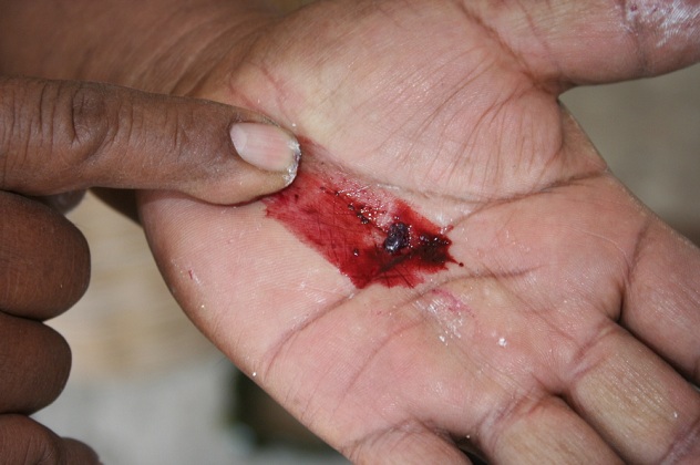
10 The Urine Wheel
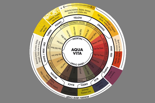
Usually urine is one color. That color is yellow—at least mine is and I hope yours is, too. But sometimes, for a variety of reasons, that color can change.
In the Middle Ages and the Renaissance, doctors thought that a patient’s maladies could be diagnosed by comparing the color of their urine to a chart that would illustrate what was wrong. They also would taste (yup!) and smell the pee to try to solidify their conclusions. The result was the urine wheel, an early ancestor to the color wheel that is so popular in today’s art classrooms.
9 Josef Albers
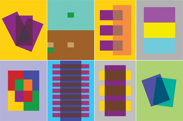
Albers (1888–1976) was a German designer and educator who was obsessed with how a color reacted with other colors. He devised exercises for his students in which they would purchase a large collection of multicolored papers. The papers would be cut and arranged next to each other to try and achieve a specific goal, like arranging colors from light to dark or trying to create an illusion of depth using only two colors.
Essentially, Albers came to believe that color wasn’t a fixed constant but changed depending on experience and what it was exposed to. Albers published these exercises and theories in his 1975 Interaction of Color, a book which is roughly the size of a suitcase and is often cited as one of the most influential art books of modern times. Recently, Interaction of Color has been published as an app for the iPad, bringing Josef’s color theories into the modern world.
8 Wittgenstein
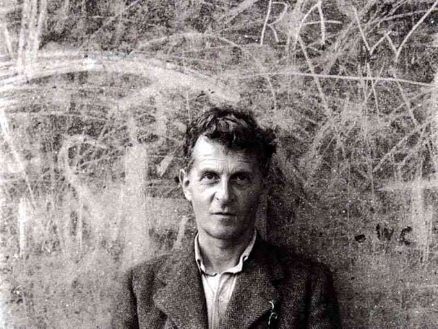
Ludwig Wittgenstein (seen creepily eyeing us in the above photo) was an Austrian-British philosopher who essentially changed the way we talk about color through language (or at least puzzle over it). His 1950 Remarks on Color was a philosophical word game that he wrote as a response to Goethe’s complex Theory of Colors (itself a brilliant work that discusses, among other things, colored shadows and the color that one sees when one presses on their eyeball).
In Remarks on Color, Wittgenstein sought to clarify Goethe’s theories, arguing that through language word games one could come to understand how color functions. Color, he theorizes, contains many problems that make it impossible to categorize as a thing at all. The result is a difficult and, at times fragmentary, work that includes several headscratchers. “Why can’t there be a transparent white?” “Why can’t there be a reddish green?” “Is white always the lightest color?”
The questions are odd enough, but perhaps even odder is that they had never really been posed before. They are “problems of color” that had long been ignored. No answer is reached, and this is perhaps because there is no real answer. Color, for Wittengstein, and maybe for us too, remains a mystery.
7 Corporate Colors
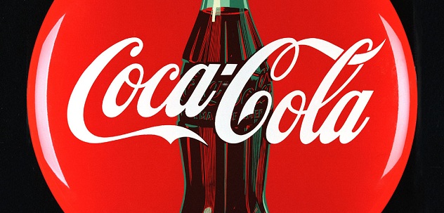
You can own a color. Well, not you, but corporations can. McDonald’s, Starbucks, Coca-Cola, and Gap all own the colors used in their logos and branding. The golden arches, Starbucks green, Coca-Cola red, and Gap navy blue can only be used by their respective companies. At first, this sounds almost absurd. How can someone own a color? However, when you think about it, it makes sense. Color becomes tied to the company’s entire identity and business strategy—why should someone else be able to use it for their own benefit? It is a perfectly legal practice and happens all around us.
Additionally, color can be tied to a corporation through advertising. “What can brown do for you?” is connected to UPS’s philosophy of fast package delivery. Likewise, PINK—all in capitals just like that—is connected to a rather expensive underwear chain.
6 Cochineal
After the discovery of the New World, Europe became fascinated with the exotic, a trend that is perfectly illustrated by the craze for cochineal. A bright red dye that was popular with the Aztecs and Mayans, cochineal was considered a precious commodity in pre-Colombian America and was given as tribute by servants of Moctezuma. The Spanish colonists were amazed by the vividness of the dye and shipped massive quantities of it across the Atlantic. It quickly became Mexico’s second most prized export, after silver.
The dye was made by crushing the cochineal beetle—yes, cochineal dye is crushed bug bits. It was smuggled, bought at insanely high prices, and faked throughout Europe until well into the early 19th century. Cochineal was recently in the news when disgruntled Starbucks customers learned that dye produced from the beetles was used to color some of the company’s red drinks (maybe that explains the brand’s unreasonably high prices).
5 Pantone
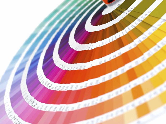
When you select a color on a computer and send it to a printer, how can you be sure that the color that prints will, in fact, be your color? The short answer is you can’t. However, the Pantone Color Matching System was created in an effort to provide a standardization for color printing.
Pantone calls itself the “authority on color” and even names a color of the year, which inundates the market in products of that color. In 2013, the color of the year is Emerald (Pantone 17-5641), a lovely vibrant green. Past colors include 2012’s Tangerine Tango (Pantone 17-1463) and 2001’s Fuchsia Rose (Pantone 17-2031). Pantone claims that the colors chosen for the year are connected to the general atmosphere of the world at the time. For example, the press release declaring Emerald this year’s color stated: “Emerald, a vivid, verdant green, enhances our sense of well-being further by inspiring insight, as well as promoting balance and harmony.” Something for all of us to hope for, certainly (assuming we weren’t already).
4 Mauve

Mauve was the first artificially created dye, and it swept the world by storm. It was discovered in 1856 by a young chemist named William Henry Perkin, who was trying to create an artificial form of quinine but instead found mauve. Mauve is an odd color to place. It is purple, but not quite. Pink, but not really. It’s both at the same time and tinged with gray and blue. To make things more complicated, Perkin’s mauve dye faded quickly, resulting in a shifting idea of what the color was in the first place.
Perkin sold his discovery to the dye industry, and mauve textiles prevailed for the next few decades. The 1890s are often referred to as the “Mauve Decade” because of the color’s popularity among the fashion-conscious. Perkin’s discovery marked a dramatic shift in the way we saw dyed textiles and color in general. Before mauve, dye was something that was rendered from base materials and could be very expensive. Because of Perkin, color could be manufactured chemically in a laboratory and became more readily available.
3 Color Film And Photography
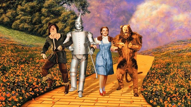
Think for a moment about The Wizard of Oz. The first section of the movie—Dorothy’s adventures in Kansas and the subsequent tornado—are in black and white. Then she opens the door, and Oz floods the screen in vibrant Technicolor. The moment is still magical. Now imagine what it must have been like in 1939, a world where photos and film were mostly black and white, because it was too expensive to produce color. The effect must have been startling—surely more awe-inspiring than our modern special effects.
Color photography had been brewing in laboratories since the mid-19th century, but didn’t really become readily available until well into the 1900s. The process was complicated and required much time and effort by the photographer. Over time, this was simplified, eventually paving the way for the camera phone that is probably in your pocket right now.
2 The Color Organ
Scriabin’s Prometheus: Poem of Fire
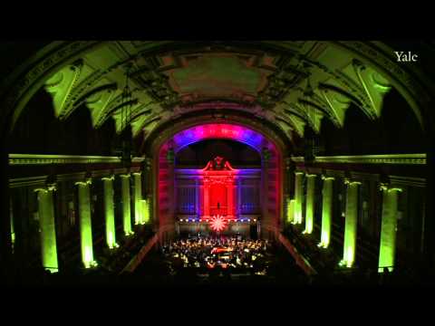
What if you could see the color of sound? People who experience synesthesia, a disorder where perception of sound, taste, and sight, are intertwined do just that. They see the color of a chirping bird and taste the flavor of Pantone Emerald. Most people, however, cannot.
But what if there was a way to convert sound to color? The color organ did just that. A musical instrument much like a regular organ, the color organ used a scale of colors which corresponded to piano keys and notes of music. When these keys would be pushed, a corresponding colored light would turn on, producing a sort of color music.
This was perhaps best utilized by early 20th-century composer Alexander Scriabin, who wrote a series of musical performances to be performed on color organ—including a symphony called “Prometheus: The Poem of Fire,” which can be seen in the video clip above.
1 Max Luscher
Do the colors you like say something about your personality? Swiss psychotherapist Max Luscher thinks so. He has produced a color test for companies to identify traits (both favorable and not so favorable) in potential employees. This was published as a book in 1971 for those interested in trying it out in their own businesses (or it also makes a great party game!). (If you want to take the test yourself, click here before we spoil it below.)
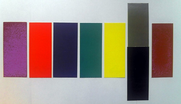
During the test, subjects are shown eight different color cards and asked to sort them into an order of preference. This order provides the diagnosis. The colors are blue, green, yellow, red, violet, brown, black, and gray. A preference for blue demonstrates calmness and tenderness, while black shows nothingness, and red indicates desire and sexuality.
Tim Betts: Artist, historian, lover of all things obscure and bizarre.
More Great Lists
 Top 10 Movies That Changed Film-Making Forever
 5 Frightening Facts About The Hollywood Forever Cemetery
 Top 10 Ways Coronavirus Will Change Your Life Forever
 Top 10 Strange Mysteries And Facts About Color
 10 Explanations For The Color Schemes Used On…
 Top 10 One-Color Paintings Worth More Than Your House
 Top 10 Little-Known Facts About Color
 10 People You've Never Heard Of Who Changed The World
 10 Bible Verses That Were Changed In Translation
fact checked by
Jamie Frater
More Great Lists