 Movies and TV
Movies and TV
Movies and TV  Misconceptions
 10 Common Misconceptions About Famous Scientists
 Creepy
 10 Prestigious Universities with Famous Ghost Stories
 History
 10 Daring Military Operations That Ended in Disaster
 Movies and TV
 10 Amazing Lost Films That Were Found Again
 History
 10 Wild Stories About America’s Most Fascinating Founding Father
 Our World
 10 Astonishingly Valuable Things Their Owners Simply Walked Away From
 Humans
 10 Disturbing Communities from the Dark Corners of the Internet
 Movies and TV
 10 Hollywood Style Choices That Backfired
 Weird Stuff
 10 Ancient Chores That Would Horrify Modern Health Inspectors
Movies and TV 10 Mind-Boggling Reasons These Blockbusters Became So Expensive
Misconceptions 10 Common Misconceptions About Famous Scientists
Creepy 10 Prestigious Universities with Famous Ghost Stories
Who's Behind Listverse?

Jamie Frater
Head Editor
Jamie founded Listverse due to an insatiable desire to share fascinating, obscure, and bizarre facts. He has been a guest speaker on numerous national radio and television stations and is a five time published author.
More About Us
History 10 Daring Military Operations That Ended in Disaster
Movies and TV 10 Amazing Lost Films That Were Found Again
History 10 Wild Stories About America’s Most Fascinating Founding Father
Our World 10 Astonishingly Valuable Things Their Owners Simply Walked Away From
Humans 10 Disturbing Communities from the Dark Corners of the Internet
Movies and TV 10 Hollywood Style Choices That Backfired
Weird Stuff 10 Ancient Chores That Would Horrify Modern Health Inspectors
10 Fascinating Maps That Will Change How You See The United States
Roughly half our readers call the United States home. To the rest, it’s a deeply familiar presence from pop culture. Yet even a land as extensively filmed, written about, and lived in as the US is capable of surprises. For all we may think we know the third most populous country on Earth, it turns out that America—and Americans—are infinitely stranger and more interesting than we’d ever have suspected. Here are 10 fascinating maps that show how and why.
10 US Defense Spending is Insane

Image credit: Bank of America via Vox
It’s common knowledge that the United States spends a lot on defense, but most of us are probably unaware of its true extent. According to this map from Bank of America’s “Transforming World” atlas, US military spending comfortably dwarfs that of the rest of the world’s nations combined.
In case it isn’t quite clear, the map above gives each country a total area based on their defense budgets in billions of dollars. That small circle at the top of the US represents Canada’s spending, while the smaller one below represents Mexico’s. Almost all of South America except for Brazil and pretty much all of Africa spend so little that each country is barely a pinprick. The US, by contrast, is represented as a gigantic beach ball of a nation.
Aside from visualizing how insanely out of proportion US defense spending is, it also shows how much the country dominates the globe militarily. Of all the other high-spending nations, only two, Russia and China, wouldn’t traditionally be classed as US allies (India and Saudi Arabia might come somewhere in the middle). If we assume the nations of Europe, plus Australia, Japan, and South Korea, are all working to project a similar ideology to the US, then the country’s military allies essentially dominate the entire globe.
9 The Most Racist Parts Of The US Aren’t Where You Think
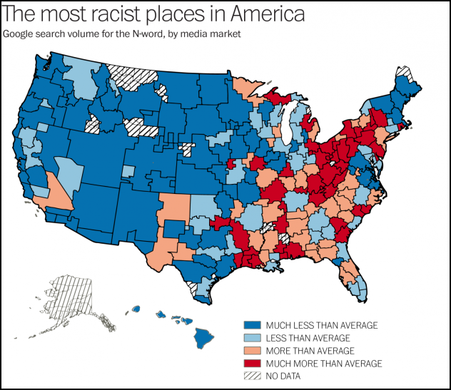
Image credit: Seth Stephens-Davidowitz via The Washington Post
When talking about racism in the US, many people automatically think of the Deep South. Former Confederate states have an unfavorable reputation as far as race relations are concerned. But one study published in PLOS ONE disagrees. As the map above shows, the Appalachian region, extending into the Northeast, may be the most racist of all.
The map’s conclusions are drawn from methodology pioneered by data scientist Seth Stephens-Davidowitz. In an older paper, he tracked how frequently people searched Google for a certain n-word to make predictions about how race affected President Obama’s re-election chances. The authors of this paper did the same, focusing their search by region and eliminating variations on the word that are more associated with gangster rap. While not everyone searching for the n-word is automatically a racist, it makes sense that the sheer volume of data that Google has might highlight general trends. You can see the results above.
What’s surprising here is how strangely racism seems to be distributed. Ohio, Vermont, and Michigan’s Upper Peninsula suffer badly, while Florida and Texas barely register. East of Texas, the number of searches for the n-word is almost always much less than average. Most notably, the red-highlighted areas coincide with regions that have a higher mortality rate among black people—8.2 percent higher on average. This suggests that perhaps the map isn’t very far off from the truth.
8 Individual US States Are Richer Than Most Countries
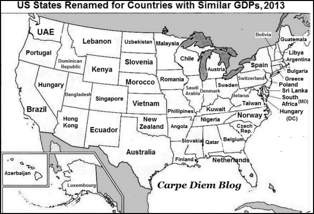
Image credit: Carpe Diem via The Washington Post
The US has by far the highest GDP of any nation on Earth, with only China really coming close. In terms of GDP per capita, the US is also very near the top, behind only wealthy micro-nations like Luxembourg and oil-rich states like Qatar. In short, the US is rich, but you might not know exactly how rich. The country is so rich that even individual states have larger GDPs than most countries.
The map above shows what countries each state would be based on its GDP. The results are jaw-dropping. California has an economy roughly comparable to Brazil’s, while Texas is on a par with Australia. North Carolina matches Norway, Pennsylvania is Switzerland, and Alaska is Luxembourg. Tiny Rhode Island is turning over as much as all of Bulgaria.
Even super-rich Middle Eastern kingdoms can’t compete against single US states. Saudi Arabia’s GDP is only the size of Illinois’s, while Qatar only breaks even with Alabama’s. All of this shows just how stunningly wealthy the US is. Although the figures are from 2013, there’s no doubt that the country still outstrips everywhere else on Earth for GDP. After China, the country with the next highest GDP in 2014 was Japan. Their economy was worth over $12 billion less than the US.
7 The US Housing Market Is Crazy
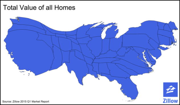
Image credit: Zillow via Vox
It’s a well-established fact that the housing market in New York City is crazy. The cost of an apartment is frequently so far out of whack with average wages that it gives you a headache just thinking about it. It’s one thing to simply think about it and another to actually see it. This map by Zillow aims to show just how distorted the housing market is by having each state’s size reflect the value of its housing stock.
The result is a geographical whirlwind that shows just how lopsided house prices have become. While it’s no surprise that densely populated California should be biggest, it’s astonishing to see just how tiny Texas is. Despite being the second-largest state by population, as well as one of the richest, Texas’s housing is worth about the same as New York’s. This is thanks to the overwhelming concentration of extremely expensive property in Manhattan, parts of Queens, and Long Island. Even Florida is bigger than it should be, thanks to all those expensive beachfront retirement properties.
You could play endless games comparing different regions of the US on this map, but there’s no denying its central message: The housing market in some regions has gone crazy. We all know how well that usually ends.
6 How The US Would Look If States Were Redrawn To Have Equal Populations
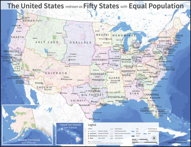
Image credit: Neil Freeman
Most of America’s population is concentrated in the major cities on the coasts or in the South. Texas has a larger population than Australia, while more people come from New York state than are in the Netherlands. By contrast, Glasgow is as populated as the entire (rather empty) state of Wyoming. These discrepancies have led some to wonder what the US would look like if states were redrawn to give all 50 an equal population. The example above, by Neil Freeman, will change the way you look at each state forever.
A huge chunk of the western United States is taken up by a mere three states, which Freeman has chosen to rename Salt Lake, Shiprock, and Ogallala. Meanwhile, California, Texas, and the eastern US have disintegrated into a whirling mishmash of competing boundaries. Michigan alone has become the states of Detroit, Menominee, and Firelands (the last two shared with other states), while Florida has split into Canaveral, Tampa Bay, and part of King. Washington state (now renamed Rainier), on the other hand, has absorbed all of Alaska.
Freeman has a serious political point to make with this, about how the state-based electoral college gives undue weight to some people’s votes while sidelining others. Even if that aspect doesn’t interest you, it’s still a fascinating depiction of a US that will never exist.
5 US Immigration Isn’t What You Might Believe
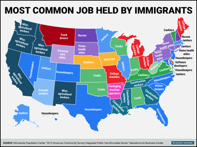
Image credit: Business Insider
Whether Americans like it or not, immigration is a fact of modern life. Across the states, people born in other countries are filling millions of jobs. Pop culture (and lazy stereotyping) would suggest these are solely menial jobs that others would rather not do. When they crunched the numbers, Business Insider found something different. The typical jobs done by immigrants vary wildly depending on what state they’re in.
As this map shows, different states need foreigners for vastly different things. In the West and South, immigrants tend to do manual labor jobs such as agricultural work or construction, with some housekeeping thrown in for good measure. Go north, and things start changing. At least five states have immigrants mostly taking up work as cooks. Another four have them working as college teachers. A full seven states rely on immigrants to work as nurses, home health aides, or personal health aides—a hugely vital profession. In Delaware, the most likely job for an immigrant to have is working as a software developer.
4 US Counties Have Been Ranked by Beauty
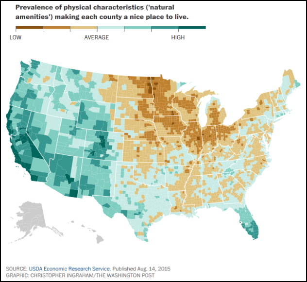
Image credit: The Washington Post
If you’re living in the US, do us a favor. Go to your window and take a look at what your county has to offer. Do you find it boring, hideous, or beautiful? Well, we’ve got some weird news for you: Your opinion doesn’t count for squat. In the 1990s, the federal government objectively ranked each county in the continental United States in terms of natural beauty.
The map above shows the results. The dark green blocks represent what the government considers to be the most beautiful counties (or the “highest in natural amenities,” as they put it), while the dark yellow ones represent the worst. The criteria excluded human activity and emphasized “the physical characteristics of a county area that enhance the location as a place to live.” According to the report, the authors think Ventura County, California, is the best-looking place in the whole country. By contrast, Red Lake County, Minnesota, is considered the bastard love child of Quasimodo and the Elephant Man.
To be absolutely clear, these rankings are objectively ridiculous. It took less than three seconds on Google to find this rather fetching picture of Red Lake County. (Two of those seconds were spent looking at cat gifs.) But it sure is fascinating to see how the federal government perceives your home area. As The Washington Post pointed out, the fact that DC doesn’t rank at the very bottom suggests that some bias might be creeping in.
3 The US Is A Nation Of Goats
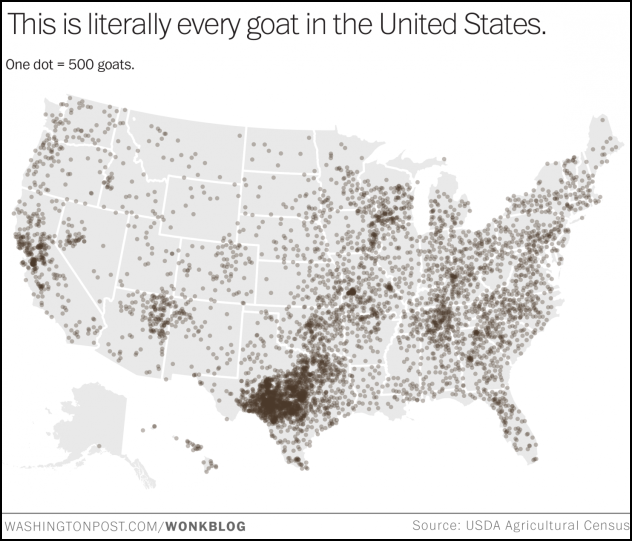
Image credit: The Washington Post
Have you ever wondered to yourself just where the United States keeps all its goats? If so, The Washington Post’s Wonkblog has you covered. In January 2015, they produced this map showing the location of every single goat in the US. The results were unexpectedly fascinating.
In 2012, the US Department of Agriculture did a census of every goat in the country. They found there were over 2.6 million goats living in the nation. That means if the goats were given their own state, it would be more populous than Wyoming, Vermont, North Dakota, and Washington, DC, combined.
Did we say “if”? According to the data, the goats already have their own state, and it’s called Texas. It has the highest concentration of goats of any state. Of the 21 counties in the US where goats outnumber people, only one of them isn’t in the Lone Star State. In Edwards County, there are 22 goats for every single Texan.
That doesn’t let the other states off the hook. Of the nation’s 3,143 counties, 2,996 are home to commercial goat farms. Only Alaska seems sufficiently not enamored by goats to keep the blighters at arm’s length. Combine this with the 3.2 million videos on YouTube dedicated to Capra aegagrus hircus, and it becomes clear that the US is a nation of goats.
2 The US Is Far Whiter Than You Think
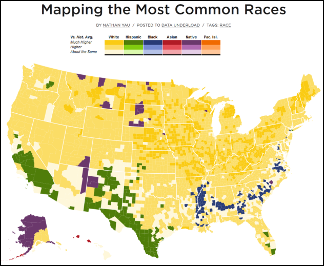
Image credit: Nathan Yau
The US is built on immigration. It’s the largest refugee-taking nation in the world. It has a historic indigenous population, a significant black population, and a president who is half Kenyan. It would be fair to call the United States one of the most multicultural societies on Earth. However, doing so masks an undeniable reality. The US is still utterly, overwhelmingly white.
In a series of maps for his Flowing Data blog, Nathan Yau used US Census data to map the distribution of different races at a county level throughout the United States. His survey of Asians found a few pockets in California and some isolated groupings elsewhere. His survey of blacks found a large clustering in the South, and very few groupings elsewhere. Whites, on the other hand, dominated the whole map.
With the exception of Indian reservations, white people formed the vast majority of the population in almost every county outside the Deep South. This included Latinos (who aren’t considered a separate racial group by the Census), but an alternative map separating out those who identify primarily as either category shows it really doesn’t make much of a difference.
This won’t come as a surprise to anyone who knows the Census figures. Non-Latino whites still make up around two-thirds of the US population. The US is much whiter than most people imagine, whether they’re pro- or anti-immigration.
1 San Francisco Is Full Of Human Poop
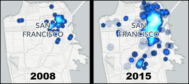
Image credit: William via Vox
Sometimes it takes a really great piece of data visualization to help us grasp an important point—a point so fundamental that it needs to be understood by as many people as humanly possible. Such a point is knowing that San Francisco is being utterly overwhelmed by a tidal wave of human poop.
In October 2015, a data visualizer known simply as “William” developed an animated map collecting all reports of human poop in the city. The map begins in summer 2008 and ends in summer 2015. The more reports of poop, the bigger and bluer the circles get. What he uncovered was an out of control pooping epidemic.
In the last seven years, people dropping a log on the streets of San Francisco has gone from disappointingly frequent to completely off the chart. While the map’s start records a few clusters around the downtown area, by the time we hit 2015, half the city is lost under an avalanche of human waste.
To give you an idea of how bad things are getting, in 2012, a city escalator became so clogged with poop that it stopped working, and a hazardous waste materials team had to be called. The number of people pooping in the city has since gotten worse. San Francisco may have swept the boards on the government’s natural beauty rankings above, but we’re betting no one in Red Lake County, Minnesota, is spending their spare time pooping on escalators.
More Great Lists
 8 Maps That Will Change How You See The World
 Top 10 Bizarre Facts That Will Change How You See Dinosaurs
 10 Small Towns In The United States Known For Weird Things
 10 Freakiest Modern Monsters Found In The United States
 10 UFO Incidents Over Air Force Bases In The United States
 9 Comedians Who Ran For President Of The United States
 8 Reasons The British Crown Still Controls The United States
 10 Weird States And Forms Of Water You Never Knew Existed
 10 Historical Facts That Will Change How You Think…
fact checked by
Jamie Frater
More Great Lists