 Mysteries
Mysteries
Mysteries  History
 10 Surprising Stories About the Texas Rangers
 Humans
 10 Philosophers Who Were Driven Mad by Their Own Theories
 Miscellaneous
 10 Video-Game-Worthy Weapons and Armors from History
 Weird Stuff
 10 Psychics Who Accurately Predicted Wartime Events
 The Arts
 10 Pieces of Art Inspired by a Broken Heart
 Health
 10 Science Fiction-Sounding New Medical Treatments
 History
 10 Surprising Facts About the Father of Submarine Warfare
 Space
Space Ten Astonishing New Insights into Alien Worlds
 Weird Stuff
 10 Bizarre Summer Solstice Rituals Still Practiced Today
Mysteries Top 10 Haunting Facts About the Ghost Ship MV Alta
History 10 Surprising Stories About the Texas Rangers
Humans 10 Philosophers Who Were Driven Mad by Their Own Theories
Who's Behind Listverse?

Jamie Frater
Head Editor
Jamie founded Listverse due to an insatiable desire to share fascinating, obscure, and bizarre facts. He has been a guest speaker on numerous national radio and television stations and is a five time published author.
More About Us
Miscellaneous 10 Video-Game-Worthy Weapons and Armors from History
Weird Stuff 10 Psychics Who Accurately Predicted Wartime Events
The Arts 10 Pieces of Art Inspired by a Broken Heart
Health 10 Science Fiction-Sounding New Medical Treatments
History 10 Surprising Facts About the Father of Submarine Warfare
Space Ten Astonishing New Insights into Alien Worlds
Weird Stuff 10 Bizarre Summer Solstice Rituals Still Practiced Today
8 Maps That Will Change How You See The World
Regardless of where you are in the world, chances are that your mental image of the world is largely the same as everyone else’s (unless your high school geography curriculum was wildly different from others’). Of course, we know much more about our immediate surroundings – like our own country, its neighboring states etc. – than other places, though our overall perception of the world is similar to each other’s.
See Also: 10 Ways You’re Picturing The World Incorrectly
As it turns out, there are many inaccuracies in that perception we simply never bother to correct, mostly because they don’t directly affect us. Inaccuracies like:
8Brazil Is Bigger Than The Entire Contiguous USA
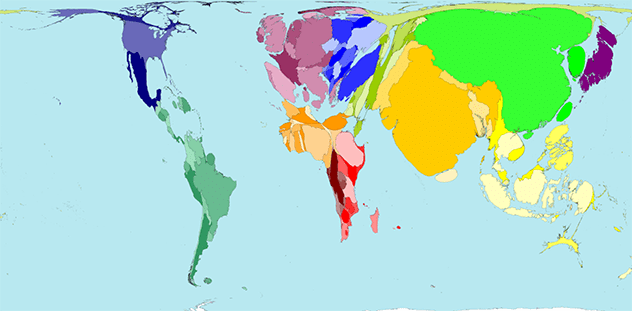
 Brazil may come across as a relatively big country by global standards, though we don’t really consider it to be anywhere near as big as the absolute behemoth that is the USA. Anyone who has driven from one American coast to the other knows that it has to be one of the biggest countries in the world (and it is!). Brazil, on the other hand, looks no bigger than any of its neighbors, let alone the USA. Just look at the map.
In reality, though, Brazil’s size isn’t just comparable to the USA, it’s also the fifth largest country in the world. If we compare it to the American mainland without its offshore territories, Brazil is actually 11% bigger. We can’t really do an east-west comparison like USA, as Brazil’s road network is far from being as extensive. Additionally, a huge chunk of the country is occupied by the Amazon, making the terrain largely inaccessible by road.[1]
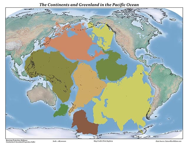
7South America Is Almost Entirely East Of North America
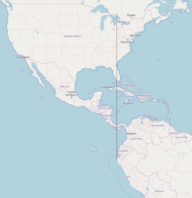
While this one may sound more America-centric than we intend, it’s not just a misconception held by Americans. Most of us – in our heads at least – place the continent of North America at a similar longitudinal position as South America. It makes sense, too, as SA looks to be almost directly below NA on most maps we see, even if it really isn’t.
The problem is the popular map we all visualize whenever we think of the world map. It’s called the Mercator’s Projection, and is only one of the many projections we have. It’s the most widely accepted, too, as almost every single country uses it for official purposes.
The problem is that the Mercator Projection isn’t just inaccurate, it also propagates outright misinformation as fact (Greenland isn’t almost as big as Africa by a HUGE margin). It’s a very Eurocentric projection of the Earth, as it massively exaggerates the size of countries in the northern hemisphere over its southern counterparts. In reality, continents in the global south are much bigger than we think they are.
That’s also the reason South America comes across to be much more compact and towards the east than it is. Apart from being much bigger than we think it is, almost the entirety of it lies east of USA – and in turn North America. Yet, maps around the world still place it more or less directly below for some reason.[2]
6 The Third Route Around The World
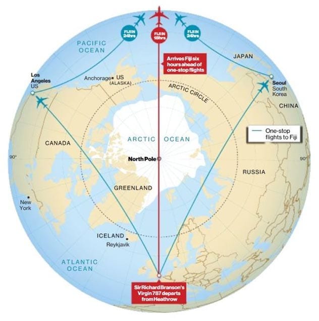
If you’re, say, in the USA and want to fly to some country on the other side of the world, chances are you’d take one of two routes. Depending on which part of the USA you’re in, it could either be across the Atlantic, or the other side via the Pacific. The latter is almost always a longer option, as the Pacific Ocean is ludicrously huge (we’ll get to that one in a bit).
If we were to ask you if there’s another, faster way to travel, the definite answer would be ‘no’. After all, if you look at the map, those two seem to be the only options, as any other possible route couldn’t possibly be shorter than these two. Right?
You see, the reason we think that is because the map is in 2D, as our brains aren’t exactly designed to intuitively convert things from 3D to a plane. If you’ve ever been lucky enough to experience it, you’d know that there’s another way around the world that may even be – depending on where you’re going—shorter than the two we know of; the one over the Arctic.
Think of the Earth as a sphere instead of a piece of paper folded in a cylinder, which is how we really perceive it. Many flights – like Cathay Pacific’s non-stop route from New York to Hong Kong – go over the Arctic, as it ends up being two hours faster than other routes. It’s also one of the most scenic routes we know of, as it gives us a rare glimpse into what the vast, unexplored wilderness of the Arctic looks like.[3]
5 Everything About Africa
In popular imagination, the Equator is seen as a neat divider between the southern and northern continents. While that’s largely true for South America and Australia – with some irregularities here and there—it couldn’t be further from the truth in the case of Africa.
If you look at the map, you’d see that most of Africa isn’t in the southern hemisphere at all, as the equator almost perfectly divides it into two parts. The northern part is still slightly bigger, though, because of the bulge on the western side of the continent.
That’s hardly the only way we’re picturing Africa wrong, though, as we tend to massively underestimate its size as well. We don’t know if it’s because of the Mercator Projection or the fact that Africa simply doesn’t figure into the regular global discourse. In reality, though, Africa is humungous. It’s bigger than China, India, the contiguous U.S. and almost all of Europe…combined. For some reason, though we still imagine it to be somewhere around the same size as the USA (or Greenland, if the maps are to be believed).[4]
4 Only A Small Part Of Iran Is A Dry, Arid Desert
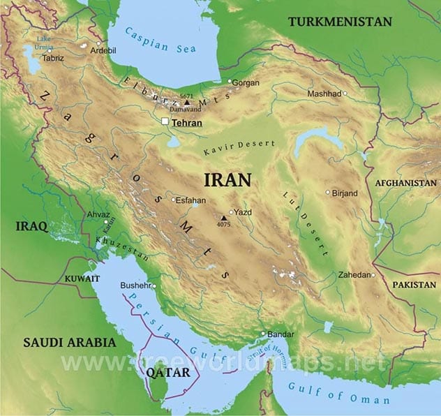
Misconceptions about the Middle East could fill up a whole list. We still perceive the vast region—with countless ethnicities, types of cuisines and ways of living—as a monolithic entity with more or less the same culture throughout. While most of us could be forgiven for that – as going there and seeing how things are for ourselves isn’t really the best course of action right now – it’s misconceptions around countries that we’ve been consistently in contact with that bother us.
Take Iran, which is still – for some reason – seen as a desert nation in popular imagination. Most of us imagine unending views of sand dunes and camel safaris to distant oases whenever we think of the country, as that’s how it’s still portrayed in the popular western media.
We’re not saying that Iran doesn’t have a desert – it does, and two of them, too – though they aren’t anywhere near as big as we think. Only about 22% of Iran could be classified as a desert. To put that in perspective, the desert makes up around 28% of China, though no one has ever referred to China as a desert nation.
The rest of Iran is actually made up of a diverse array of terrain types, like rangelands, wetlands, glaciers and tropical beaches, among others. Mountain peaks perpetually covered by snow – things we don’t expect to exist anywhere near Iran, or the Middle East—form the backdrop of daily life in Tehran, which may as well be one of the most scenic cities in the world.[5]
3 Europe Is A Lot Closer To The Arctic Than USA
Ask anyone if New York is closer to the Arctic than London, and the answer would probably be a definite yes. It stands to reason that it is, too, as its average temperature in the winters is around 10C lower than London, which must be because of its proximity to the Arctic. It’d be absolutely ridiculous to think that its counterpart in Europe would be, say, a country so much further south that a part of it lies in Asia, like Azerbaijan.
It’s not that ridiculous, though, once you actually see the map. New York is on almost the same latitude as Azerbaijan, which – as you’d have noticed – is quite far from London. Miami’s European (or more accurately, African) counterpart is somewhere in Egypt. If you horizontally fold the map, you’d find that America’s northernmost tip falls somewhere near the southernmost point in Europe.
The misconception likely arises from the abovementioned Mercator map, which distorts the size of some parts of the world to make them look bigger than the others, resulting in irregularities in the overall positions of the places.[6]
2 We Just Don’t Understand How Big The Pacific Ocean Is
Back when cartographers were first mapping the world, a lot of them took liberties in their calculations depending on various thing, like cultural prejudices, lack of better equipment, or simply not being the best at their job. Even if most of those inaccuracies have been cleared up, we still exaggerate the size of Earth’s landmass compared to its oceans.
This discrepancy is the most acute in the case of the Pacific Ocean, which is perhaps the least explored ocean in the world. Even if we know it’s the biggest ocean on paper, we’re unable to grasp just how big that translates to in practice. Consider this; the Pacific Ocean covers more than a whooping one third of the Earth’s surface. Yup, around 33% of the 70% of the Earth covered by water (that’s all water, including freshwater) is just the Pacific Ocean.
The Pacific’s size isn’t just for show, as it creates real problems for exploration and mapping for us. It’s so huge that we still find things we never knew existed there (they recently found a 3 million old volcano near Minamitorishima Island, Japan). It’s also the deepest ocean, and its deepest point has only been visited – not even explored – four times. For perspective, we’ve been to space over five hundred times.[7]
1 Australia Is Quite Empty
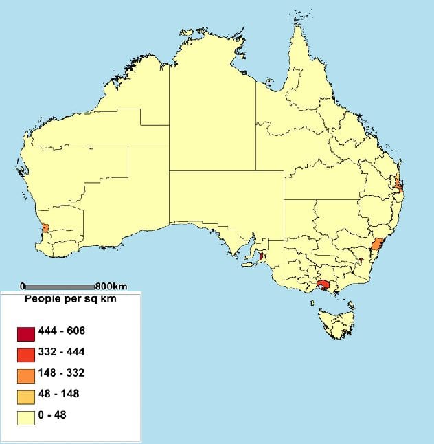 Australia is like that cool brother who moved out of the house on his own for a job pretty early on and we don’t hear from him much. It’s one of the five majority English-speaking countries (not including autonomous overseas colonies), and a relatively prosperous nation by all measures.
What we don’t realize, though, is that it has managed to do all of that by being so sparsely populated that it could be compared to some of the emptiest and most inhospitable regions around the world, like Mongolia and Namibia. Despite being as developed and huge as the contiguous USA (it’s the sixth largest country) Australia only has a population density of 5 people per square mile. That’s because the entire population of Australia actually lives on the coasts, as most of the inner part of the country is too inhospitable for human life. Even on the coasts, the population is concentrated around the biggest urban centers on the eastern side.
The government acknowledges that the low population density is a problem, as there are still many regions of the country that could be turned into thriving towns and cities with more focused development efforts.[8]
For more lists like this, check out 10 Lesser-Known Facts About World-Famous Landmarks, and 10 Movies Based On Common Misconceptions
About The Author: You can check out Himanshu’s stuff at Cracked (www.cracked.com/members/RudeRidingRomeo/) and Screen Rant (https://screenrant.com/author/hshar/), or get in touch with him for writing gigs ([email protected]).
More Great Lists
 Top 10 Bizarre Facts That Will Change How You See Dinosaurs
 10 Ways Life Will Change If China Becomes The…
 Top 10 Tech Crazes That Failed To Change The World
 10 Historical Facts That Will Change How You Think…
 10 Bizarre Helper Animals You Don't See Every Day
 20 Incredible Time-lapse Videos You Have To See
 Top 10 Listverse Lists Google Doesn't Want You To See
 Top 10 Underappreciated Directorial Debuts You Need To See
 Top 10 Things Disney Doesn't Want You To See
fact checked by
Jamie Frater
More Great Lists