 Weird Stuff
  Weird Stuff
  Animals
 10 Inspiring Tales of Horses Being Human
 Mysteries
 Top 10 Haunting Facts About the Ghost Ship MV Alta
 History
 10 Surprising Stories About the Texas Rangers
 Humans
 10 Philosophers Who Were Driven Mad by Their Own Theories
 Miscellaneous
 10 Video-Game-Worthy Weapons and Armors from History
 Weird Stuff
 10 Psychics Who Accurately Predicted Wartime Events
 The Arts
 10 Pieces of Art Inspired by a Broken Heart
 Health
 10 Science Fiction-Sounding New Medical Treatments
 History
 10 Surprising Facts About the Father of Submarine Warfare
 Weird Stuff
 10 Times Real Laws Were Based on Bizarre Hypotheticals
 Animals
 10 Inspiring Tales of Horses Being Human
 Mysteries
 Top 10 Haunting Facts About the Ghost Ship MV Alta
Who's Behind Listverse?

Jamie Frater
Head Editor
Jamie founded Listverse due to an insatiable desire to share fascinating, obscure, and bizarre facts. He has been a guest speaker on numerous national radio and television stations and is a five time published author.
More About Us History
 10 Surprising Stories About the Texas Rangers
 Humans
 10 Philosophers Who Were Driven Mad by Their Own Theories
 Miscellaneous
 10 Video-Game-Worthy Weapons and Armors from History
 Weird Stuff
 10 Psychics Who Accurately Predicted Wartime Events
 The Arts
 10 Pieces of Art Inspired by a Broken Heart
 Health
 10 Science Fiction-Sounding New Medical Treatments
 History
 10 Surprising Facts About the Father of Submarine Warfare
10 Of The Most Beautiful Maps Ever Created
During much of history, maps were designed as much for beauty and display as for accuracy. When maps were hand-drawn, they were difficult and expensive to produce, and ones designed for personal libraries were appropriately lavish to reflect their status as luxury items. Even in modern times, some map makers design their works to make a point. Others designed them for beauty, and sometimes a map designed for entirely practical purposes is also beautiful.
10Planisphaerium Arateum Sive Compages Orbium Mundanorum Ex Hypothesi Aratea In Plano Expressa
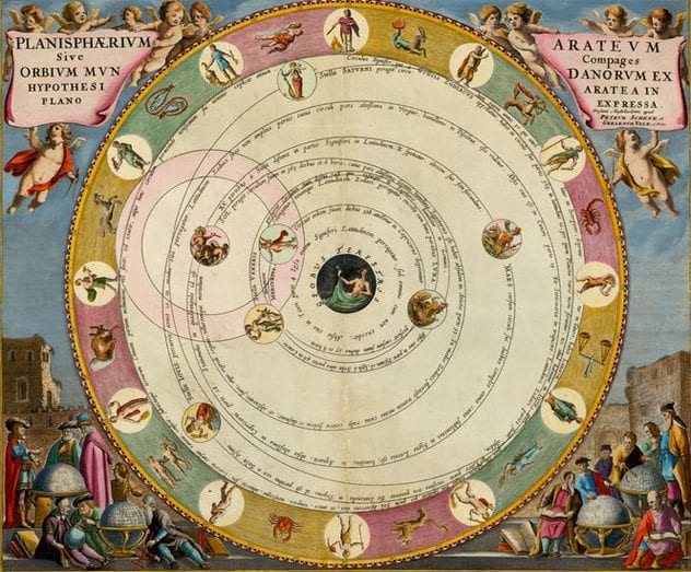
The planisphere of Aratus, or the composition of the heavenly orbits following the hypothesis of Aratus expressed in a planar view, was designed by Andreas Cellarius and published in 1660 as part of his Harmonia Macrocosmica (harmony of the macrocosm). It shows a model of the universe according to the Greek astronomer and poet Aratus. It shows the Earth at the center of the universe, with the Sun, Moon, and other planets orbiting around it, and the signs of the zodiac orbiting around those.
The orbits are particularly graceful, and all the details are clear and precise. Every map in the Harmonia is stunningly beautiful, but this one combines some of the virtues of each.
9The Cedid Atlas Tercumesi
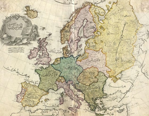
Selim III, then Sultan of the Ottoman empire, engaged in many reforms and modernizations during his reign, and this 1803 atlas was the first known complete printed atlas in the Muslim world to use European-style cartography. Only 50 copies were printed, and many of these were burned in a warehouse fire during a Janissary uprising of those opposed to Selim’s reforms, so it is also one of the rarest printed atlases.
The lettering is remarkably well done, even by the high standards of the day. Each page was mounted on cloth, rather than paper, to make it more durable.
8This Fantasy Map Of Sarkamand
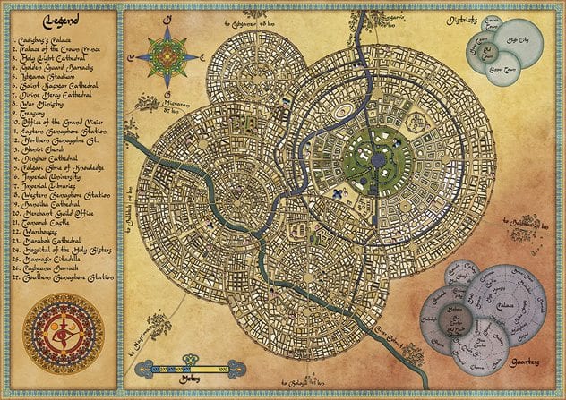
This map of a mighty capital in the desert, seat of the Padisha, was created in Photoshop and Illustrator by Robert Altbauer. The lettering style suggests Arabic, and the name references the extraordinarily beautiful city Samarkand, located in today’s Uzbekistan.
The design of overlapping circles almost looks like photographs of cellular structures. Altbauer has designed maps for games, television, and fantasy novels.
7An Ancient Mappe Of Fairyland

This map, created in 1918, depicts an island that shows the locations of dozens of myths, fairy tales, and folklore. The sources are mostly British, but there are also inspirations from Greek and German myths. You can see Oberon’s kingdom from Midsummer Night’s Dream, King Arthur’s tomb, a mountain where rocs build their nests, Red Riding hood’s cottage, Tom Thumb, Monsalvat (the land where the Holy Grail is guarded by the Grail Knights), and Ulysses’s ship.
Sleigh was inspired by many of the artists of the Arts and Crafts movement, especially William Morris, and this shows in not just the subject matter but the delicacy of the colors. 1918 marked the end of World War I, so it’s quite possible that for Sleigh and those who admired the map, this fantasy land in which even the more dangerous creatures, such as dragons, looked peaceful was a welcome escape.
6Duke’s Plan Of New York
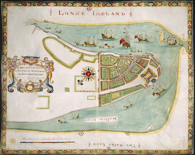
1664 was the year the English captured New York from the Dutch. This map shows several of the original spellings from that time, including Hudson’s River, Longe Isleland, and Mannados. The map was presented to James, the Duke of York, with the expectation that he would name the city after himself.
The design, copied from an earlier Dutch map, blends ornate elements, such as the decorative border and legend, with plenty of empty space depicting land and much of the water. The British ships, added to reinforce that the city became British territory, are drawn so delicately that they emphasize the empty space.
5Cheonhado
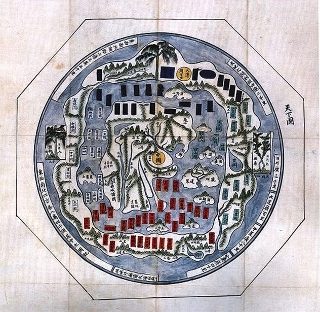
This map, created in Korea around 1800, is known as a Cheonhado. The term means “complete map of all under Heaven” and shows the mystical Mount Meru in the center. In Buddhist, Jain, and Hindu beliefs, Mount Meru is not just the physical but the spiritual center of the universe.
Other countries, with little regard for their relative sizes or geographical location, orbit China and Mount Meru.
4Yongying County In China
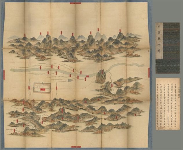
This map was created in China sometime between 1734 and 1779 and shows the river systems of Yongying County in China. Unlike most Western maps, the south is at the top and the north at the bottom.
It was painted on silk, and the labels were pasted on. The gentle curves and muted colors give the map a rather tranquil appearance.
3Leo Belgicus
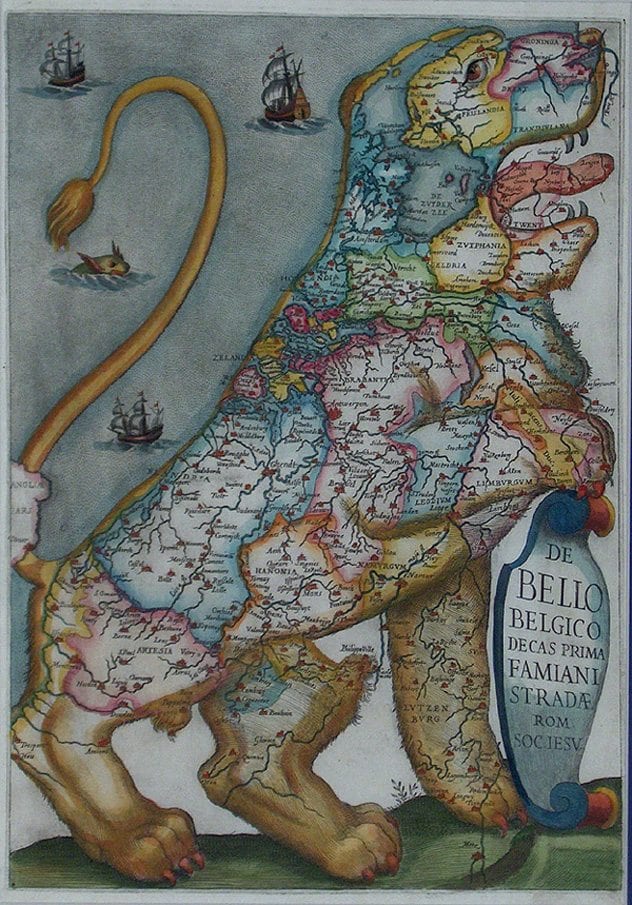
In 1583, Michael Aitzinger drew a map that depicted the Netherlands, Luxembourg, and Belgium in the shape of a lion, inspired by the lions that were so common in the region’s heraldry. He called it the Leo Belgicus, and it started a trend for mapmakers. The most famous version is by Claes Janszoon Visscher, from 1611.
2Geological Investigation Of The Alluvial Valley Of The Lower Mississippi River
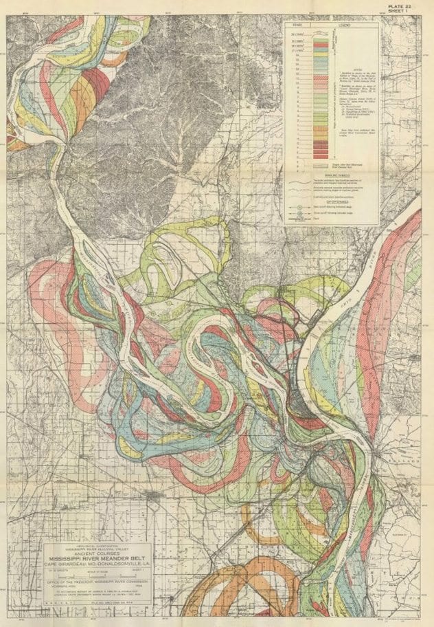
In 1944, Harold Norman Fisk, a geology professor, published this as part of a report for the Army Corps of Engineers. These maps of the changes of the Mississippi River over time look a bit like the undulations of muscle tissue, a bit like ribbon candy, and a bit like abstract art.
The research behind these maps is just as impressive as the maps themselves. Fisk and his team used approximately 16,000 soil samples from various locations around the river and compared them to aerial photographs to establish the old flow patterns.
1Book Of Navigation
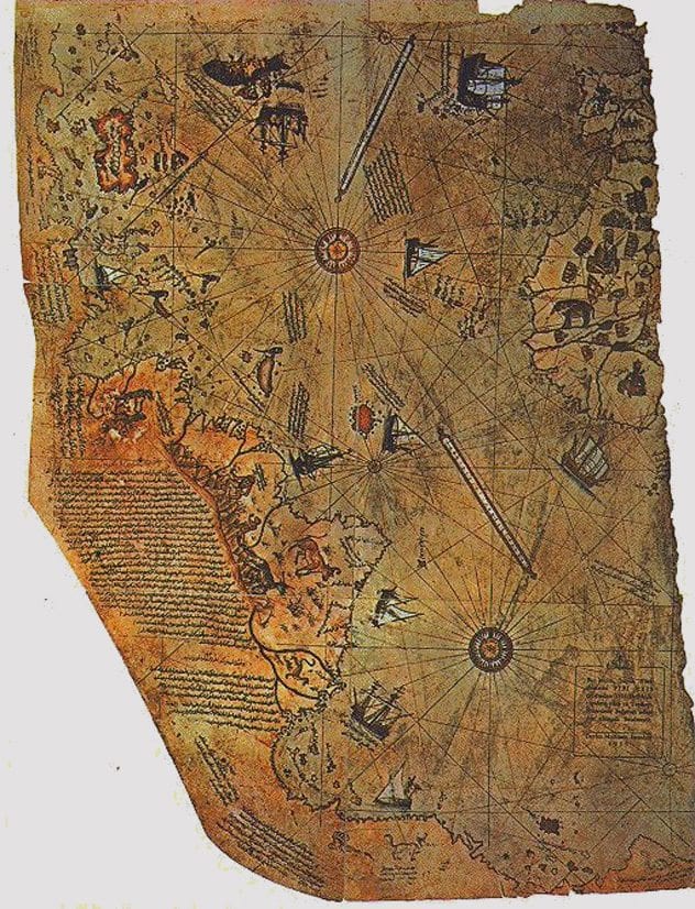
The Ottoman admiral Piri Reis designed many gorgeous maps, including the collection in his Book of Navigation, published in 1521. The maps show the delicate precision of Ottoman illuminated manuscripts, and the coloring of the land masses (which were far less important to Reis) has an almost playful note.
His first world map, published in 1513, includes both North and South America. Some people believe the section that shows the southern part of South America and the coast of Antarctica are so accurate that it proves humans explored Antarctica long before the historical record indicates. However, the map has enough mistakes (including an annotation that says the region is warm) to make it clear that the points that are accurate are far more likely due to good informed guesses based on Reis’s topography skills.
+A Humorous Diplomatic Atlas Of Europe And Asia
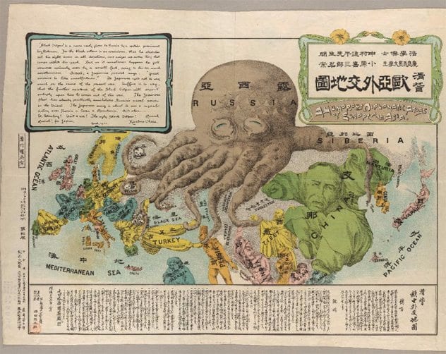
In March, 1904, at the beginning of the Russian-Japanese war, student Kisabur Ohara, published this atlas that showed Russia as an octopus trying to strangle all of Asia and much of Europe. Finland, Poland, Crimea, and the Balkans are already dead and represented by skulls, while Turkey, Persia, and Tibet are caught firmly. Each living country is depicted as a person in the country’s typical costume. One of the octopus’s arms is reaching toward Korea and Port Arthur, ready to throttle those, as well.
Previous maps had shown Russia as an octopus reaching greedily across Asia, but this is the first known one to show Europe at risk as well. Even without the text, the map does a remarkable job of portraying Russia as a bestial menace and other countries at risk.
Ann is a researcher, writer, and currently a job hunter. Learn more or see more of her writing.


