 Movies and TV
Movies and TV
Movies and TV  History
 10 Wild Stories About America’s Most Fascinating Founding Father
 Our World
 10 Astonishingly Valuable Things Their Owners Simply Walked Away From
 Humans
 10 Disturbing Communities from the Dark Corners of the Internet
 Movies and TV
 10 Hollywood Style Choices That Backfired
 Weird Stuff
 10 Ancient Chores That Would Horrify Modern Health Inspectors
 Politics
 10 Strange High-Tech Tools Shaping Modern Politics
 Humans
 10 Extraordinary Places Humans Have Adapted to Live
 Weird Stuff
 Ten of the Strangest Things You Can Buy Online
 Movies and TV
 10 Crime Shows with Gorgeous Settings
Movies and TV 10 Amazing Lost Films That Were Found Again
History 10 Wild Stories About America’s Most Fascinating Founding Father
Our World 10 Astonishingly Valuable Things Their Owners Simply Walked Away From
Who's Behind Listverse?

Jamie Frater
Head Editor
Jamie founded Listverse due to an insatiable desire to share fascinating, obscure, and bizarre facts. He has been a guest speaker on numerous national radio and television stations and is a five time published author.
More About Us
Humans 10 Disturbing Communities from the Dark Corners of the Internet
Movies and TV 10 Hollywood Style Choices That Backfired
Weird Stuff 10 Ancient Chores That Would Horrify Modern Health Inspectors
Politics 10 Strange High-Tech Tools Shaping Modern Politics
Humans 10 Extraordinary Places Humans Have Adapted to Live
Weird Stuff Ten of the Strangest Things You Can Buy Online
Movies and TV 10 Crime Shows with Gorgeous Settings
10 Ridiculous Problems Caused By Fonts
We probably do not think much about fonts. Most of us can’t recognize the majority of them, let alone name them. However, history has proven that fonts are more important than we think they are.
Fonts have sometimes become symbols of progress and political allegiance. They can also be used to expose fraud or delay court judgments. They have caused centuries-old disputes, brought down governments, and fomented protests and public outrage.
Photo credit: artsy.net
10 A Two-Century-Old Dispute Over A Font Ends After Hitler Intervened
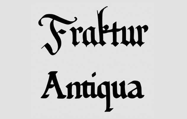
Photo credit: Manuel Strehl (Fraktur), Manuel Strehl (Antiqua)
From the 1800s until World War II, Germany was enmeshed in a weird controversy over the use of two fonts: Fraktur and Antiqua.
Fraktur was the major font used in Germany until Antiqua came along in the 16th century. Antiqua had been adopted in the non-German parts of Europe, including France and Italy, but not in Germany. However, German printers used it to print non-German words and maintained Fraktur for German words.
Antiqua started to gain prominence in Germany in the 1800s. Several Germans resisted it because it was the preferred font for several political events, including the Renaissance and the French Revolution. The German resistance to Antiqua became more heated after Napoleon was defeated at Waterloo.
Conservative Germans considered Antiqua to be a symbol of the French and deemed its use to be unpatriotic in Germany. Radical Germans supported the adoption of Antiqua because they considered it progressive. Soon, German printers were divided over the two fonts. Printers who used Antiqua were called Altschrift, while those who used Fraktur were called Frakturbund.
The Frakturbund continued to win. In 1911, Germany even banned Antiqua in schools and introduced Sutterlin script in its place. The Nazis found themselves at the center of the heated Fraktur-Antiqua dispute when they got into power. They supported Fraktur until January 1941 when Hitler declared it a Jewish script. So they abandoned it and switched to Antiqua.[1]
9 A Font Brings Down The Pakistani Prime Minister’s Government

Photo credit: deccanchronicle.com
On April 3, 2016, German newspaper Suddeutsche Zeitung released 11.5 million pages of damaging documents belonging to the Panama-based law firm Mossack Fonseca. The documents exposed how Mossack Fonseca set up fake companies to help several high net worth individuals hide money in tax havens.
Several top celebrities, businesspeople, and politicians (including currently serving and past world leaders) were implicated. This included Iceland’s Prime Minister Sigmundur David Gunnlaugsson and Pakistan’s Prime Minister Nawaz Sharif. Gunnlaugsson resigned the day after the leak, while Sharif managed to hold on for some months.
The Panama Papers revealed that Sharif and his family possibly wired state money through the fake businesses to buy homes in London. Sharif and his family denied the accusations. His daughter, Maryam, even provided documents to prove that the homes were owned by a private business. She claimed that her family only acted as the trustee.
The key document was dated February 2006. However, it was printed in the Calibri font, which was released in 2007. The Sharifs’ attorneys and supporters claimed that Calibri was designed in 2004, which was true. The designer, Lucas De Groot, started work on the font in 2002 and completed it in 2004.[2]
However, Microsoft only released test versions to a closed group of people before its official 2007 release. According to De Groot, it is unlikely that an unknown and unreleased font would have been used to print official documents in 2006. Nawaz Sharif later resigned after the Pakistani Supreme Court declared that he was not honest enough to remain in office.
8 Telecom Executive Loses Homes After Using The Wrong Font
In December 2017, Gerald McGoey, the chief executive officer of Look Communications, filed for bankruptcy. He was ordered to sell his properties to repay the $5.6 million he owed creditors. These creditors appointed some trustees to audit McGoey’s properties to see what they could lay their hands on.
The trustees found two homes. However, McGoey claimed that the homes belonged to his three children and even provided paperwork as proof. He was soon busted after the documents were revealed to have been printed with fonts that did not exist at the time the supposed trusts were signed.[3]
One document dating back to 1995 was printed in Cambria, which was designed in 2002. The other paper dated back to 2004, even though it was printed in Calibri. As we mentioned earlier, Calibri only became available in 2007. McGoey’s attorneys later claimed that the couple had made mistakes with the dates but insisted their claims were true. The court decided otherwise.
7 Everyone Hates Comic Sans
Photo credit: artsy.net
Vincent Connare designed Comic Sans in 1994. He made the font for Microsoft Bob, a new program that Microsoft was working on at the time. Microsoft Bob turned the screen of a computer using the Windows 95 operating system into the image of the inside of a home. Users could launch programs by clicking on similar objects in the home.
For instance, clicking on the clock opened the calendar. Clicking on the pen and paper opened Microsoft Word. A dog guided users through the home and spoke in a speech bubble in Times New Roman font. Connare thought that Times New Roman was too serious for the new program, so he created the playful and friendly looking Comic Sans.[4]
Although Comic Sans never made it into Microsoft Bob, Microsoft released it with Windows 95. The font became popular and was soon used for important and official purposes like tombstones, warning signs, and lifesaving hospital equipment. This whipped up outrage against the font.
Having a playful-looking font on official and important items was a big no-no. It was like having a clown in a business meeting. So the font ended up as the most hated font out there. There is even a movement calling for its ban. Nevertheless, it is still good for children and people with dyslexia.
6 Outrage After IKEA Changes Font

Photo credit: sitepoint.com
In August 2009, IKEA quietly dumped the trademark Futura font it used in its signage and catalog and switched to Verdana. Unfortunately, customers noticed and started a backlash that we remember today as Verdanagate.
IKEA agreed to the change a few months earlier when executives decided to standardize the fonts they used online and offline. Before then, IKEA used Verdana on its website and Futura on its signage and in its catalog. Futura was not available online at the time, so executives settled for Verdana.
Unfortunately, Verdana was created for online use and flops badly when used offline. It looks unusual when the font size is increased or is printed at a high resolution, which is what IKEA did. This was why it was quickly noticed and generated such negative publicity that IKEA was forced to revert to Futura.[5]
5 A Money-Saving Font Won’t Save The US Government Any Money
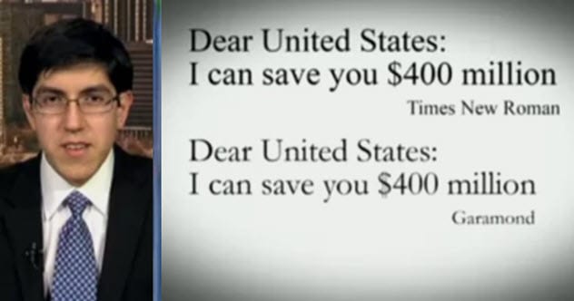
Photo credit: fastcompany.com
In 2014, Suvir Mirchandani, a 14-year-old student, revealed that the US federal and state governments could save around $467 million a year if they changed the font they used in official documents to Garamond.
Mirchandani made the claim after comparing Garamond with Century Gothic, Comic Sans, and Times New Roman. He discovered that Garamond was thinner and used about 25 percent less ink than the other fonts. He later calculated that US federal and state governments could save $467 million a year if they switched to Garamond.
Mirchandani’s experiment was later determined to be flawed because Garamond is 15 percent smaller than the other fonts at the same size. This means that Garamond would use the same amount of ink as the other fonts if its size was increased to match that of the other fonts. Similarly, other fonts will save the government the same amount of money if their sizes are reduced to match the smaller size of Garamond.
Besides, the US government does most of its printing with printing presses and not with office printers. Mirchandani’s experiment was done with inkjet printers, even though the government also uses laser printers which require toner. Toner is cheaper than inkjet inks, which would affect any cost savings.[6]
Lastly, the US government does not actually buy ink. Instead, it has deals with other businesses to provide office printing services. These businesses charge based on the pages printed and not the amount of ink used. So the government spends the same amount of money to print a color photograph as it does to print a page with just a single letter on it.
4 Font Size Used To Delay Judgment Over A Controversial Michigan Law
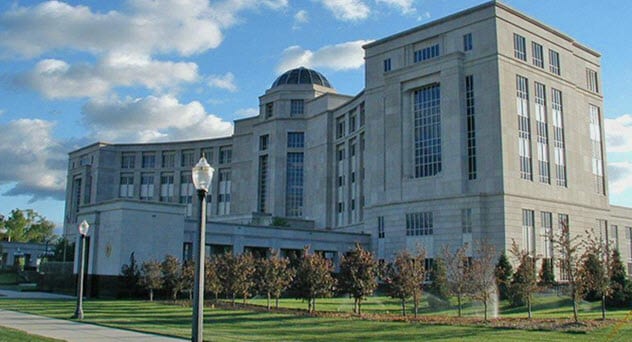
Photo credit: michiganradio.org
In 2011, Michigan governor Rick Snyder signed a controversial law that allowed the governor to appoint emergency managers to take over the affairs of mayors and city councils in periods of crisis. The law quickly became infamous, causing protests, controversies, and a legal battle.
On one side was Michigan Citizens for Fiscal Responsibility that opposed the law. On the other was Stand Up for Democracy that supported the law. The state agreed to call for a referendum in November 2012 to decide if they wanted the law to remain.
Michigan Citizens for Fiscal Responsibility sued, asking the Michigan Supreme Court to cancel the referendum because the Stand Up for Democracy movement used a small-sized font in the documents it submitted to request the referendum.
Michigan Citizens for Fiscal Responsibility claimed that the small font made the petition illegal. This did not fly with the court, which later ruled that the state could appoint emergency managers.[7]
3 Controversy After The US Federal Highway Administration Revokes Approval Of A Font For Road Signs
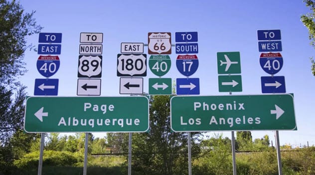
Photo credit: bigthink.com
The US Federal Highway Administration approves only two fonts for highway signs. The first is the Highway Gothic typeface that has been in use for over seven decades. The other is Clearview, a newer and supposedly clearer alternative to the Highway Gothic typeface.
The Federal Highway Administration first approved Clearview for use in 2004 after researchers proved that it was clearer than the Highway Gothic typeface. A 1997 test indicated that Clearview was 16 percent more readable at night. A 2001 experiment proved that it increased reading distance by 12 percent on the highway. This meant that drivers could read Clearview 23 meters (74 ft) farther away than they could read Highway Gothic.
However, later tests indicated that Clearview was no better than the Highway Gothic typeface. The supposed clarity was credited to the quality of materials used in making road signs bearing the Clearview font.
There were also concerns that the Federal Highway Administration only approved Clearview for monetary reasons. Town and city councils that opted to use Clearview paid a $175 to $795 licensing fee for the font. The Highway Gothic typeface is available free of charge. Nevertheless, the Federal Highway Administration approved Clearview for use again two years later.[8]
2 Researcher Gets Funding Approval Rejected For Using Wrong Font

A few years ago, Susannah Maidment, a paleontologist at the Imperial College London, tweeted that her research grant application to the Natural Environment Research Council (NERC) in the UK had been rejected because she submitted it using Calibri.
Apparently, NERC had stringent guidelines and required that grant proposals be submitted in “Arial 11 or other sans serif typeface of equivalent size to Arial 11.” Maidment had used a font that did not fit the guidelines. She claimed that the initial guidelines mentioned “Arial or other sans serif typeface of equivalent size,” which did not ban Calibri.[9]
NERC later explained that it rejected 4 percent of funding proposals over wrong fonts. The organization said that its font requirement was necessary to ensure that applicants had an even playing field because smaller fonts took up fewer pages and allowed applicants to give more details.
1 Ad Agency In Trouble Over Font
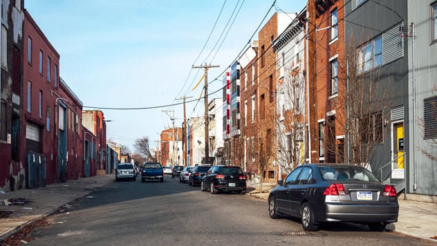
In 2017, Cliff Ross, an advertising agency based in Philadelphia, released 10 new fonts that it felt would resonate with the city. Each font was modeled after a different neighborhood. For instance, the font modeled after Center City, which contains much of Philadelphia’s offices, resembled skyscrapers.
However, the font modeled after North Philly proved controversial. It resembled boards of wood held together with nails. This provoked outrage because it suggested that the African-American–dominated North Philly was filled with shanties. Users called the font everything from offensive to gross and disturbing, forcing Cliff Ross to retract it.[10]
Read more fascinating facts about fonts on Top 10 Origins Of Famous Fonts and 10 Fascinating Typographical Origins.
More Great Lists
 Top 10 Top-Level Domains That Caused Controversies
 10 Controversies Caused By Commas
 10 Disturbing Internet Trends That Caused Fatalities…
 10 Unfortunate Deaths Caused By Food
 10 Catastrophes Caused By Food
 Top 10 Reasons To Believe the Wuhan Virology Lab…
 Top 10 Movies That Caused Controversy Before Release
 10 Weird But Fascinating Problems Faced By Ancient People
 Top 10 Long-Term Space Exploration Problems We Have…
fact checked by
Jamie Frater
More Great Lists