 Creepy
Creepy
Creepy  Movies and TV
 10 Movies That Get Elite Jobs Right, According to Experts
 Weird Stuff
 10 Times Real Laws Were Based on Bizarre Hypotheticals
 Animals
 10 Inspiring Tales of Horses Being Human
 Mysteries
 Top 10 Haunting Facts About the Ghost Ship MV Alta
 History
 10 Surprising Stories About the Texas Rangers
 Humans
 10 Philosophers Who Were Driven Mad by Their Own Theories
 Miscellaneous
 10 Video-Game-Worthy Weapons and Armors from History
 Weird Stuff
 10 Psychics Who Accurately Predicted Wartime Events
 The Arts
 10 Pieces of Art Inspired by a Broken Heart
Creepy 10 Death Superstitions That Will Give You the Creeps
Movies and TV 10 Movies That Get Elite Jobs Right, According to Experts
Weird Stuff 10 Times Real Laws Were Based on Bizarre Hypotheticals
Who's Behind Listverse?

Jamie Frater
Head Editor
Jamie founded Listverse due to an insatiable desire to share fascinating, obscure, and bizarre facts. He has been a guest speaker on numerous national radio and television stations and is a five time published author.
More About Us
Animals 10 Inspiring Tales of Horses Being Human
Mysteries Top 10 Haunting Facts About the Ghost Ship MV Alta
History 10 Surprising Stories About the Texas Rangers
Humans 10 Philosophers Who Were Driven Mad by Their Own Theories
Miscellaneous 10 Video-Game-Worthy Weapons and Armors from History
Weird Stuff 10 Psychics Who Accurately Predicted Wartime Events
The Arts 10 Pieces of Art Inspired by a Broken Heart
10 Bizarre Stories Behind US State Flags
Each US state has its own flag. They fly over capitols, adorn courtrooms, and appear on everything from bumper stickers to coasters. They’ve become accepted parts of local culture. Few people stop and think about where the designs of these banners came from, but, in fact, each has a complex web of history, symbolism, and negotiation behind it.
The flags’ designs were far from set or certain in their early days—and were subject to just as many foibles, disputes, and mistakes as any other human endeavor. The process of getting a state flag was often far from stately.
10 Nebraska—Utter Laziness
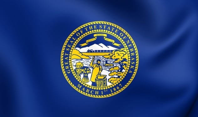
Flag designs, like other areas of life, are subject to trends. A long-standing trend in US state flags is the tradition of putting the state seal on a blue field. Flag enthusiasts (vexillologists) tend to hate this trend, saying the “seal on a bedsheet” style is completely lazy and uncreative. For the laziest of the lazy, look no further than Nebraska.
This Midwestern state took a long time to even get around to adopting an official flag at all; the designation took place in 1963, though a design had been in common use in prior years. Flag-lovers love to hate it. A survey by the North American Vexillogical Association (NAVA) in 2001 voted it the second-worst flag in the US and Canada combined. Since the worst-ranked in that survey, Georgia’s state flag, has since been changed, Nebraska now holds the dubious distinction of having the most detested official banner.
Nebraskans don’t seem to bother about it much. In 2002, the legislature discussed creating a commission to redesign the banner; nothing came of it. In 2017, a state senator pointed out that the flag had flown upside down at the state capitol for ten days with no one noticing.[1] He urged the legislature to redesign the flag into something state residents would actually care about, as the current design apparently inspired only apathy.
Unsurprisingly, the legislature did nothing. But their inaction proved his point!
9 Utah—Gradually Getting it Right
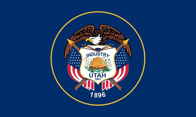
Photo credit: Utah’s Online Library
The tale behind Utah’s flag is of a constant struggle to reconcile the will of the people with the random mistakes of flagmakers. It only took a century to iron out all the wrinkles!
The Utah flag carries classic American imagery, featuring a bald eagle and the US flag. It is actually one of the few state flags to include the national flag in its design, a sign of the state’s gratitude for being accepted into the American union. The Mormons, who form the majority of the state’s population, were long ostracized, and their admission to the US was a big victory. For the same reason, the year of that admission (1896) appears prominently on the banner, along with the year of first settlement (1847). A shield, a local sego lily, and an inspirational beehive round out the design.[2]
The flag was adopted in 1911, when Utah was still a newly minted state, but it didn’t take long for odd issues to emerge. The following year, a local group ordered a copy of the flag to be presented to the brand new battleship USS Utah. When the banner arrived, it was wrong: The maker had colorized the shield and added a gold ring in the center. Anxious to avoid embarrassment, Utah natives apparently decided that the law was easier to change than the flag. The legislature quickly resolved that the random quirks of the flagmaker were now the official version.
It didn’t stop there. In 1922, a flagmaker departed from the established design again, this time putting the 1847 date in the wrong spot. His erroneous design became a model for other manufacturers, and the mistake went uncorrected for 89 years. It was finally brought to legislators’ attention in 2011—and this time, they decided to make the flag fit the law. All Utah flags produced since 2011, at long last, conform to the officially approved design . . . at least until some future flagmaker’s flaws become official policy once more!
8 Ohio—The Swallowtail
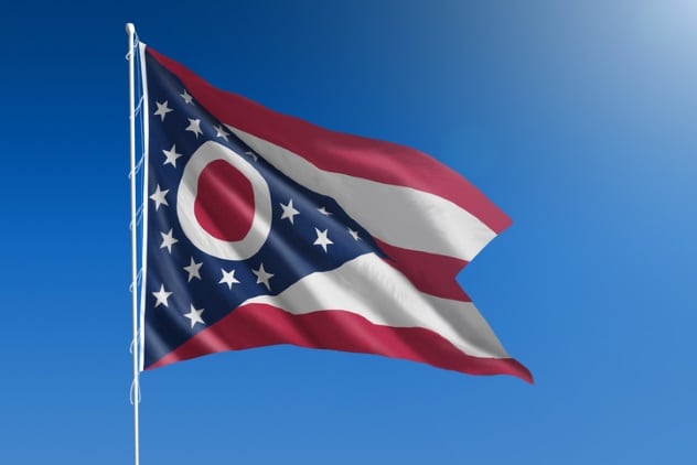
Unique among American state flags, Ohio ignores the rectangular standard in favor of a swallowtail (or guidon)-shaped banner. Flag historians suggest the design is inspired by the guidons carried by Ohio cavalry units in the Civil and Spanish-American Wars—both conflicts being in living memory when the flag was approved in 1902. Despite this origin, the flag is officially called a burgee, a term usually reserved for maritime banners. This makes perfect sense for a state which has no oceanic coastline.
The red-and-white “O” that dominates the flag’s star field stands for the state’s name; it drew derisive comparisons to Japan’s rising sun flag in 1902, but Ohio has remained proud of it. Like many other state flags, the Ohio burgee pays tribute to the growing United States: The overall design is obviously inspired by the national flag, and the star layout refers to the number of states in the Union. Thirteen stars on the left represent the original states, and the four on the right represent the later additions (Ohio itself being the 17th state).
Ohio’s pride in its flag has resulted in some unusual circumstances. In 2002, the legislature approved an official salute to it, to be recited after the Pledge of Allegiance to the national flag. The burgee’s distinctive shape makes it a nightmare to fold; it required a local Boy Scout to come up with a systematic method for doing so as his his Eagle Scout service project.[3] The 17-step process (fitting, for the 17th state) is still challenging but has found official approval. The Boy Scout saw his procedure signed into law by Ohio’s governor in 2005.
7 Louisiana—A Pious Error
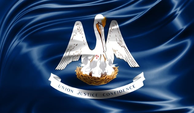
All good flags strive for meaningful symbolism. Unfortunately, some symbols persist even after they gave been proven to have no basis in fact. Such is the case with Louisiana’s flag, which is centered around a beautiful, poignant, and erroneous image.
The coastal pelican has long been associated with the state, whose Gulf Coast and many waterways define it. When the state flag was designed in 1912, it took up a symbol of pelicans that has been in use since medieval times: “the pelican in her piety.” This shows a mother pelican vulning—biting at her breast in order to tear pieces off and feed them to her chicks. As a celebration of self-sacrifice, this emblem has been popular for centuries.
Sadly, the entire thing rests on a misunderstanding. Bird experts have known for some time that pelicans don’t actually do this. Pelicans will point their bills downward when feeding chicks, to better deliver fish to their young; this might look, from a distance, like the pelican was feeding parts of itself to the chicks. The brutal reality is that starving pelicans—like most other creatures—would save themselves and leave offspring to die.[4]
One cannot judge Louisiana too harshly, though. It’s much more elegant to promote fanciful self-sacrifice than ugly self-preservation. Presumably, no one wants to see a state flag featuring an empty nest and pelican skeletons!
6 California—The Homespun Grizzly
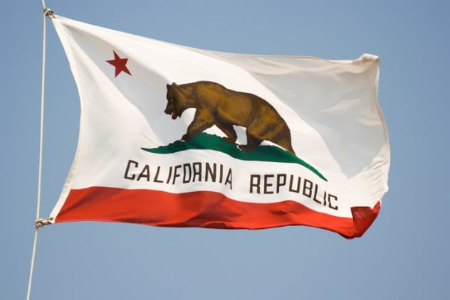
Today, one tends to picture California as a place of posh and manicured culture, the glitzy land of Beverly Hills and Malibu. Yet the grizzly bear on its flag suggests something much wilder, something hearty and rough. The origin of the flag—bound up with the origin of the state itself—is definitely at the rough end of the spectrum.
In 1846, California was Mexican territory, but not for long. Weary wagon train emigrants and weather-beaten mountain men had been trickling in for some time, and they had grown tired of ineffectual Mexican rule. A band of these men gathered at the Sonoma home of the local Mexican authority, General Mariano Vallejo, on a June sunrise. A member of the group later called them “as rough-looking a set of men as one could imagine”; their buckskins and rags did not aim to impress. But their muskets and Bowie knives did.[5]
The men gently placed a surprised Vallejo under arrest and proclaimed a new “Republic of California.” This added legitimacy to their actions. But they soon realized a new republic needed a new symbol.
The first California flag was as rough and hasty as its soldiers. A local woman found a spare rectangular piece of brown cloth lying around—this would become the foundation. One of the soldier’s wives tore off a red strip from her petticoat and sewed it to the bottom, making a stripe. Next, William Todd took over. Using a mixture of brick dust, oil, and paint, he sketched a crude star and an even cruder grizzly bear onto the banner. The star was in solidarity with Texas, another breakaway Mexican province. The grizzly was meant to evoke the intensity of the most ferocious animal in the West.
Unfortunately, Todd’s zeal exceeded his artistic ability. The bear, recalled General Vallejo, came out looking more like a pig. Nonetheless, the revolutionaries ran with it. Missing the hilarious chance to declare a Pig Republic, they raised the makeshift “bear flag” over Sonoma. It stayed the flag of the short-lived Republic of California, and in its honor, a grizzly remains on the state flag today.
At least now it actually looks like a bear.
5 Kansas—A Fierce Flag Feud
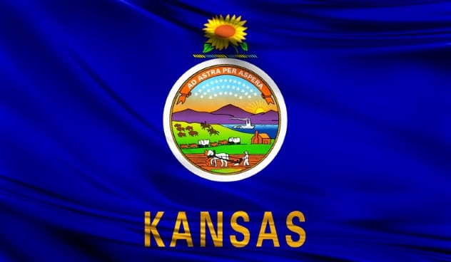
While some states’ residents really don’t seem to care about their flags—Nebraska springs to mind—others have natives who will get into passionate fights over flags. By 1911, Kansas was one of only a handful of states without an official flag, and citizens were clamoring for one. The fight over a design started hot and remained so. It would take over a decade for the disagreements to be resolved.
Several designs looked similar to the US national flag. However, same Kansans argued that such symbolism was no more than plagiarism and would compete unfairly with the national colors. Union army veterans of the Civil War, a powerful demographic at the time, insisted on respect and voted down red, white, and blue designs. The only one they would agree on was the one eventually adopted—and whose main benefit was being deliberately unlike the national flag.
It was quite different. The flag hung down from a horizontal brass bar. The design was kept simple: a blue field with the state seal set inside a golden sunflower.[6]
Simple did not mean uncontroversial. The horizontal-hanging banner was adopted in 1925, and it almost immediately became besieged with fresh opposition. Some complained that the sunflower was an improper symbol, since many considered it an invasive weed. Others argued that the horizontal-hanging format was ungainly. It was difficult to march with and hard to hang in contexts set up for vertical flagpoles. For this latter reason, the Kansas banner had been rejected from state flag displays in Washington, DC.
In 1927, the state legislature bowed to the pressure and approved a design modification. The horizontal-hanging format was out. The visual elements would stay, however; essentially, the design was rotated 90 degrees. No great controversy over the flag has arisen since then. Sunflower-haters, at least, seem to have made their peace with it.
4 Colorado—Enthusiastic Forgetfulness
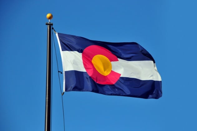
All of us have times when we get excited and go off half-cocked. One would like to think that those in charge of a state flag would spend a little more time checking their work, but that doesn’t always happen. At least not in the state of Colorado.
It all started when the Colorado legislature approved an official flag for the state in 1907—unsurprisingly, it consisted of the state seal on a blue field. The legislators promptly made a half-hearted announcement, had a single copy of the flag made, and stuffed it in a closet at the state capitol.
It’s little wonder that when, three years later, a group of patriotic Coloradan ladies got together to discuss ideas for a state flag, they had no idea that one already existed.[7] Almost no one did. The group, a chapter of the Daughters of the American Revolution (DAR), were eager to fill this perceived gap in Colorado pride, writing that, “State loyalty is too precious to be lost.”
Arguably, the gap did exist. A state flag had been created, but without public knowledge, it couldn’t fulfill the purpose a flag is meant for. No public knowledge meant no increased sense of public identity, loyalty, or pride. The bright-eyed Colorado DAR aimed to achieve all of this and more.
They moved at a rapid pace, eventually ramming through an immensely popular version of the modern flag. However, in their enthusiasm, they forgot a few details, like specifying the shades of colors to be used or how big the iconic Colorado “C” should be. This led to multiple competing designs for half a century. Only in 1964 did the legislature finally settle on an exact design—one that all zealous Coloradans could call their own.
3 Maine—Navies Of The Northeast
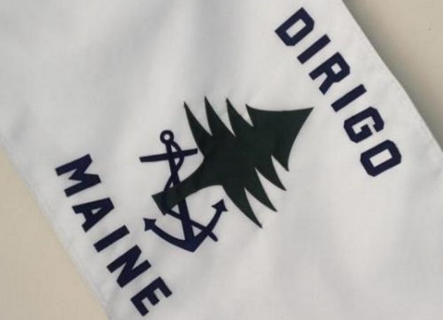
Photo credit: Maine Flag Company
While the Maine state flag is unremarkable—earning another seal-on-a-blue-bedsheet designation from NAVA—there is another Pine Tree State banner with more interest behind it. That’s the state naval ensign. This subject brings to light some hidden history and possibly some decades-old copycatting by Maine legislators.
The American rebels in the Revolutionary War didn’t float just one navy against the British; they floated 12. In addition to the united Continental Navy, 11 of the individual states commissioned their own navies to protect their coastlines. These were tiny and underpowered (what later eras would call “Mosquito Fleets”), but the mere fact of having them was a gesture of state pride and self-sufficiency. Each state navy had its own official ensign, as naval flags are called. These cousins of the state militias on land disappeared after the war, as did their ensigns—except one.
Massachusetts alone kept its ensign on the books. That naval mindset must have persisted in the population when Massachusetts produced offspring: Maine, which split off to form its own state in 1820. Something made Maine citizens hang onto the idea of a state naval ensign, even though it took them over a century to realize this half-remembered dream.
In 1939, Maine officially declared its own naval ensign—despite never having its own navy—becoming the second state in modern times to do so. With such a lack of competition and a chance to make something completely unique, the legislators . . . lost their nerve. Instead, they decided to duplicate Massachusetts!
In many ways, Maine seems to act toward Massachusetts like a rebellious teenager does toward a parent: desperate to go out and be independent but never quite able to escape the elder’s influence. Thus, while Massachusetts’s naval ensign features a green pine tree on a white field, Maine has: a green pine tree on a white field with an anchor attached.[8] To take one last stab at originality, the Maine legislature pasted a state motto on the ensign: Dirigo, Latin for “I direct.” Just as adolescents proclaim their boundless knowledge and authority.
As of this writing, these two Northeastern locales remain the only states with separate naval ensigns. Should the need for state navies ever again arise, Massachusetts will surely be two steps ahead of the rest—and Maine will be following a single step behind.
2 Alaska—Realizing A Schoolboy’s Vision

There’s a reason most flag designs are created by committees or legislatures: Making the process truly open to the public might produce a bunch of crude, bizarre, or inappropriate designs. It’s certainly hard to imagine a local government asking its teenagers to participate in a serious competition to design a flag. It’s even harder to imagine one of the youngsters winning. But the Alaskan authorities apparently trusted their youths quite a lot in 1927, and it’s a good thing they did.
In the mid-1920s, Benny Benson was much like the Alaska he was born into—young and scruffy. Son of a native woman and a poor Swedish fisherman, at the age of three, Benson lost his home and his mother in the same year (to fire and pneumonia, respectively). The children were doled out to foster care; Benny and his brother ended up in an orphanage in the Aleutian Islands.
Alaska, for its part, was still a fledgling territory. Organized in the 1880s, its progress toward statehood had been glacial. Alaskans were only granted piecemeal autonomy. Governed by far-off and distracted officials in Washington, DC, and often passed over for economic and infrastructure investment, Alaskans felt themselves the neglected stepchildren of the Union. At the time, casual observers would not have imagined bright prospects for either Alaska or Benson.
While the other states on this list came up with flags to celebrate a firmly established identity, Alaska’s territorial authorities seized on a banner as a means to affirm and define the statehood they were trying to create. Alaskan adolescents would help. A flag design contest was announced, with all 13- to 18-year-olds invited to take part. Benny Benson, then a student at the orphanage school, was just old enough to make the cut. And he had a flash of inspiration.
First, he gave the design a deep blue background, symbolizing the eventual state flower, the forget-me-not, as well as the sky over Alaska.[9] Keeping with the celestial theme, he used the well-known constellation the Big Dipper to evoke the larger formation of which it is a part: Ursa Major, the Great Bear. For Benson, this symbolized strength. Finally, a single large star in the upper right corner represented Alaska itself, the newest and most northerly addition to the American constellation.
Benson’s design met unanimous approval. It rocketed through the selection process, beating 141 other entries; within four months, the territory had a flag of its own. Within 11 years, it had a state poem and song, each inspired by the banner. And within 32 years, Alaska finally became the 49th state in the Union. Alaska’s statehood effort had been invigorated by the flag symbol—and Benny Benson went from a poor, no-account foster child to a sensation, a respected Alaskan goodwill ambassador for the rest of his life. He and his native state had both realized their potential.
1 Maryland—Reconciliation
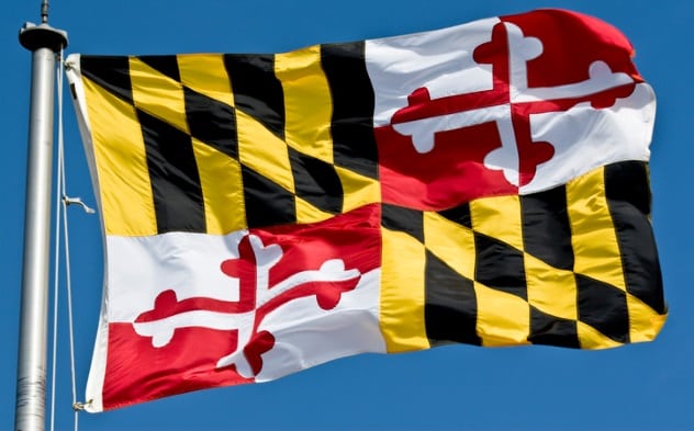
Looking at Maryland’s flag, one could be forgiven for thinking it came straight from an automobile racetrack. Yet the reality is much more profound. This distinctive banner traces its origin through British heraldry all the way to America’s most blood-soaked years.
The US Civil War pitted Northern states against Southern states, making the country a “house divided,” as Abraham Lincoln called it. Smaller houses, too, were divided. Tempers ran hot along the border between North and South—nowhere more so than in those states which had the Southern institution of slavery but remained officially part of the United States. Maryland, one of these, was split right down the middle over the war, as were many of its families.
Marylanders fought on both sides during the war and went toe to toe with each other in battles at Front Royal and Gettysburg, among others. Fittingly, Maryland units on opposing sides carried distinct battle flags, both of which recalled the state’s colonial history. Unionist Marylanders carried the black-and-yellow coat of arms of the Calvert family, noble founders of the colony; Southern sympathizers bore the red-and-white Crossland banner, representing another branch of the family. Thus, even the flags symbolized blood ties severed by a blood feud.
The war ended, eventually. The United States would remain a whole country and Maryland a unified state. Yet Maryland had suffered the ravages of pitched battles, marching armies, and martial law, and its citizens had died by the thousands. Could such a reunion-by-force ever be truly healthy again? Or would they have to live as two peoples, the victor and the vanquished, one privileged and one subjugated?
As the flag shows, they could and did become one again. It took time; scars were slow to fade. But as decades passed, memories of a shared heritage and mutual respect for each side’s wartime sacrifices began to close the wounds. A combined flag, incorporating both of the wartime designs, first flew in the Maryland city of Baltimore in 1880, on the 150th anniversary of the founding of the city. By 1904, the state legislature adopted it as the official state flag.[10]
The Old Line State’s banner is a definitively American flag, as its essence demonstrates a core American standard. Whatever lay in Marylanders’ pasts, all of them would remain equal under the law, preserving the path to that American ideal of a country where all have a voice. This banner serves as a vibrant reminder that reconciliation is always possible, even after the worst of divisions.
David Ellrod lives in Maryland with his wife, three daughters, and one very excitable dog.
Read about more strange events from history on Top 10 Bizarre Historical Crimes You Haven’t Heard Of and 10 Historic Events Fueled By Bizarre Circumstances.
More Great Lists
 10 Stories Behind Incredible Pulitzer Prize--Winning…
 10 Stories Behind Astounding Space Pictures Of Earth
 10 Interesting Stories Behind The Invention Of Modern Foods
 Top 10 Behind-The-Scenes Stories From The Best Action Movies
 10 Weird Place Names And The Stories Behind Them
 10 Bizarre Secrets Behind America's National Treasures
 10 Bizarre People Behind Everyday Words
") Site Update: State Of Listverse (March 2020)
Site Update: State Of Listverse (March 2020) 10 Bizarre Stories From European Witch Trials
fact checked by
Jamie Frater
More Great Lists